The Trickiest Op Art Pattern Examples
Feb 3, 2017
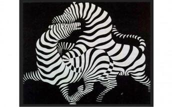
Op Art is an anomaly. Victor Vasarely pioneered the movement in the 1930s as a serious aesthetic investigation. But today we are as likely to see an Op Art pattern on a painting in a museum as on a pair of shoes, a kitchen gadget or a sports car. And yet what began as a formal exploration into optical aesthetics then devolved into kitsch has now once again asserted itself as an important area of artistic research. In the opinion of many contemporary abstract artists Op Art patterns present a position from which to examine and expand the optical limits of the two-dimensional plane. Some use Op Art to create a sense of flash or mystery. Others use it to explore the possibilities of kinetics. And still others use it simply to entice viewers into looking longer at art. What we find remarkable is that regardless of their individual goals, Op Artists as a whole have created a fantastic range of aesthetic illusions using a relatively limited vocabulary of techniques. Here are eight of the trickiest Op Art patterns used by our favorite Op Artists:
Dimensional Vectors
A vector can be described as a line that expresses both magnitude and direction. Victor Vasarely was a master of using vectors to transform shapes into forms. This untitled silkscreen by Vasarely from 1975 combines precise, symmetrical vectors with geometric shapes, horizontal and vertical lines and gradient colors. Despite being completely flat, it presents the illusion that a large mass is bulging outward from the picture plane.
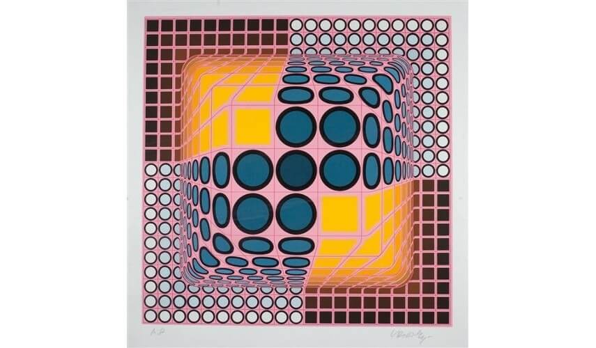 Victor Vasarely - Untitled, 1975. Silkscreen. © 2020 Artists Rights Society (ARS), New York / ADAGP, Paris
Tunnel Effect
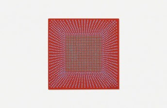
Another Op Art pattern of which Victor Vasarely was a master is the tunnel effect. In this trick, repeating geometric shapes in decreasing sizes are placed within each other in such a way that they seem to disappear into a vanishing point. In his 1975 painting Vonal-Stri, Vasarely used squares as his shape of choice and gradually adjusted the thickness of the sides of the squares in order to create the illusion that the tunnel is rounding a corner as it heads toward the vanishing point.
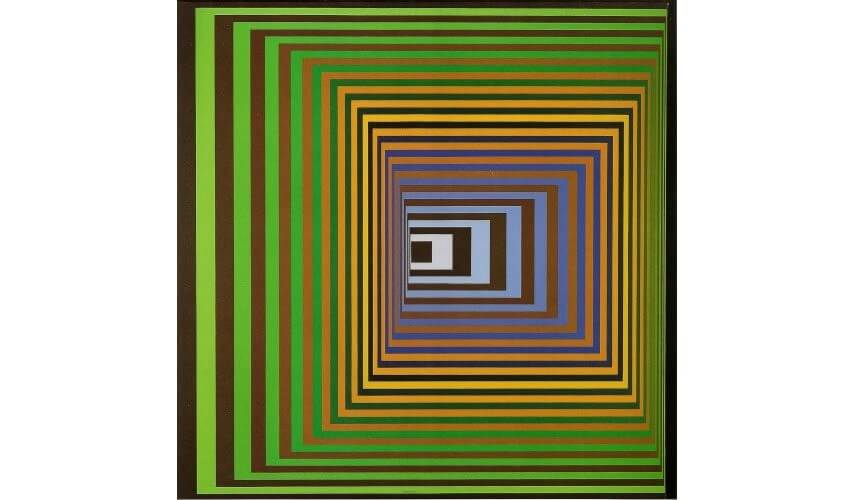 Victor Vasarely - Vonal-Stri, 1975. Acrylic on canvas. © 2020 Artists Rights Society (ARS), New York / ADAGP, Paris
Convex Distortion
One of the most fascinating tricks Op Artists play with is called convex distortion. This is when a surface appears to have a rounded fold, similar to a wave or a flag blowing in the wind. Bridget Riley mastered this effect and used it in numerous paintings. One of her earliest and most effective demonstrations of convex distortion was in her 1961 painting Movement in Squares. For this piece, she used a simple horizontal and vertical crosshatch pattern then gradually reduced the distance between the vertical elements on either side of what became the distortion.
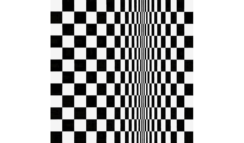 Bridget Riley - Movement in Squares, 1961. Tempera on board. © Bridget Riley
Tapering Lines
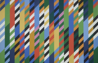
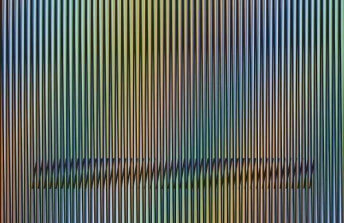
When a straight line gradually becomes thinner or fatter near the ends a tapering illusion is created. Tapering lines can create the sensation that an image is in motion or that it is three-dimensional. In 2015, Carlos Cruz-Diez combined tapering lines with a gradient color palette in his Caura-14 aquatint. He also carefully placed diagonals in a parallel arrangement in the lower segment of the image, creating the illusion of a spiral spring form hovering in the swaying, vertical space.
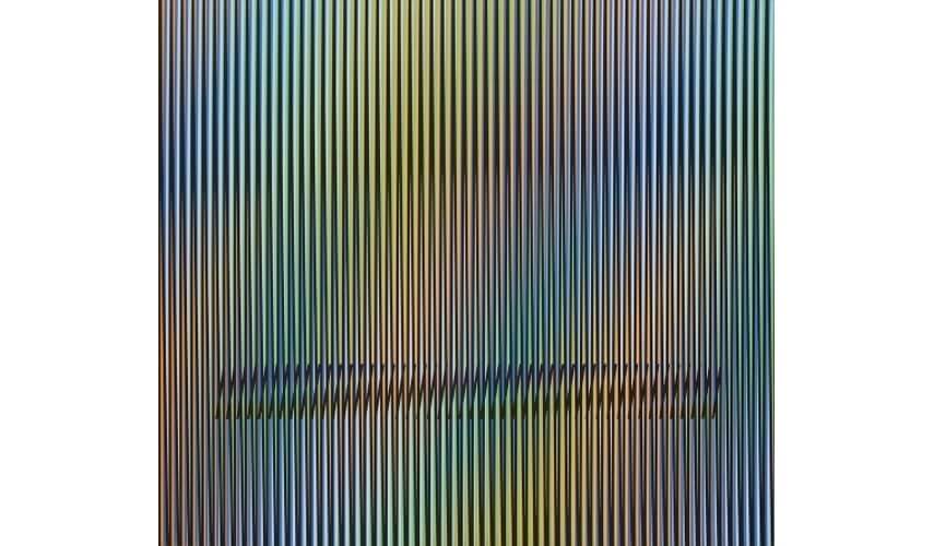 Carlos Cruz-Diez - Caura-14, 2015. Lithograph. 23 3/5 × 27 3/5 in. 60 × 70 cm. Polígrafa Obra Gráfica, Barcelona. © Carlos Cruz-Diez
Layered Crosshatch
The crosshatch pattern is native to weaving. When lines made of different hues are layered on a two-dimensional surface and placed in a crosshatch pattern, an illusion appears that the surface has depth. By adding additional layers and hues the illusion can become increasingly complex. In her 2008 painting #403 Blue-Violet, Susie Rosmarin overlaid diagonal lines in a crosshatch pattern over a gradient colored background and added additional gradient color patterns to the crosshatched lines. She also incorporated areas of convex distortion to create a sense of pulsating areas of light and dark.
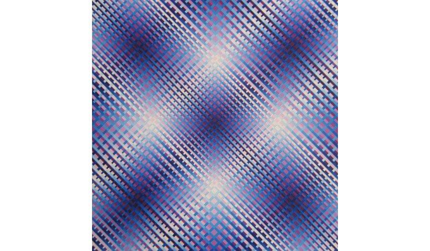 Susie Rosmarin - 403 Blue-Violet, 2008. Acrylic on canvas. © Susie Rosmarin
Gradient Parallels
It sounds simple, but sometimes just by placing lines next to each other optical effects can be created. The effects occur when the hues of the lines change. As Hans Hofmann explained in his push pull theory, warm colors placed next to cool colors create perspective, or the illusion of depth, as the warm colors cause the cool colors to appear to recede into the background. Yaacov Agam demonstrated this phenomenon in his 1979 masterpiece titled Mirror, in which he used only vertical lines and the push pull theory to create a magnificent illusion of geometric forms floating in dimensional space.
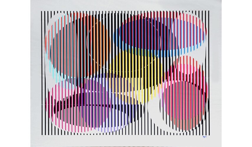 Yaacov Agam - Mirror, 1979. Silkscreen on mirror. © Yaacov Agam
The Vortex
Also known as a whirlpool, spiral, or cyclone, the vortex is a common, yet mystifying Op Art pattern. To achieve this strange effect, round or elliptical shapes of decreasing size are nested within each other. Each ellipse has two wide sides and two tapered sides, and each successive ellipse is rotated slightly in one direction. The vortex was demonstrated perfectly by Francis Celentano in 1867 when he created his Elliptical Kinetic Painting, a series of ellipses nested exactly as just described then attached to a spinning motor.
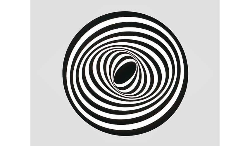 Francis Celentano - Elliptical Kinetic Painting, 1967. Acrylic on masonite with motor. Collection of Albright-Knox Gallery, Buffalo, NY, © Francis Celentano
Visible Waves
There are several ways to create the illusion of waves on a two-dimensional plane. One way is to use convex distortion, as discussed earlier. Another way is to simply paint a series of curved lines in such a way that they look like a wave. John Aslanidis has developed a third way. By layering concentric circles of different hues, waves appear as the circles increase in size and overlap. He calls the compositions he makes using this trick Sound Spheres, and describes them as, “a rhythmic oscillation between different colors that gives visual form to the pulse of a beat.”
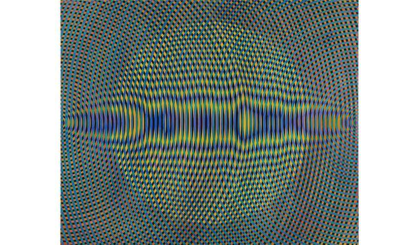 John Aslanidis - Sonic No-49, 2015. Oil and acrylic on canvas. 137 × 167 cm. © John Aslanidis
Featured image: Victor Vasarely - Riu-Kiu-C (detail), 1960. © 2020 Artists Rights Society (ARS), New York / ADAGP, Paris
All images used for illustrative purposes only
By Phillip Barcio
