Carmen Herrera: Lines of Sight
Sep 15, 2016
Cosmologists say that when we look into outer space we look back in time. The galaxies we see through telescopes may not even exist any more. But does that matter to the light? It is here now to help us see. Why complicate matters? Carmen Herrera is someone who believes in simplicity. As an artist she has much in common with cosmic light. She began painting in the 1930s, but did not sell her first work of art until age 89, despite being connected to some of the most famous and influential artists of the 20th Century. Now at age 101, she is enjoying her first museum retrospective, at the Whitney Museum in New York. Titled Lines of Sight, the exhibition includes works spanning the early period of her career, from 1948 to 1978. Alongside the works a narrative explores the possible reasons why Herrera has spent most of her career working in near total anonymity. She was a Cuban-born woman in the ideological, prejudiced, white male dominated art world of the past. But while some elements of that narrative are undeniable, the story takes power away from a confident, talented artist. A simpler explanation is that Carmen Herrera simply chose her own time, which is now. We choose to simply allow her light to illuminate us, no matter how long it traveled to get here or what stood in its way.
Surface Interpretations
The most striking observation apparent when touring Lines of Sight is the transformation that is evident in the work over the course of the exhibition. The works are arranged in roughly chronological order, allowing viewers to consider the formal and conceptual evolution Herrera experienced over the years. From a material perspective, we see that Herrera started out painting on rough-hewn burlap. It takes a great deal of paint to cover the wide holes in a burlap surface. In addition to their abstract qualities, paintings such as A City, painted in 1948, and Siete, painted in 1949, possess a raw, emotive, painterly quality due to the physicality and materiality of their surfaces.
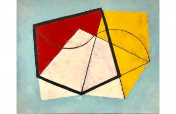
Also evident in these early paintings is the way Herrera utilized the canvas compared to how she worked later in her career. Paintings such as Field of Combat contain a relative multitude of forms and colors compared to her later works. And several of her works from the late 1940s and early 1950s play with notions of optical illusion and symbolism, relying on complex visual patterns and systems. In all of these early paintings there is a sense that Herrera sees the canvas as the support for an image, and that the concerns with which she is working are all contained right there on the surface of the work.
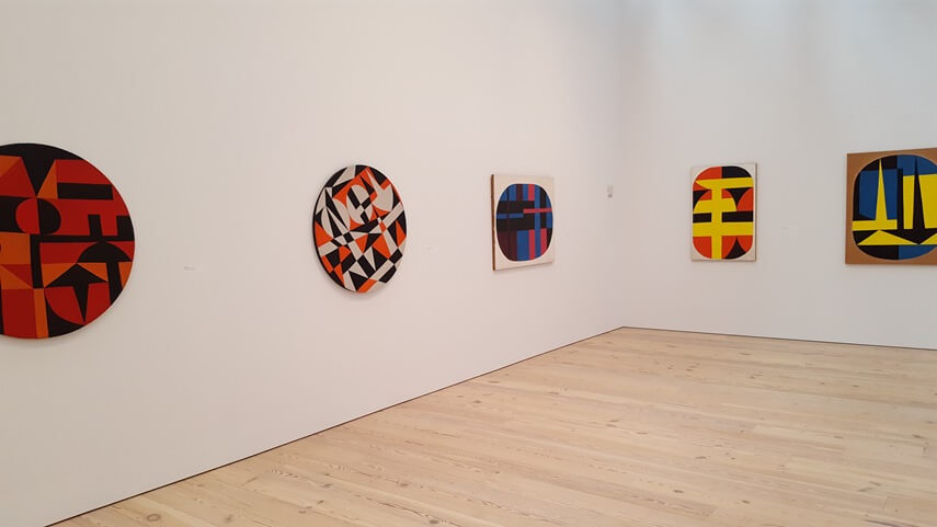
Carmen Herrera - Paris, 1948 - 1954. View of the exhibition
An Expanded Arena
During a sojourn in Paris, Herrera developed the perspective that she had too many things happening in her paintings. She became interested in simplifying her work. She began limiting her palette to just one or two colors, and she dramatically reduced her vocabulary of forms. This transformation is beautifully presented as the centerpiece of Lines of Sight, through a selection of works from a series Herrera made in the 1950s referred to as Blanco y Verde. These works all utilize the colors green and white, as well as relying on forms so sparse they often seem more like lines.
Along with the goal Herrera set for herself to simplify her palette and her language of forms, she also changed the way she viewed the essence of paintings as objects. She began seeing her canvases less as surfaces on which to paint, and more like objects inhabiting space. She began continuing her painted forms beyond the front of the canvas and onto the sides and created compositions that projected beyond the limits of the canvas, into space.
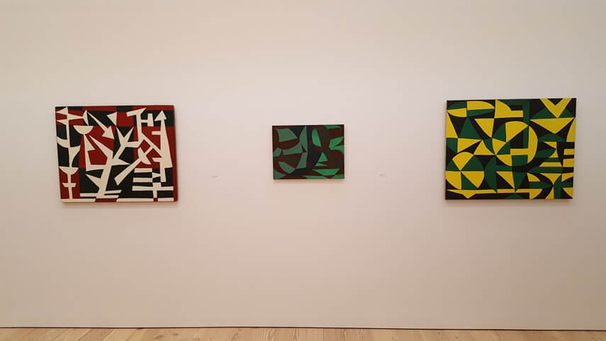
Carmen Herrera - Field of Combat, 1952; Green Garden, 1950; Untitled, 1947-48 (Left to Right)
Myths of Creation
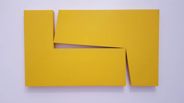
Expanding her view of paintings as objects, Herrera also began working in three-dimensional space, creating objects that sit directly on the floor or that are sculptural in their presence but hang on the wall. Through such works Herrera allows viewers to fully inhabit her aesthetic propositions. The opportunity to carefully and fully consider these forms and the way they occupy their surroundings offers an expanded contemplative understanding of the rest of the works in the show.
From one particular perspective in the exhibition, that contemplative layer opens up beautifully, as we see Herrera exploring the same spatial conversation across a range of works on display: a painting in the Blanco y Verde series, a monochromatic red sculptural object supported by the floor, and a monochromatic yellow sculptural object hanging on the wall. Something both simple and profound is communicated here. These objects can be defined according to their differences, which are obvious. But with a shift in perception we can appreciate them far more for their similarities, and thus absorb ourselves in a celebration of their common essence.
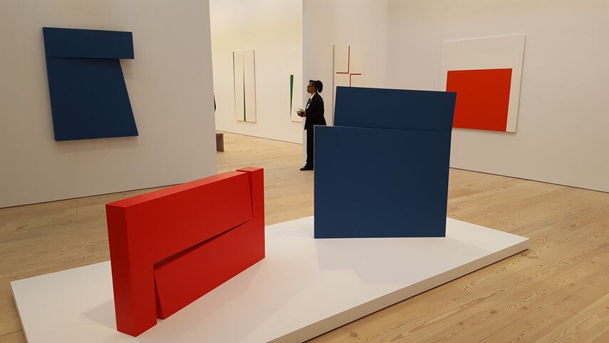
Carmen Herrera - 1962-1978 - Exhibition view
Master One Thing
Herrera has proven that the most important notions can be expressed in the simplest terms. Through her art she expresses simple, direct propositions. Her oeuvre communicates something like a Zen riddle: that if you try to focus on everything you will end up understanding nothing, but if you master one thing you can understand everything.
What is perhaps most telling about Herrera as an artist and as a human being is that throughout Lines of Sight, a sense of continuity exists. Each work on display possesses its own sense of itself, but the larger body of work holds sway over individual considerations. This is an exhibition about relationships, and about how we see the parts compared to the whole. It reveals how easy it is to focus on the inconsequential and the petty, which do nothing but complicate our lives. It invites us to abandon ideology and prejudice, and to quiet our minds and simply look.
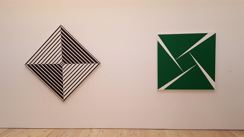
Carmen Herrera - Black and White, 1952 - Green and White, 1956 (Left to Right)
Featured Image: Carmen Herrera - Lines of Sight, Exhibition View (Credit: IdeelArt)
By Phillip Barcio
Featured Artists
Tom McGlynn
1958
(USA)American
Jessica Snow
1964
(USA)American
Daniel Göttin
1959
(Switzerland)Swiss
Holly Miller
1958
(USA)American
