The Psychology of Colors - Why Certain Colors Appeal?
Colour is able to influence our state of well-being, how we feel and how we enjoy life. Although much of the appreciation and perception of colours may of course be dependent on personal experiences, in general there is firm anecdotal evidence that shows certain colours evoke stronger feelings and moods than others, impacting behaviour, emotions and more.
Despite criticism, colour theory has been lauded by many for centuries and it is a science that is finally beginning to be taken seriously. Colour psychology works on a subconscious level; colour is the first criteria many people use when shopping for art, even if they are unaware of it.
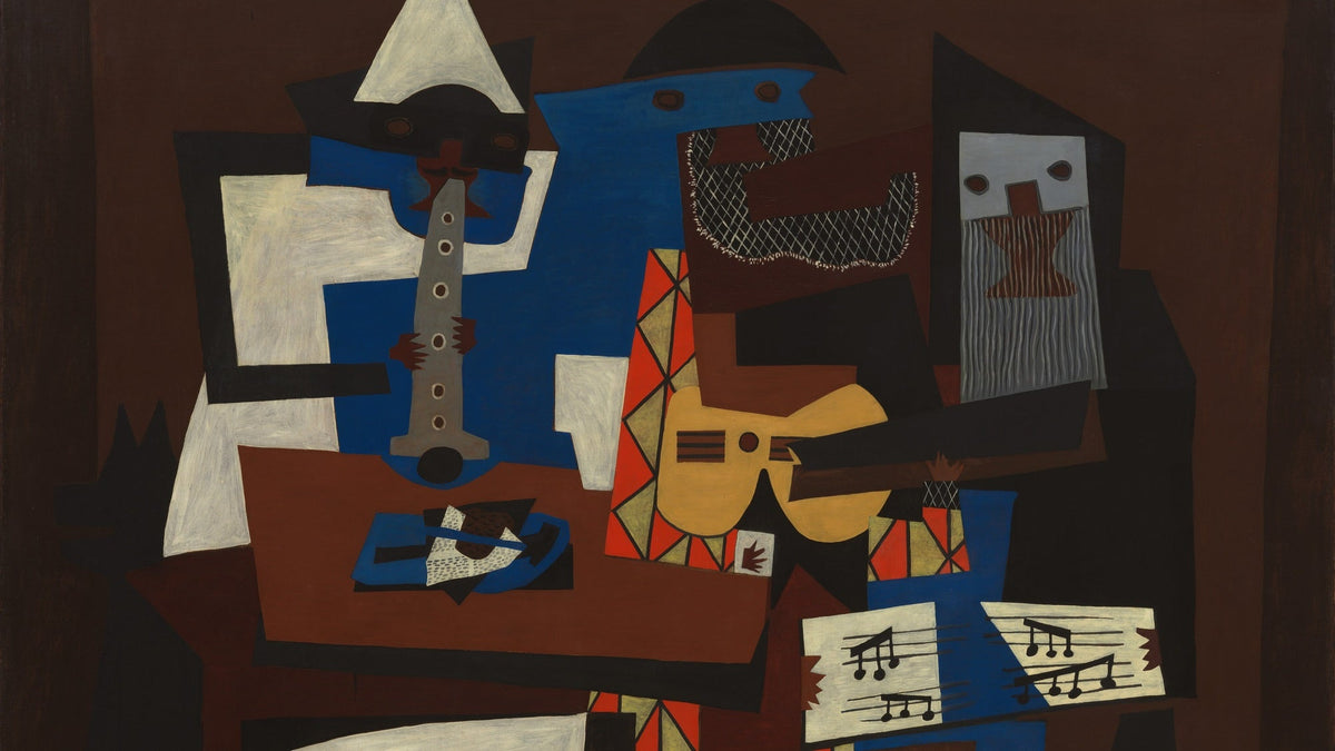
“Colours, like features, follow the changes of the emotions” - Pablo Picasso
Colour theory in history
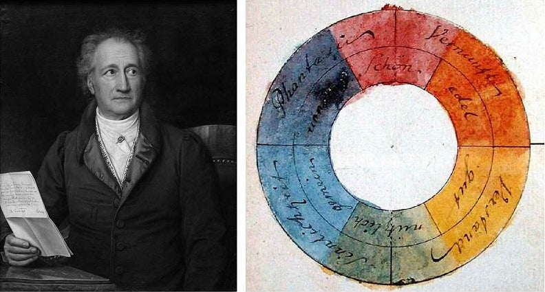
The German poet, artist and politician Johann Wolfgang von Goethe was one of the first to formally explore colour psychology in his book ‘Theory of colours’ published in 1810. Although his musings were dismissed by the majority of the scientific community, many of the brightest minds in the arts community took a passionate interest.
Although now, many years later, some of Goethe’s conclusions no longer hold their own, his work is held up as a delightful and insightful exploration into colours and what they can mean to an artist and an individual. His thoughts on the emotions communicated by colours allow the reader to begin to think about colour without restraint; exploring the connections and philosophical ideas surrounding why we are drawn to certain colours and the reasons an artist may choose a certain palette. Even 200 years later he manages to bridge the intuitive and the visceral, paving the way for many of the studies into colour psychology used today.
The psychology behind colour is used extensively, not just in art and interior design, but in business as well; used in advertising and brand marketing across the world. The debate on the link between colour and emotion is contested hotly by various scientists, yet taken very seriously by many artists and designers. Having said this, the body of scientific research into colour psychology is growing, and much of it points to one answer – that perception of colour really does affect our minds, and our bodies.
Perception – colour is in the eye of the beholder
Since colour is not tangible, it can realistically appear differently to each of us, dependant on how our own eyes interpret rays of light. Human eyes have three different colour receptors shaped like cones – each of these cones is designed to pick up different wavelengths of light; red, green and blue. This allows art to remain hugely personal, as it reveals itself to each of us in a unique way.
In addition, perception can also come into play based on past experiences. One person may have a negative reaction to a certain shade of green because it reminds them of something sad in their past. Cultural differences can also introduce alternate responses.
Generally though, certain colours are said to evoke specific feelings or meanings on a universal level. This can be as broad as the colour pink being associated with romance or white being thought of as pure.
Warm colours
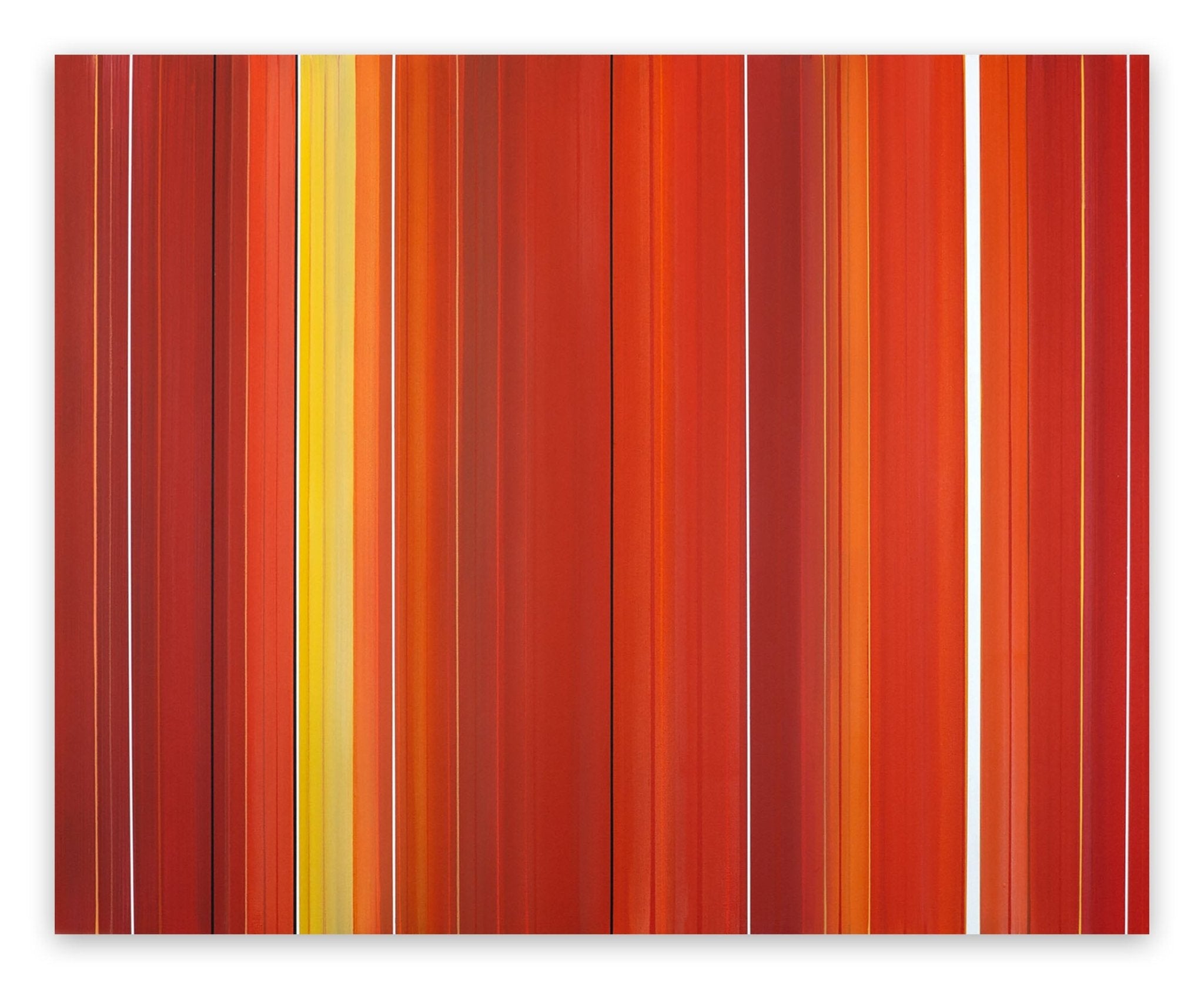
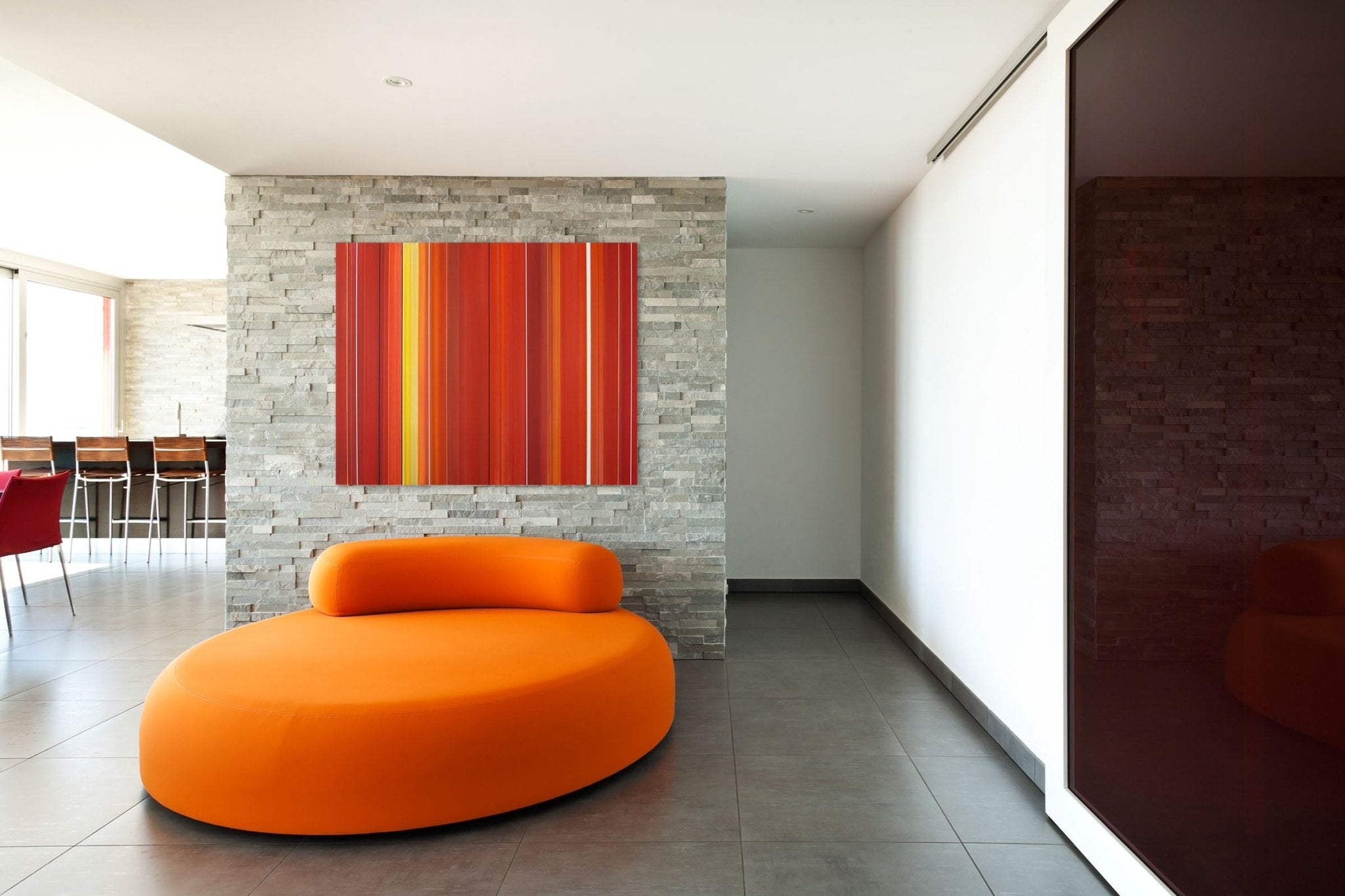
Warmer tones such as red, orange and yellow are usually described as being just that – they evoke feelings of comfort, but equally, fiery colours such as these can raise the blood pressure and evoke anger and hostility.
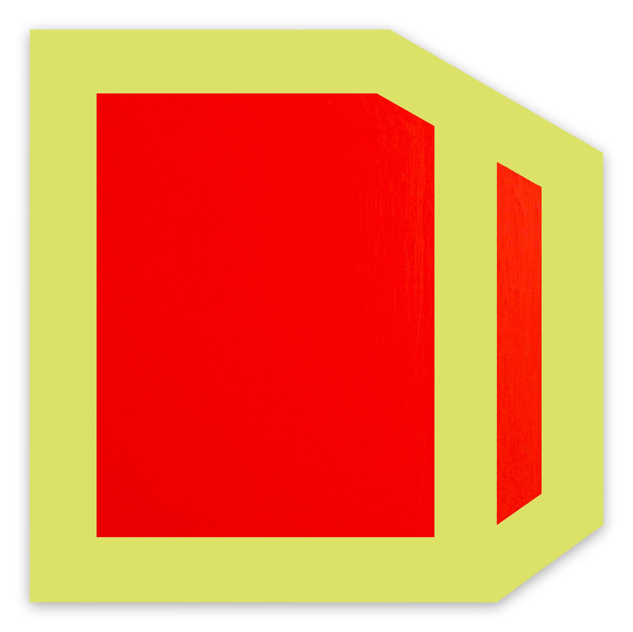
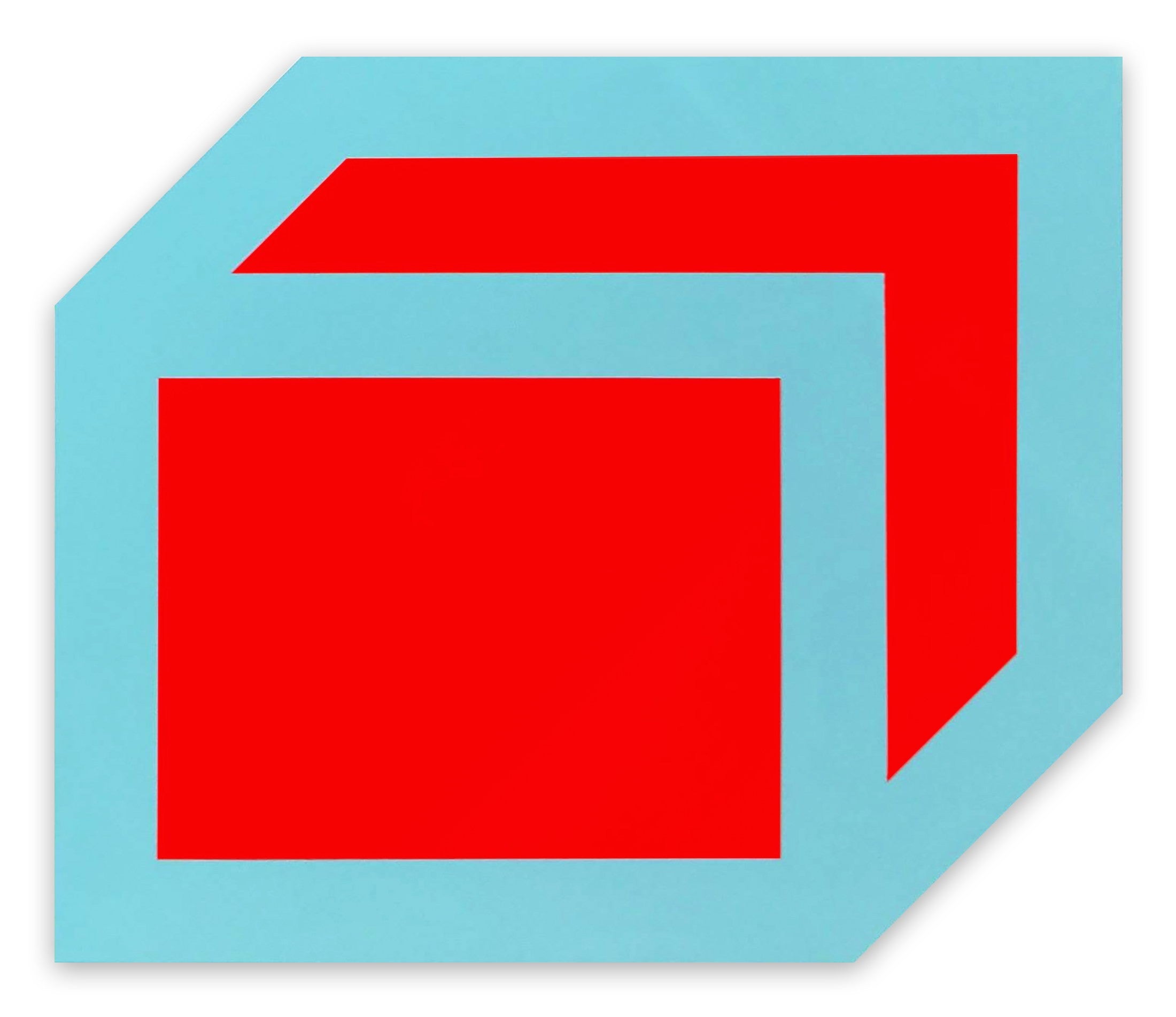
Red, notable for being lucky in Eastern cultures, is seen to be a significantly lucrative colour for artwork; when used in paintings these pieces fetch a far higher price than those without this particular hue. The importance of this colour is notable in the work by Piet Mondrian; his painting featuring red blocks of colour are firmly considered to be more desirable.
Thought of as a powerful colour, Goethe remarked on red as conveying an “impression of gravity and dignity, and at the same time of grace and attractiveness.”
Works in focus — Red

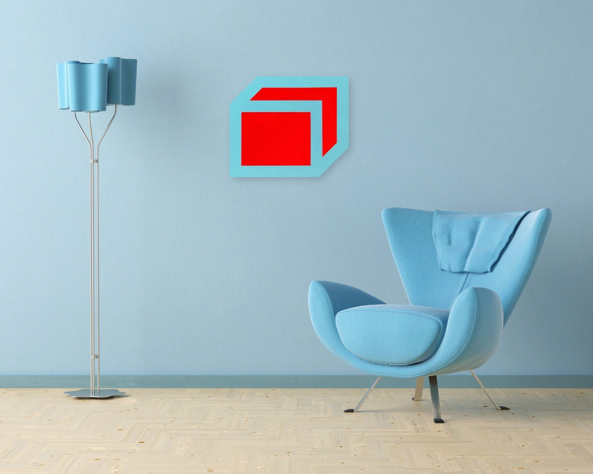
Untitled Red 2009 — Ulla Pedersen
Pedersen’s red resists naming; Raw and unmediated, it channels the visceral charge Goethe attributed to the colour: gravity and grace held in a single field.

Red Swash — Anne Russinof
A single gestural arc of red that confirms the colour’s dual nature: simultaneously seductive and destabilising, impossible to ignore.
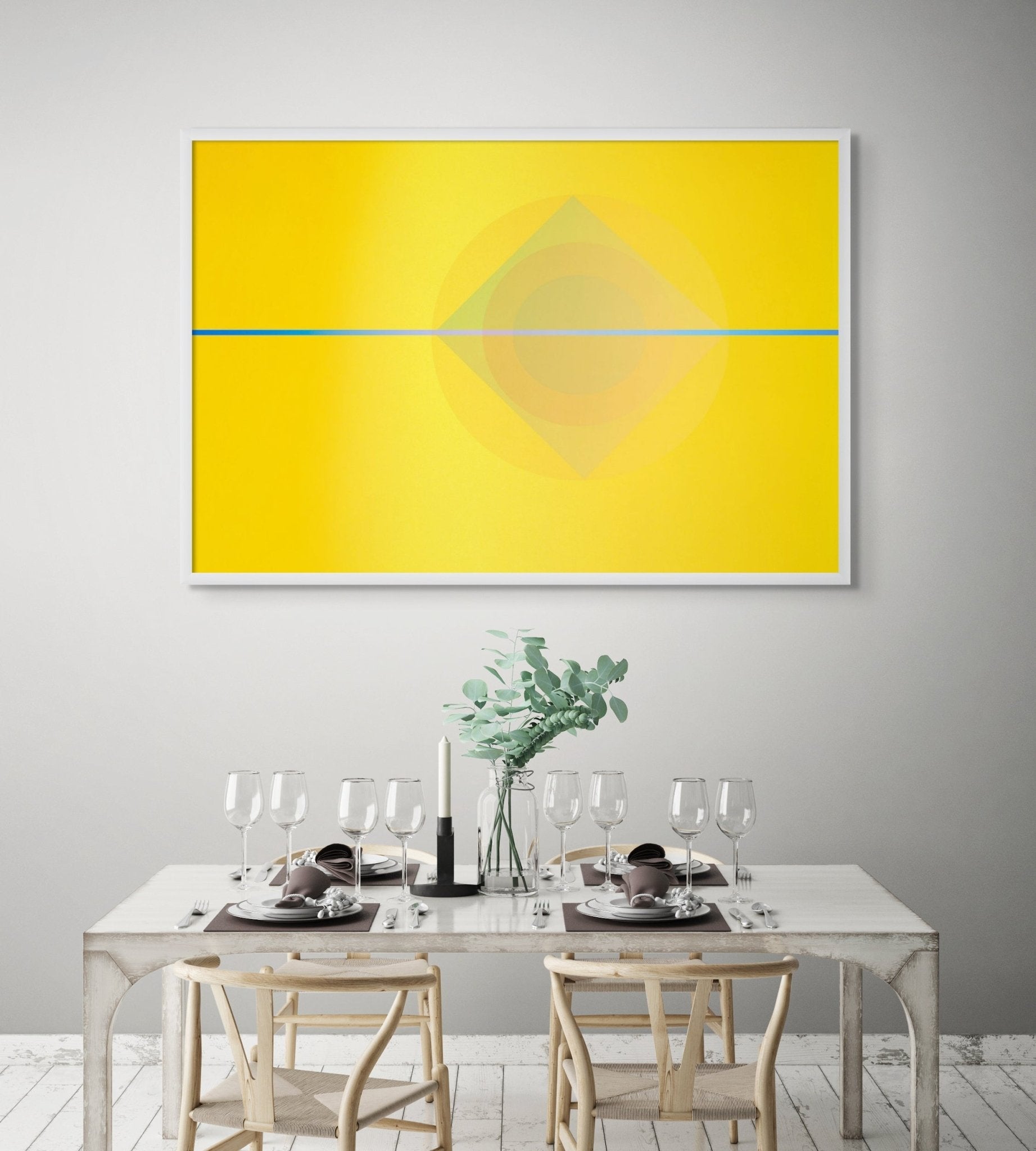
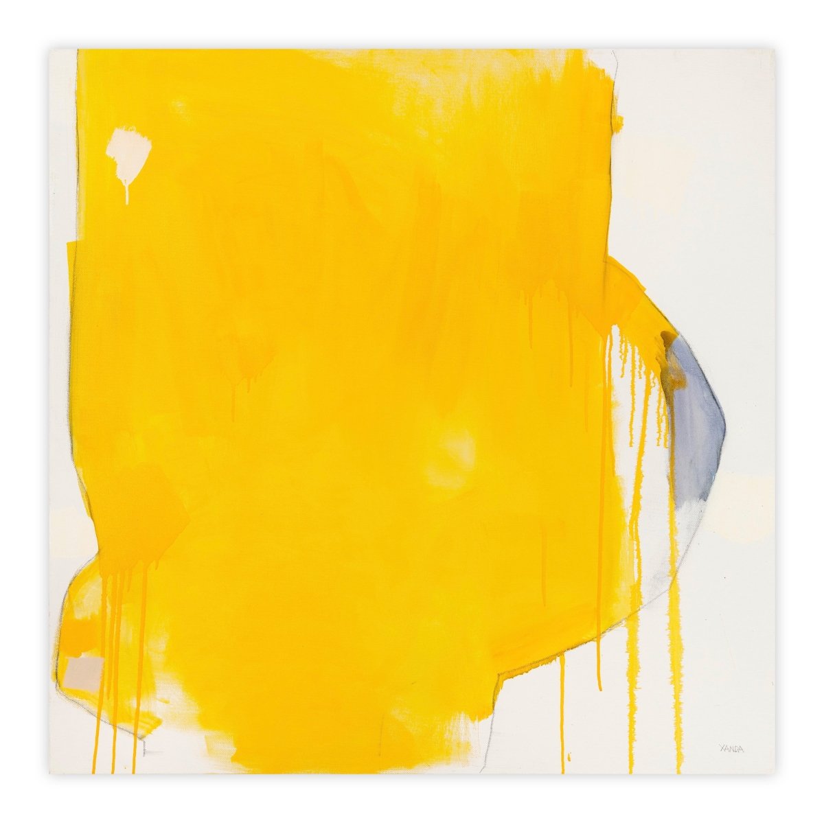
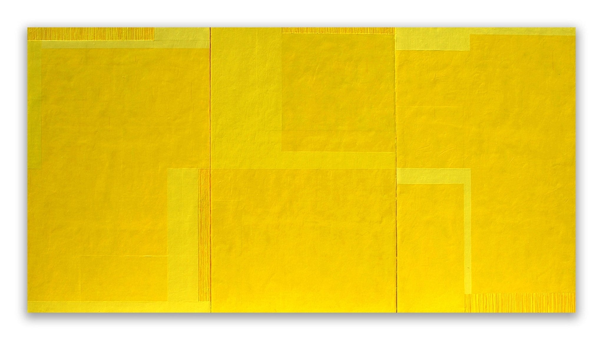
When discussing yellow it seems that the amount of green or other ‘contaminations’ can greatly affect how yellow is perceived. Goethe notes that the surface that yellow appears on can also affect how the colour is perceived; turning something sunny and cheerful, into a more negative and ‘foul’ effect.
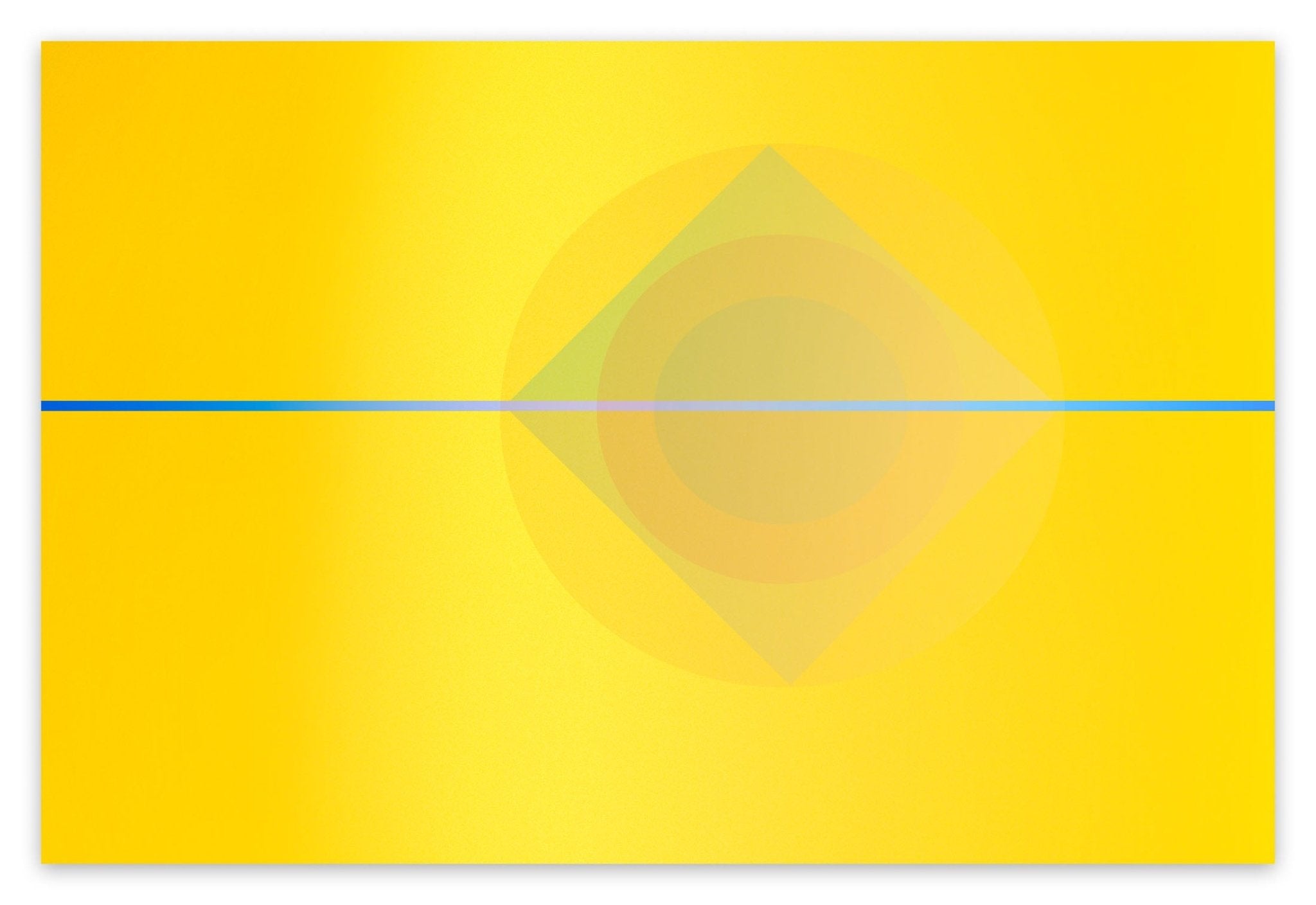
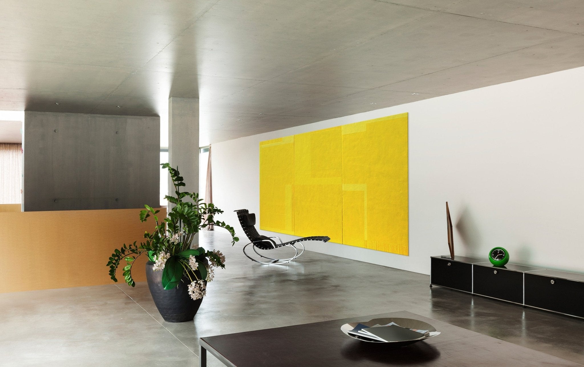
Works in focus — Yellow

Milbrook in Yellow - Robert Baribeau
Baribeau bathes a familiar landscape in yellow light, capturing the colour’s most essential quality: its ability to transform the ordinary into something luminous and charged.

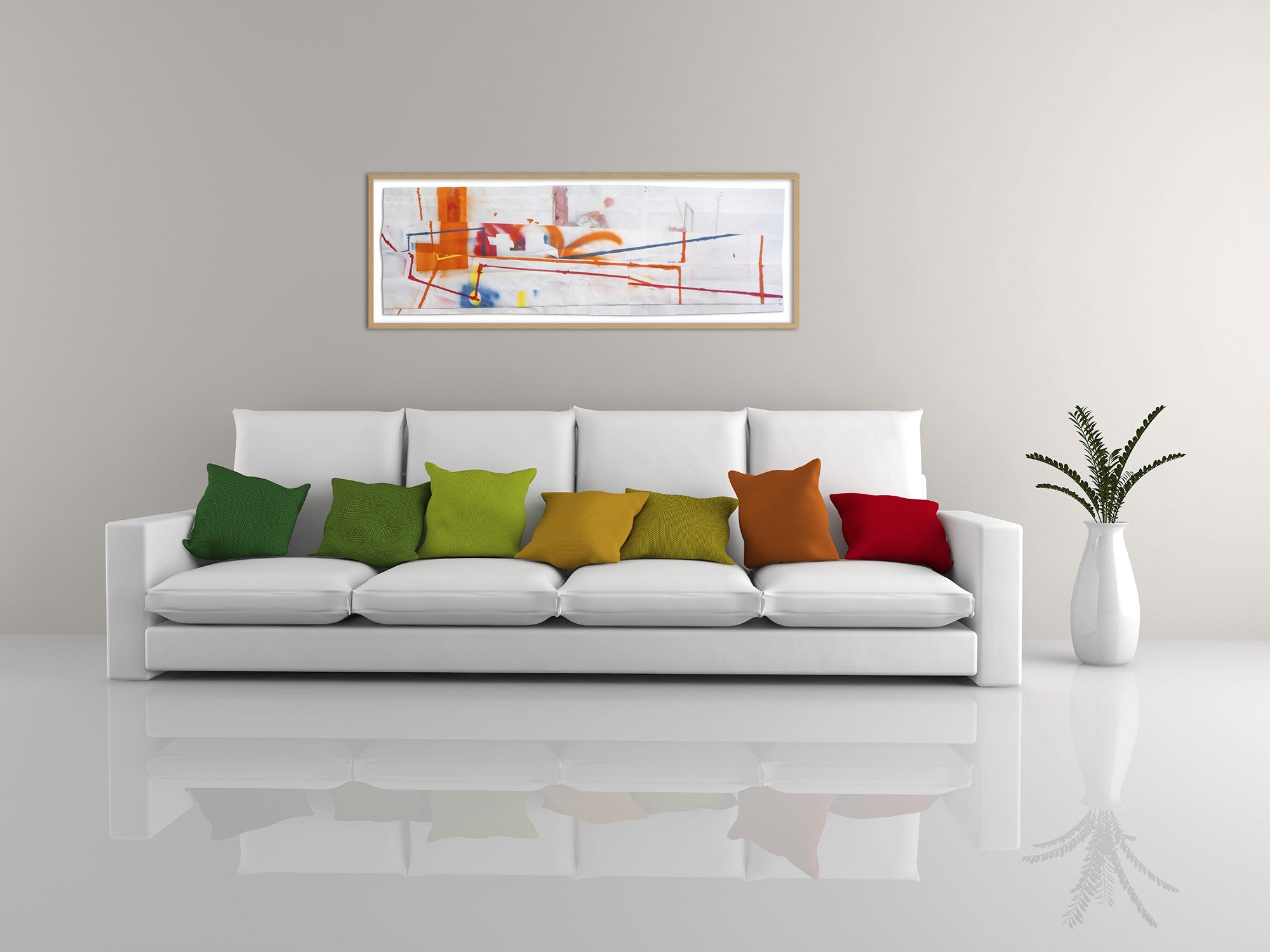
Color Kinesthesia 5B39 - Yellow - Anne Katrine Senstad
Senstad’s “kinæsthesia” series explores how colour physically moves through the body; Yellow here becomes a sensory event, not merely a hue.
Orange is associated with energy, perhaps due to the association of the fruit of the same name; this zesty colour can command attention and bring to mind vitality. It is also often synonymous with movement; orange autumn leaves signifying the changing of the season.
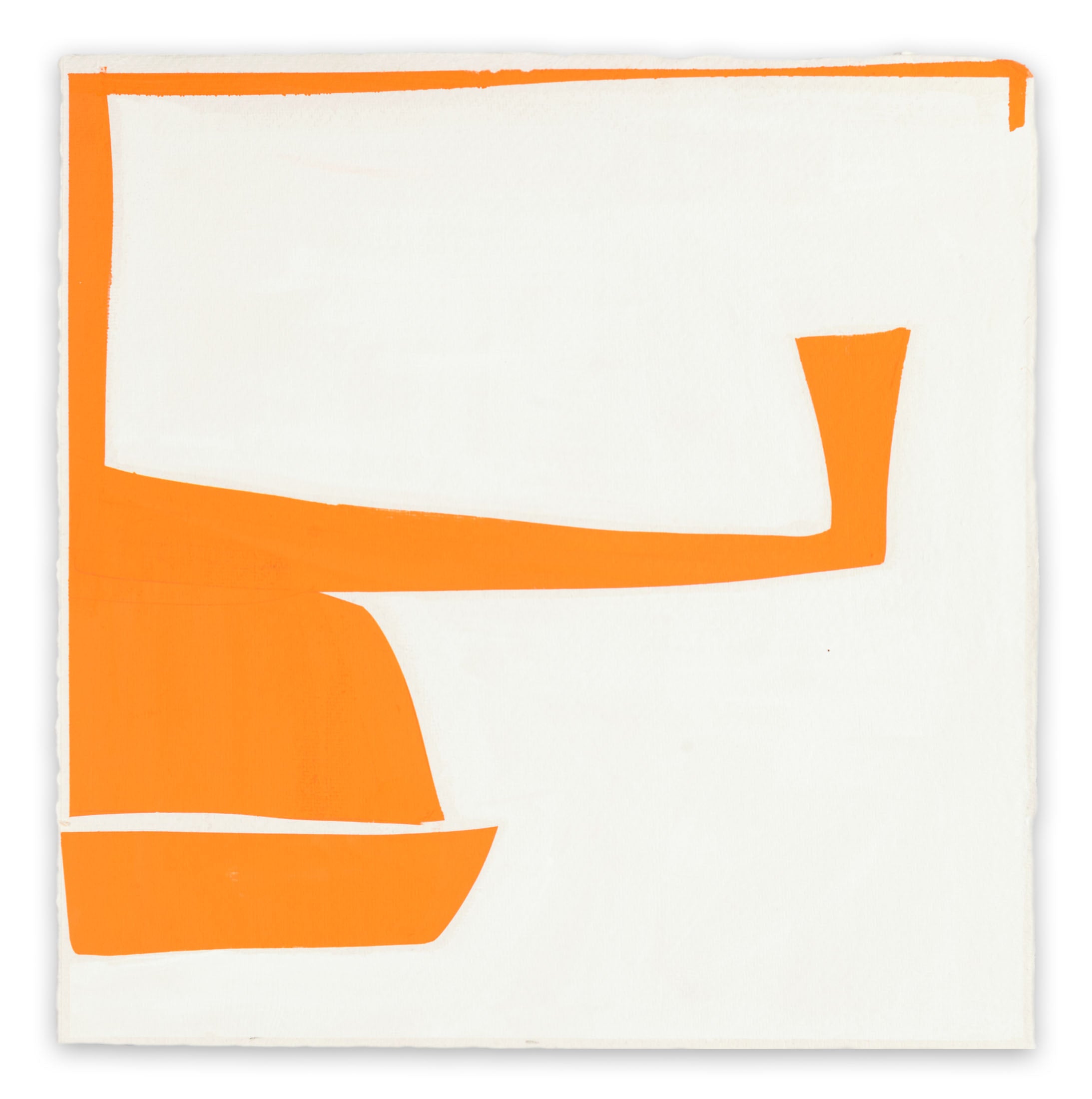
Works in focus — Orange

Orange Blossom Special - Matthew Langley
Langley’s orange radiates the seasonal vitality the colour has always promised: a burst of attention-commanding warmth that refuses stillness.
Cool colours
Cool colours on the blue side of the spectrum are generally thought to be calming. However, just like those colours in the warmer spectrum, these colours can also bring opposite emotions to mind such as sadness and indifference. It certainly is a delicate equilibrium which the artist must tread.
Green is often thought to signify new beginnings and growth; connected to nature as the chlorophyll colour of leaves and grass. This link to the natural world invokes feelings of balance and harmony. Similarly blue can have an equally calming affect; with an affinity to sky and water; floating and weightlessness can be brought to mind. It is important to note that the shade and intensity of blue can strongly affect its message; whilst light blue can be refreshing and friendly, dark blue can be strong and reliable.
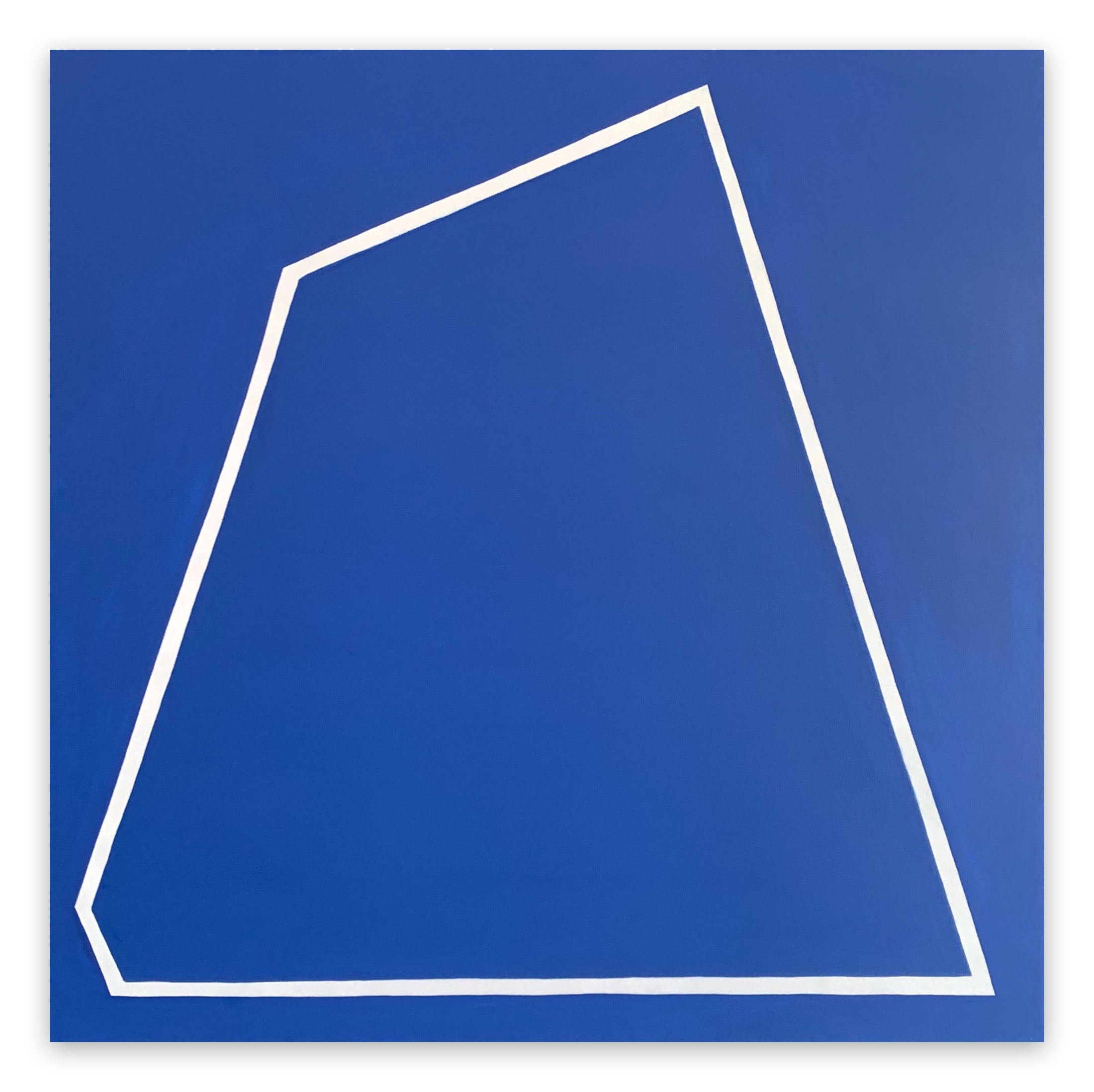
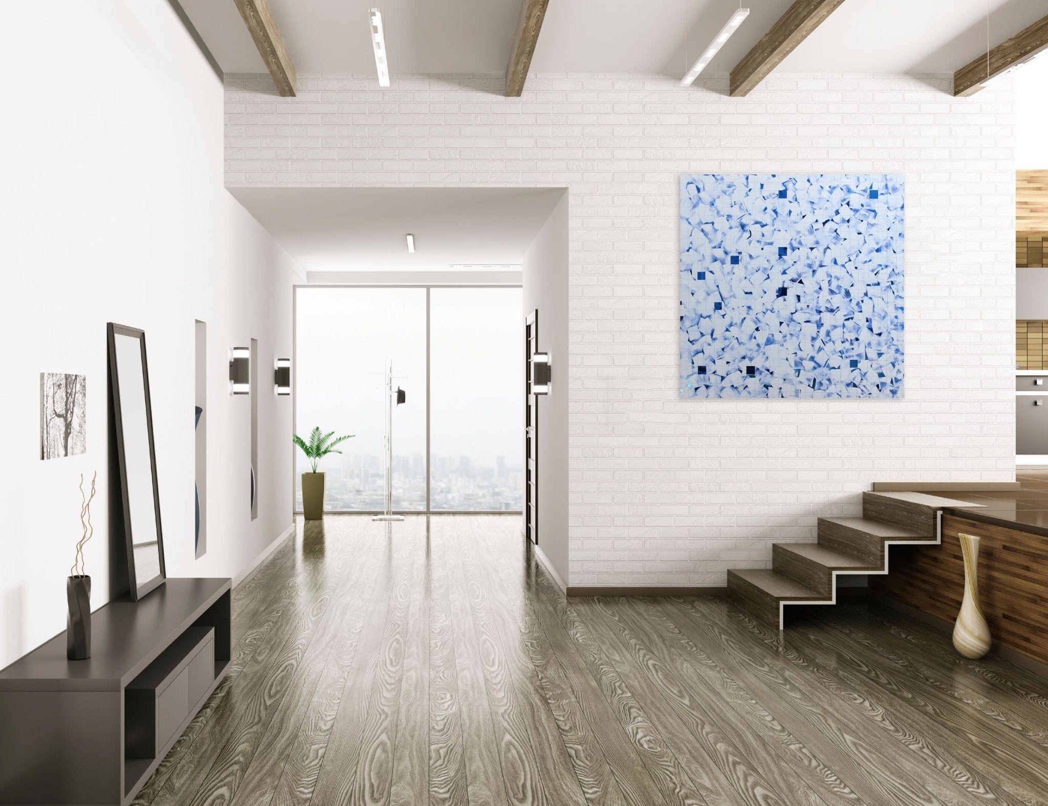
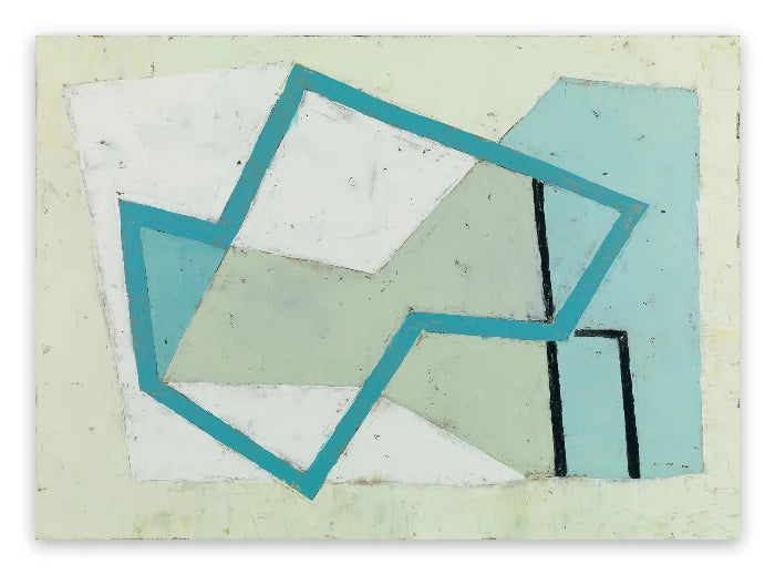
Works in focus — Blue

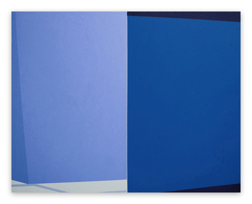
Blue Nesting - Louise Blyton
Blyton’s layered blue fields embody the colour’s most intimate quality: shelter, depth, and the quiet weight of calm.

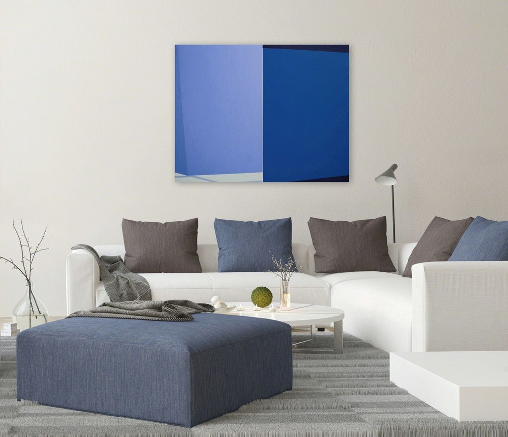
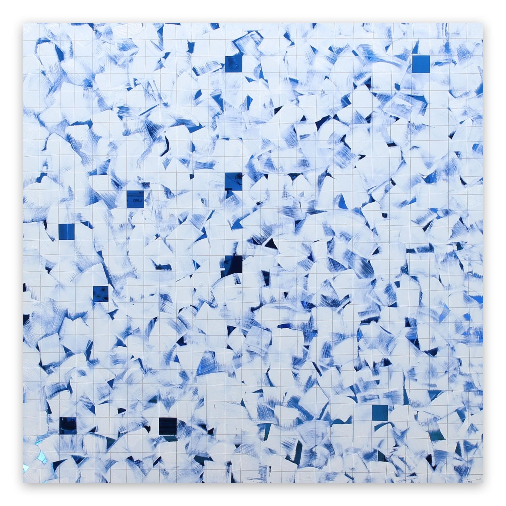
Blue Shift - Marcy Rosenblat
A shift in blue’s register - Rosenblat maps the tension between the colour’s soothing surface and its capacity for melancholy and introspection.
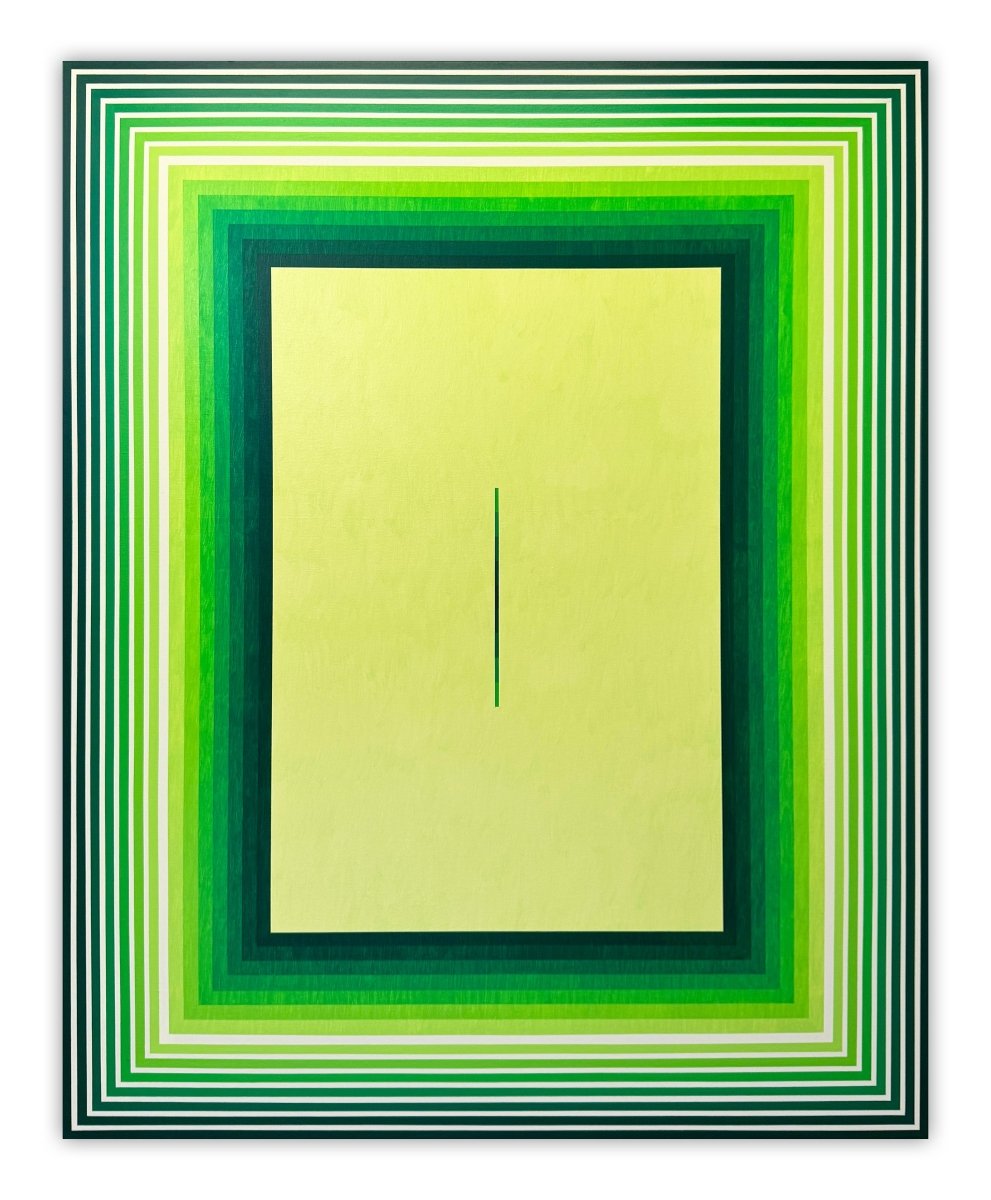
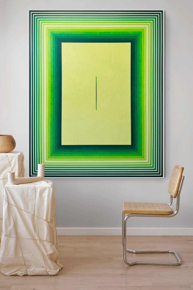
Works in focus — Green

Green Velvet - Nikolaos Schizas
The tactile quality of Schizas’s green - dense, organic, almost physical - speaks directly to the colour’s deep association with growth and natural harmony.

Equinox Green 03 - Emma Godebska
Named after the seasonal turning point, Godebska’s green carries the promise of renewal: balance between light and dark, growth and rest.
Colour psychology works across borders, no matter what the style of artwork being produced. Grahame Ménage is a muralist specialising in trompe l’œil and feels the power of colour theory cannot be ignored: “I carefully design murals adopting the effective use of colour psychology to create a sense of well-being. To this effect, I have just completed a series of tone on tone murals in New Orleans using a palette of smokey grey, greens and greys.
“Colour is a powerful communication tool: a poor choice and your painting fails because the message is wrong or misunderstood.”
The relevance of lighting
Lighting can play an important role in how we perceive colour. The use of electric lighting can subtly - and in some cases dramatically - change a colour when compared with natural daylight. This in turn can affect how the viewer feels when faced with the colours within the artwork.
Colours may also be affected by the time of day too, with natural light changing throughout the day, as well as the direction of the light affecting the spectrum. Obviously sunlight as the purest light will provide the purest colour from the spectrum standpoint, but the tones it lends will change throughout the day.
Exploring reason
Despite some headway into scientific explorations on colour, there is still much to be discovered to explain exactly why a certain colour appeals to each of us, and why some colours can evoke such strong reactions when compared to other hues. However what is clear is that art still remains very much subjective and personal, with colours speaking to the individual based not only on science and natural associations, but also individual perspective.
Francis Berthomier
Featured image: Goethe’s colour wheel (Creative Commons)