Article: The Power of Blue: From Historical Masters to Contemporary Abstract Art
The Power of Blue: From Historical Masters to Contemporary Abstract Art
When you see the color blue, what do you feel? Would you describe it as something different than what you feel when you hear the word blue, or read the word blue on a page? Is the information communicated by a hue different than the information communicated by its name? Whatever you feel, is it possible that feeling is universal? Or does the color blue mean different things to different people? And what about animals? Do they associate color with emotion, or do they use their color receptors only for survival? These questions have mystified students of color for centuries, and in some ways we are no closer to answering them today than we were a hundred years ago. But a book recently published by Phaidon Press takes us a little farther toward an understanding of color, at least as it relates to art. Written by Stella Paul, a former curator at the Los Angeles County Museum of Art and former program director at the Metropolitan Museum of Art in New York, Chromaphilia: The Story of Color in Art highlights 240 individual artworks. Not only does her exhaustive exploration of color shine new light on the innumerable ways ten distinct color categories have been used by artists throughout history, it also explores the range of ways color intersects with science, emotion, aesthetics and other areas of human culture. Today we would like to take a deeper look at the work of a few of the artists Paul mentions in the book to illustrate the range and power of the color blue: Helen Frankenthaler, Pablo Picasso and Yves Klein and see how their legacy continues in contemporary abstract art.

Seeing Color: The Subjectivity of Sight
One of the odd things about color is how often two people can look at the same object at the same time in the same place and still claim the object they are looking at is a different color. We wonder, “How can that be? Is color not objective?” But the short answer is no. Color is often subjective. The reason has something to do with the science behind how humans see color. Humans (and most other animals that see color) are trichromats. That means the receptors in human eyes perceive three basic wavelengths that correspond to color. You may have heard of the RGB color model used by some printers. The initials RGB stand for Red, Green and Blue. That is the color model that most closely corresponds to human vision. Obviously, red, green and blue are not the only colors human eyes can perceive. In fact, most humans can perceive as many as seven million distinct hues. But each of those different hues is interpreted in the brain after the eyes first perceive it as some combination of red, green and blue.
Additionally, the color we perceive an object to be does not only have to do with the object itself. Yes, we could analyze the material an object is made of and arrive at some understanding of what color that material is likely to be based on its chemical makeup. But the chemical makeup of a substance is not the only factor that goes into what color we perceive it to be. The reason humans are able to perceive color at all is because of light. And light can also be colored, in which case it can alter the color our eyes see when they look at a surface. Furthermore, one set of eyes can also be more sensitive, or just differently sensitive, to light than another set of eyes, thus causing the way two brains interpret color to also be different. Basically, the same thing that allows us to see color can also alter our perception of color. Therefore, to talk about color can sometimes indeed seem subjective, and to argue over what color something is can seem downright silly.
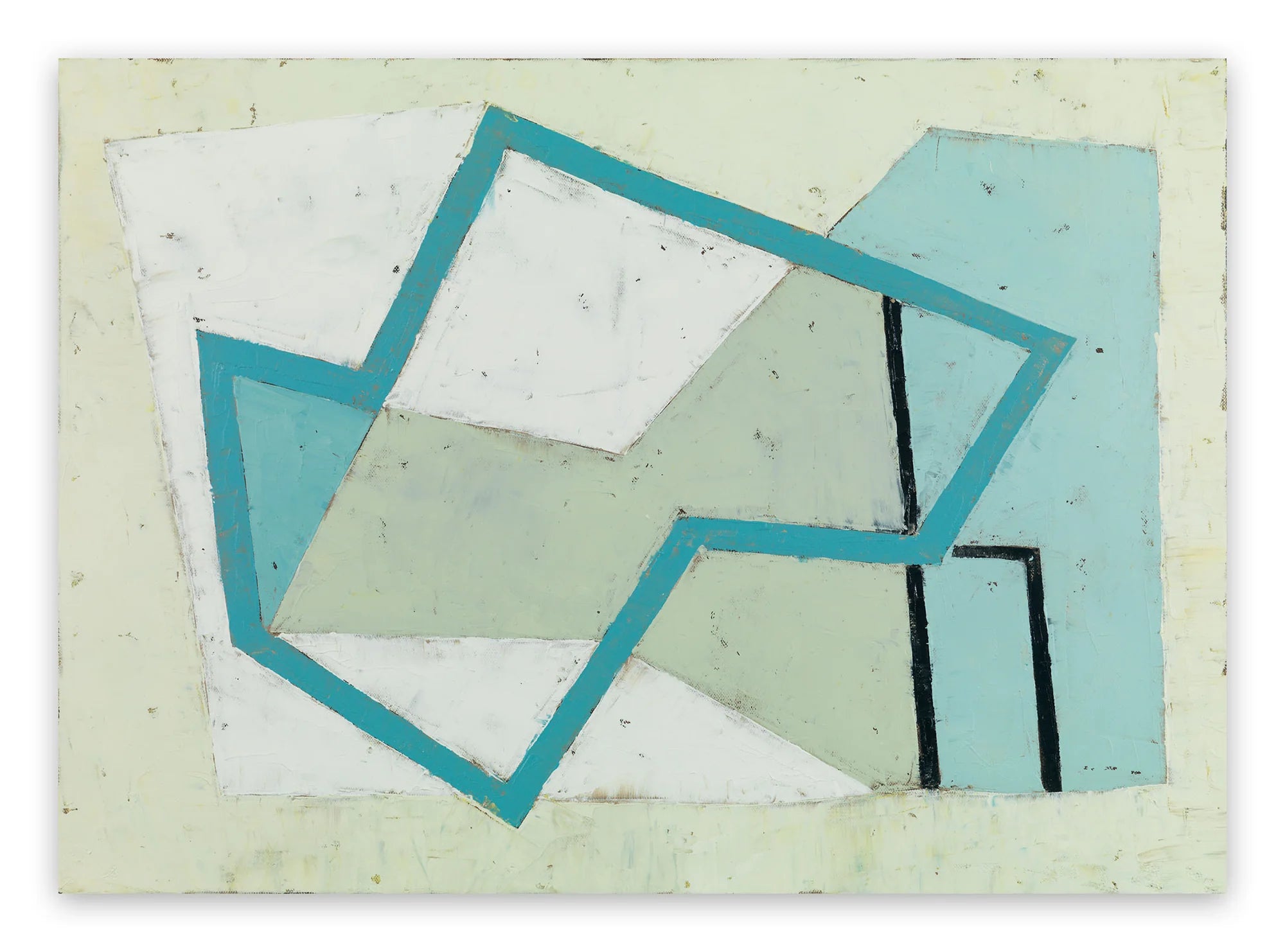
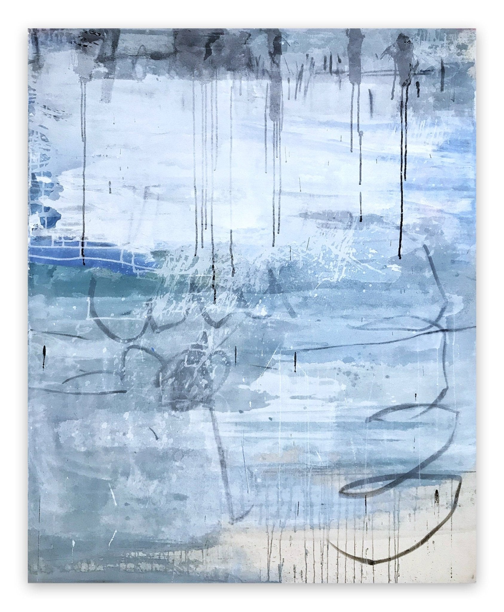
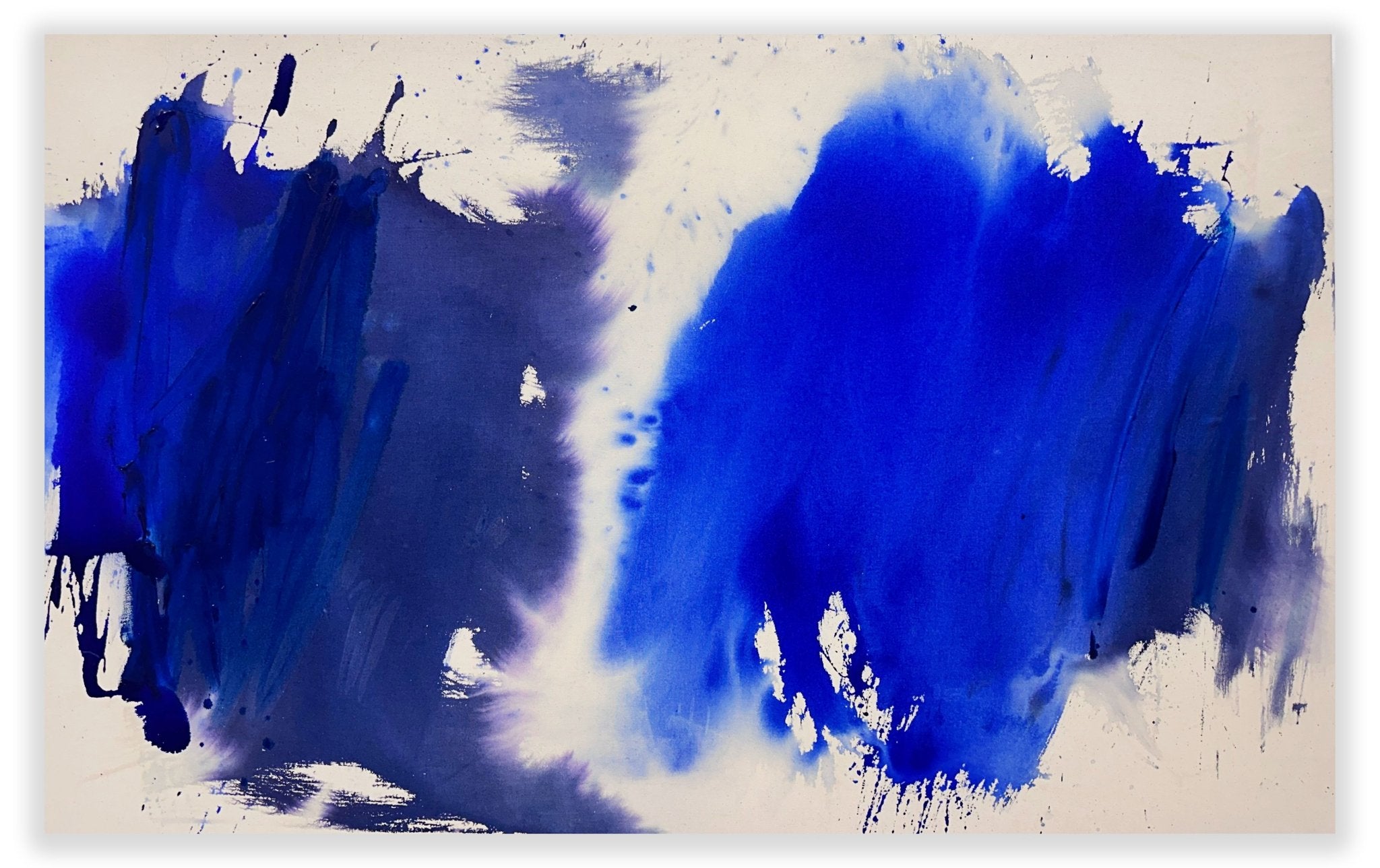
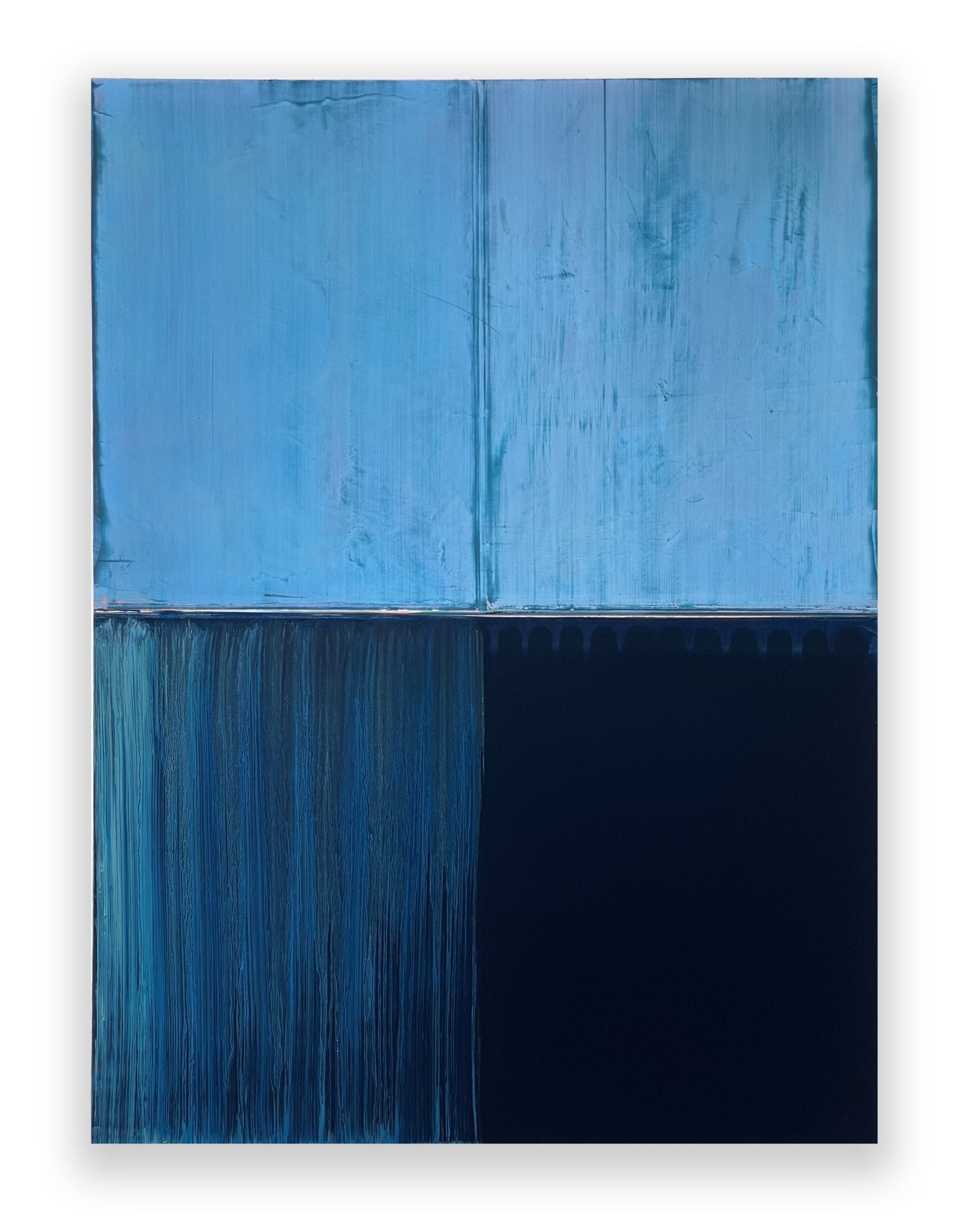
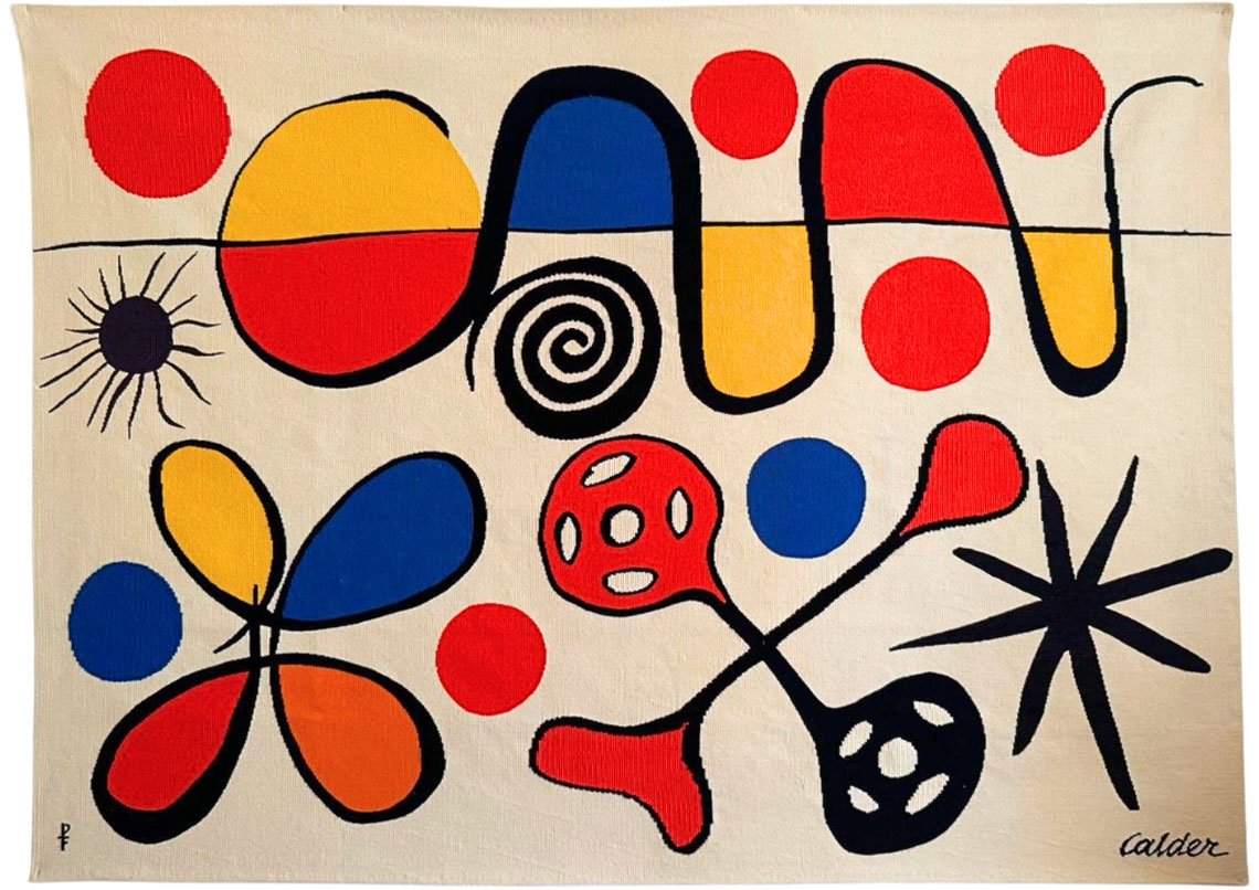
 Helen Frankenthaler - Moveable Blue - 1973
The Emotional Weight of Blue
Nonetheless, the variations different people see when they look at something that is a particular color do not usually vary so dramatically as, for example, one person seeing red and another person seeing blue. Normally, the variation is more subtle, such as one person seeing sky blue and another seeing aquamarine. But what can vary widely is the range of other things our brains perceive when we look at a particular color, beyond its physical properties. As the opening sentence of the chapter on the color blue in Chromaphilia: The Story of Color in Art observes, “There are many kinds of blue—all the same hue, yet with in-exhaustive permutations of appearance, effect, origin, and meaning.”
Appearance we have already covered. But the fun really starts when we consider “effect, origin, and meaning.” As for effect, one person may see the color blue and become calm. Another may become sad at the sight of something blue. So much of how we react to color has to do with our past experiences with the color. Origin is another fascinating consideration, since every variation of the color blue comes from some fundamentally different mix of elements. Variations in blue paint pigments could come from different combinations of binders and minerals. Variations in blue light could have to do with different particles in the air. And as for meaning, that is where things really become complicated. Every individual, every group and every culture develops its own idiosyncratic relationship with the color blue. Therefore, when using the color blue in a work of art there is literally no telling what kind of meaning is going to be perceived when the artwork is finally viewed. To explore just how wild the variations between the perception of blue can be in art, consider the work of the three artists mentioned in Chromaphilia: The Story of Color in Art: Yves Klein, Helen Frankenthaler and Picasso.
Pablo Picasso: Blue As Melancholy
Color was of paramount importance to Pablo Picasso, especially in the early phases of his career as an artist. Often his work from this time is classified according to color, as in his RosePeriod and his Blue Period. These classifications obviously have something to do with the predominant pigments he was using in his paintings at the time, but they also relate to the circumstances of his personal life, which allegedly affected the subject matter he chose to portray with these different hues. His Rose period, for example, spanned roughly from 1904 to 1906. It coincided with the beginning of his relationship with his lover Fernande Olivier, and his move to the Montmartre area of Paris. His work from the Rose period consisted of joyful images of things like harlequins and circuses. It was at the end of his Rose Period that Picasso painted his seminal work, the pink-hued Les Demoiselles d’Avignon, which is often cited as the predecessor to Cubism.
The Blue Period for Picasso preceded his Rose Period, spanning from roughly 1901 to 1904. It was a time in his life dominated by an awareness of depression and sadness. Picasso once stated, “I started painting in blue when I learned of Casagemas's death.” The remark refers to his dear friend Carlos Casagemas, who shot himself in the head at a cafe in Paris while Picasso was out of town. When Picasso returned to Paris, he lived and worked in the studio of Casagemas, where he embarked on painting nearly monochromatic compositions in blue. As Stella Paul points out in Chromaphilia: The Story of Color in Art, “The pervasive blue of The Old Guitarist is the material expression of something sad, disenfranchised, and marginal. A twilight mood of low spirits is cast over the subject's unnatural blue-tinted flesh, his garments, and the ambient encompassing space. The angular gestures and attenuated limbs and features of this downcast, blind musician reinforce impressions established by the insistent blue color.” But as we can see from these three examples, of Yves Klein, Helen Frankenthaler and Pablo Picasso, blue does not always communicate sadness, no more than it always refers to the sky or to the sea. The potential range of hues that we refer to when we say blue is seemingly endless. As well, the potential range of emotions, feelings, contexts and meanings we can coax from the color is equally vast.
 Pablo Picasso - Breakfast of a Blind Man, 1903, oil on canvas
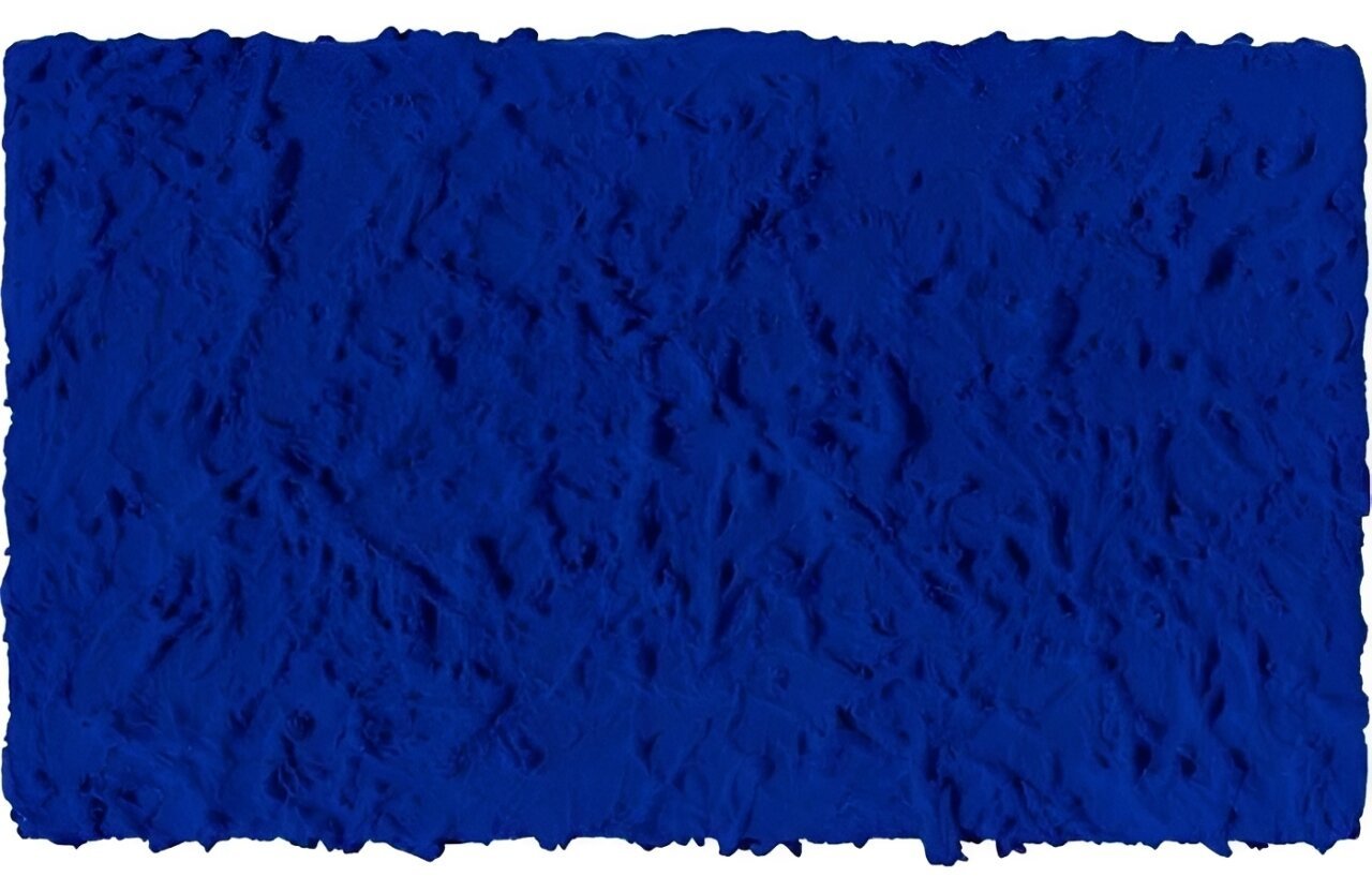
Yves Klein: Blue As The Infinite
When it comes to 20th Century art and the color blue, no artist jumps faster to most minds than Yves Klein. Legend has it that as a young man, Klein was hanging out on the beach with his friends, the artist Arman and the French composer Claude Pascal. The three divided the world between them. Arman chose the earth. Pascal chose written symbols. And Klein chose the sky, immediately then raising his hand up and signing his name in the air. From that moment color was important to Klein. One of his earliest exhibitions featured monochromatic canvases painted in various pure colors. Bu when the audience failed to understand what he was trying to express, he realized he would have to simplify, and use only one color to make his point. He thus embarked on a process of developing his own signature hue.
As Stella Paul explains in Chromaphiliaa: The Story of Color in Art: “[Klein] worked with Edouard Adam, a Parisian color vendor who consulted with chemists at Rhone-Poulenc, to create a synthetic binder...The result was Rhodopas M60A, which could be thinned to various levels of viscosity with ethanol and ethyl acetate. This binder preserves the magical luminescence of the pigment...Klein commissioned his own customized synthetic paint using this new binder, which he patented as IKB (International Klein Blue); from 1957 onward he used this pigment almost exclusively.” Klein used International Klein Blue to make his iconic monochromatic blue canvases and several monumental public installations. He also used it to create what became some of his most influential works: performance pieces in which nude models covered themselves in IKB then pressed their bodies in various configurations against canvases.
 Yves Klein - Anthropométrie de l' époque bleue, 1960, © Yves Klein Archives
Helen Frankenthaler: Blue as Lyrical memory
The abstract painter Helen Frankenthaler was another masterful, 20th Century proponent of the color blue. Frankenthaler was the inventor of a painting technique called soak-stain. The technique involves pouring paint directly onto the surface of unprimed, un-stretched canvas spread out on the floor then allowing the paint to soak into the fibers and spread across the surface of its own accord. Frankenthaler initially performed this technique with oil paints, but soon learned that oil paint quickly degrades raw canvas. She thus became an early proponent of acrylic paints, which do not have the same degrading effect on canvas. What acrylic paints do have, however, are vibrant, luminous qualities when it comes to hue. By pouring different pure hues directly onto her canvases, Frankenthaler could direct the flows of paint in ways that explored color relationships in new ways, without conceptual interference from elements such as line, shape, texture or form.
In Chromaphilia: The Story of Color in Art, Stella Paul pays particular attention to the painting Mountains and Sea, which Helen Frankenthaler painted in 1952. It is considered to be the first canvas Frankenthaler created using her soak-stain technique. Says Paul about the work: “Having returned to her New York studio from an interlude in Nova Scotia, Frankenthaler later recalled that she had internalized the Canadian landscape, which had become embedded not just in her mind but also in her shoulder and her wrist. With that backdrop of mind and body, she created a lyrical, pastoral abstraction to summon a memory of a place through color.” Frankenthaler conceptualized the process of pouring the paint as a way of translating something internalized within her body into something externalized on the canvas. The painting almost entirely utilizes hues of red, green and blue, the various hues of blue standing out most profoundly as an abstract, rather than figurative, manifestation of the sea.
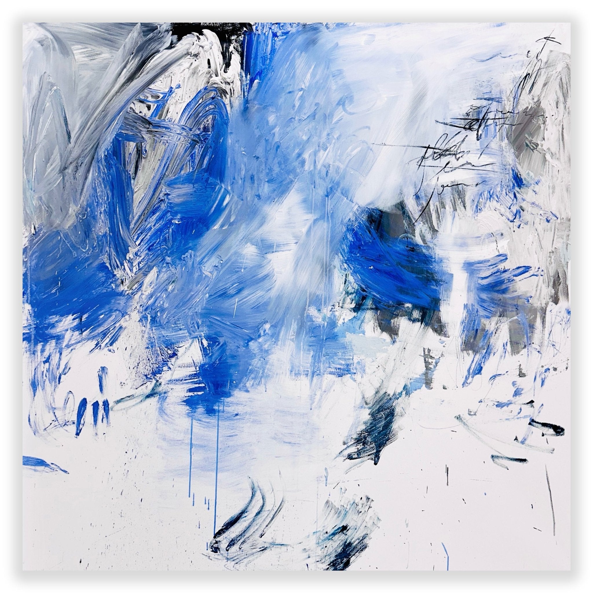
 Helen Frankenthaler - Blue Current (Harrison 134) - 1987
Collecting Blue Today: The Contemporary Masters
As we can see from these historical examples, blue does not always communicate sadness, no more than it always refers to the sky or to the sea. The potential range of hues that we refer to when we say blue is seemingly endless, and the potential range of emotions, contexts, and meanings we can coax from the color is equally vast.
To understand how the legacy of Klein’s conceptual blue and Frankenthaler’s physical immersion converged in contemporary art, one must look to the undisputed contemporary master of light, space, and sight: James Turrell.
In his famous, immersive Ganzfeld installations and architectural Skyspaces, Turrell strips away all physical matter, isolating pure, saturated, and highly specific wavelengths of blue light. By filling whole rooms with monochromatic light, he forces the viewer's eye to adjust to a dense, vibrating blue atmosphere where depth perception ceases to function. The light ceases to be transparent; it becomes a physical, tactile substance that completely fills the space. For Turrell, color is not a coat of paint on a surface, but a physical experience that dictates the limits of our biology. He demonstrates on a monumental scale that blue is a psychological destination—a portal that alters our relationship with the concept of infinity.

James Turell - Elliptic Ecliptic Skyspace - Venet Foundation
Today, the desire to bring this profound emotional resonance of blue into our daily lives drives many collectors to acquire contemporary abstract art. Browsing the extensive, curated collection of over 3,000 exclusive abstract artworks on IdeelArt, one can easily see how today’s leading contemporary painters continue the legacy of this powerful color through deeply intellectual and highly distinct stylistic approaches:
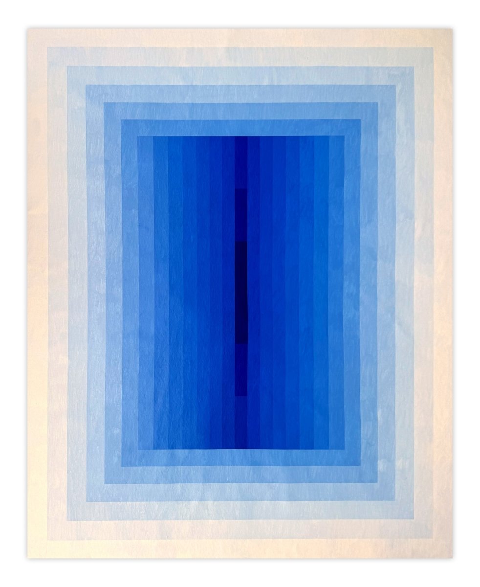
Hard-Edge Minimalism & Reductive Abstraction
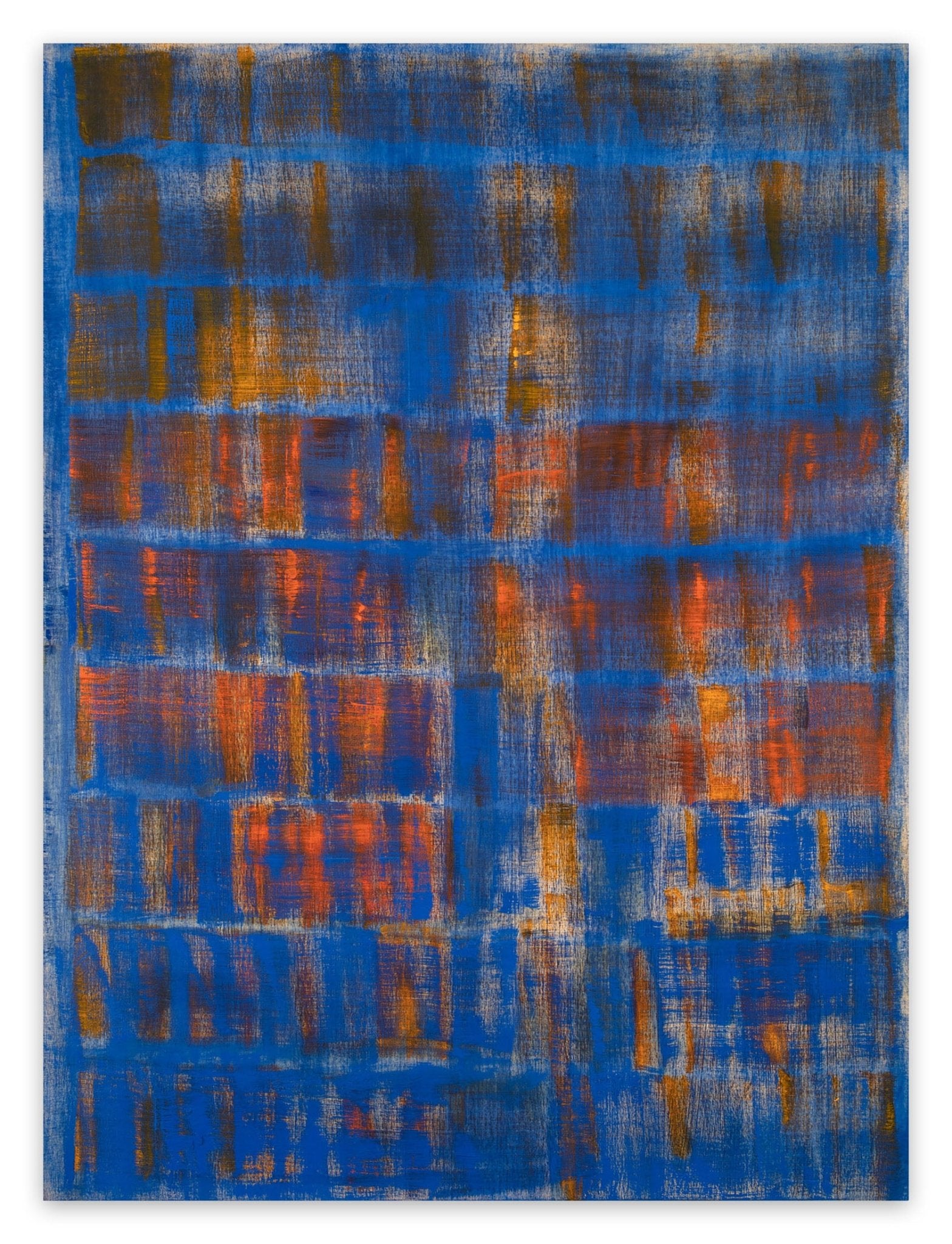
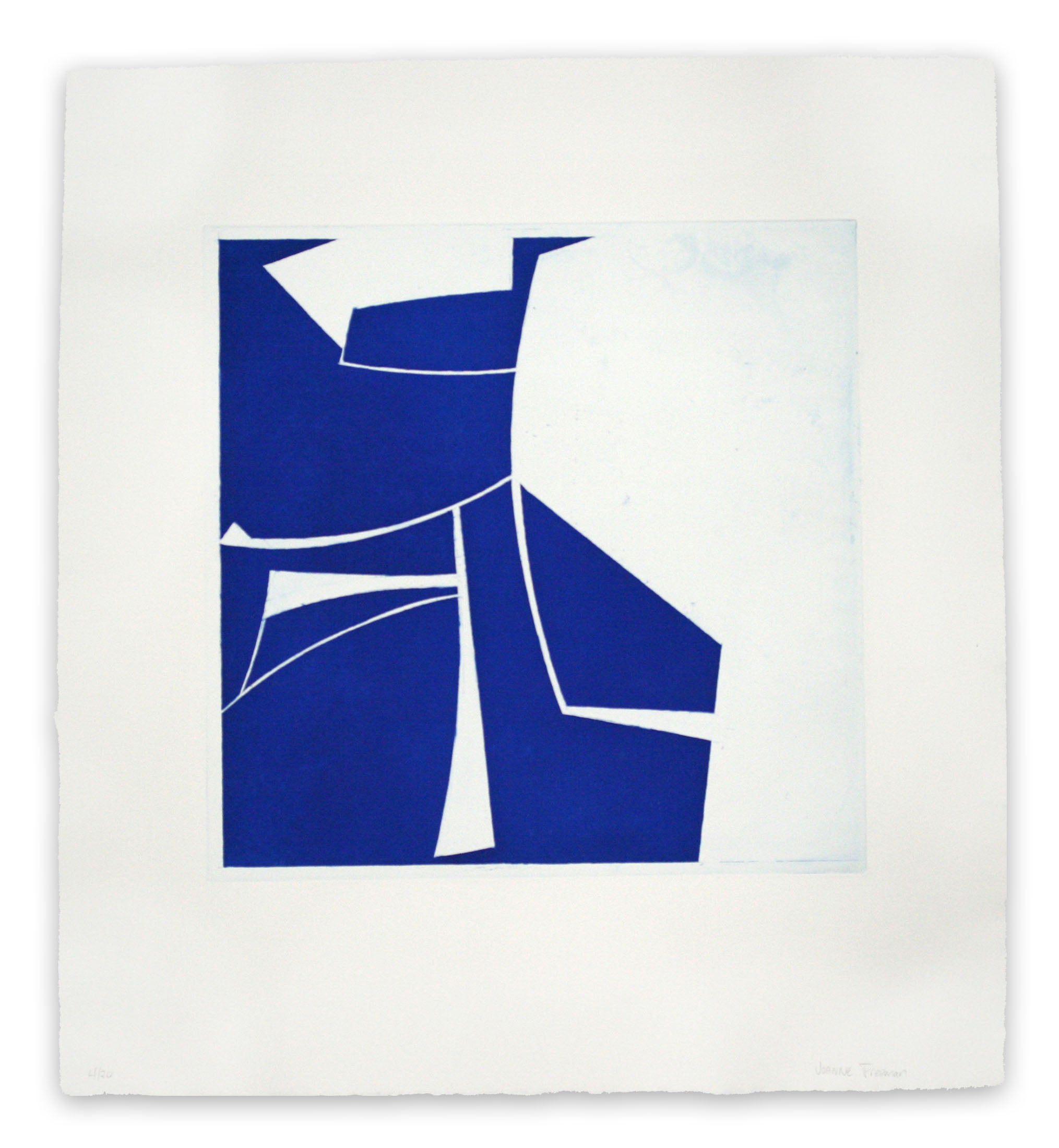
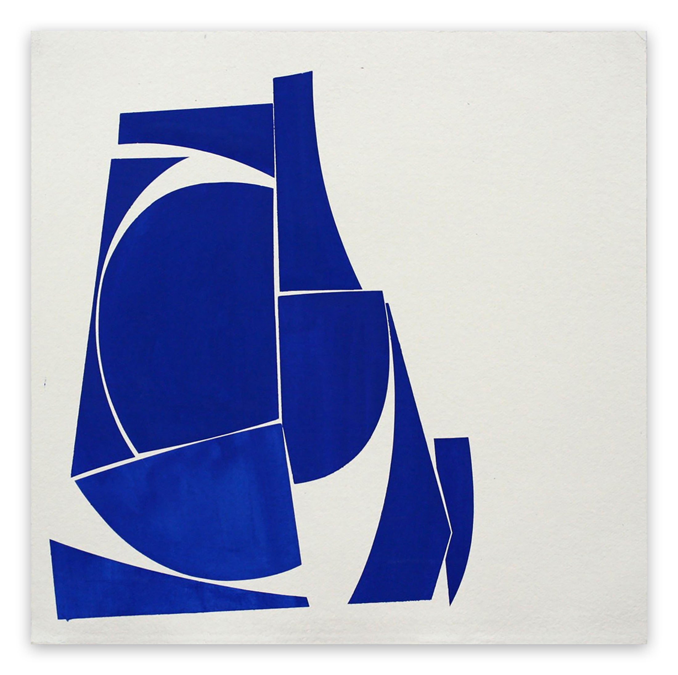
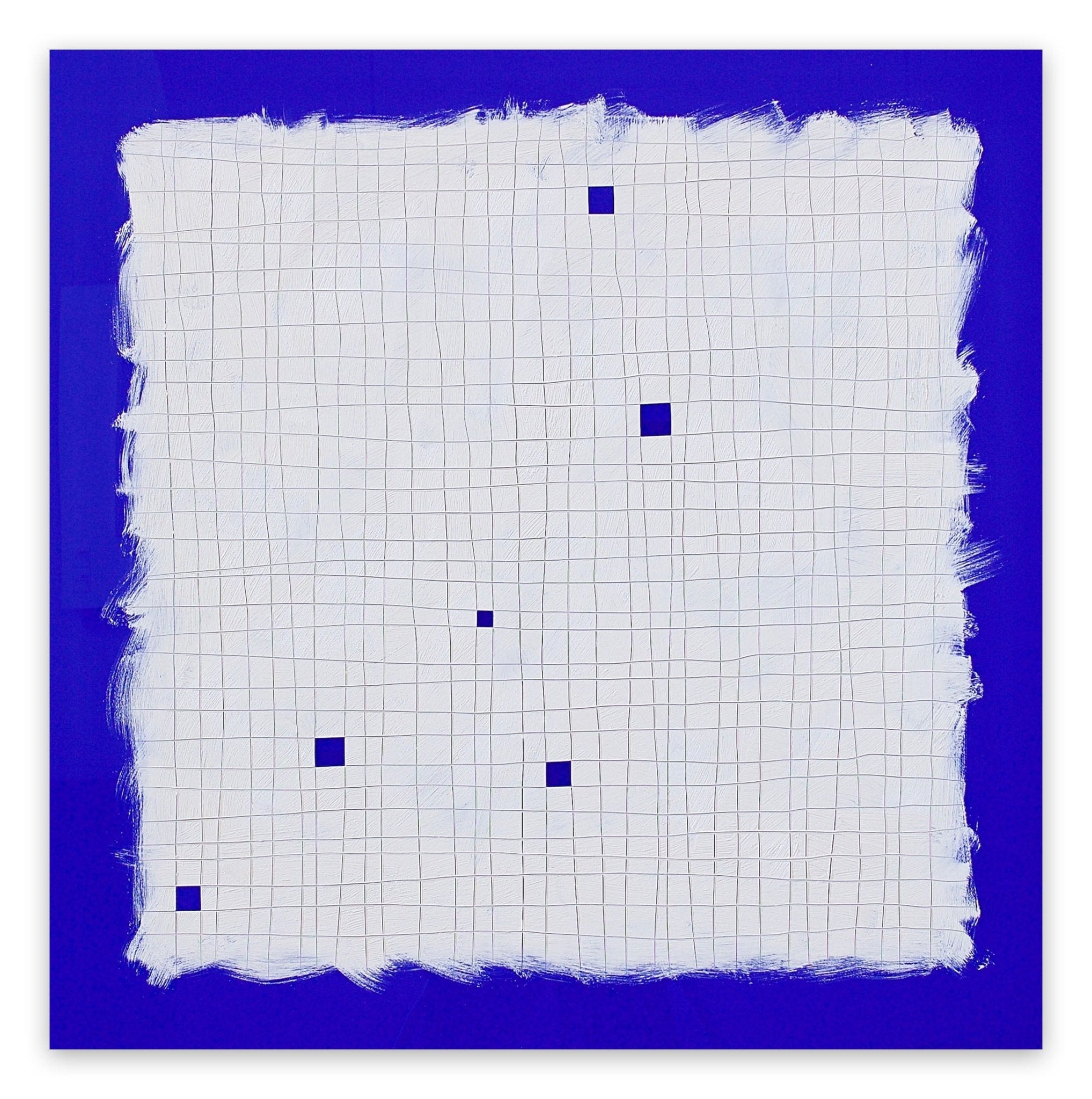
American artist Joanne Freeman harnesses the sheer, uncompromising impact of pure pigment to explore the core tenets of Reductive Abstraction. In works like Covers 3 Ultramarine and Covers 2 Cobalt, she deploys hard-edged, minimalist shapes that pop against handmade Khadi paper. Heavily influenced by the Bauhaus and the geometric utility of mid-century graphic design, Freeman channels the physical authority of pure blue—reminiscent of Yves Klein—by balancing taped-off areas of control with spontaneous gestural markings. Her work is a masterful reduction of urban signs and architectural shadows into pure, luminous color relationships.
 Joanne Freeman - Covers 24 Blue D Summer - 2016
Concept-Driven Grids & Structured Color Fields
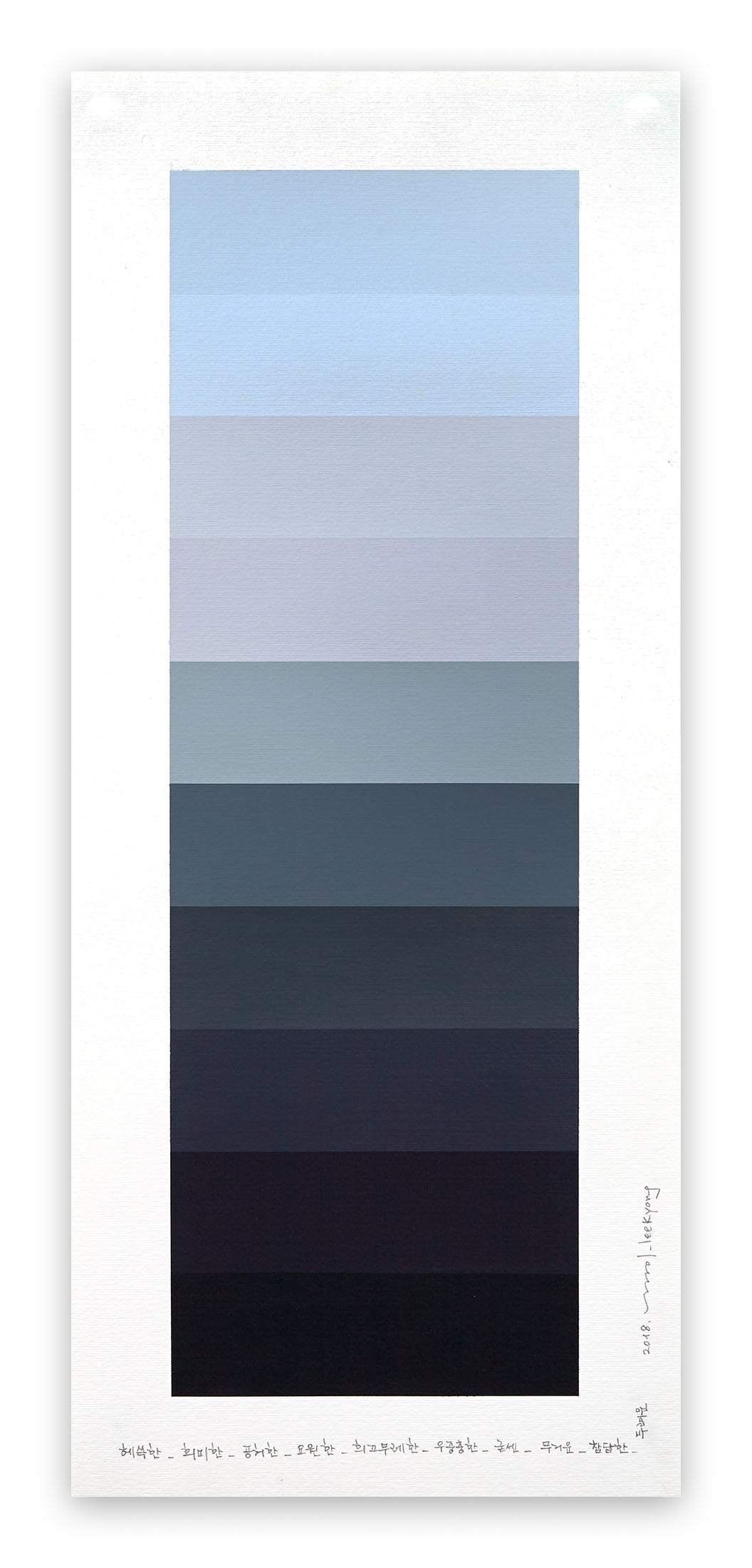
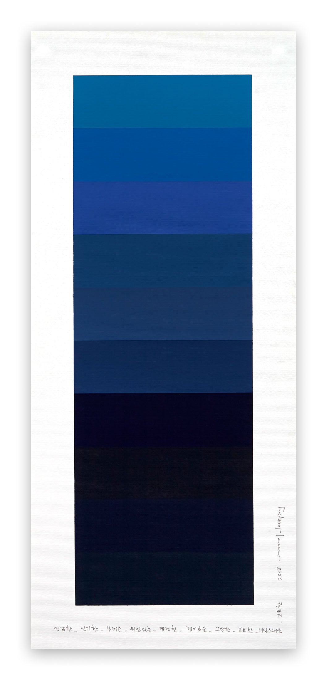
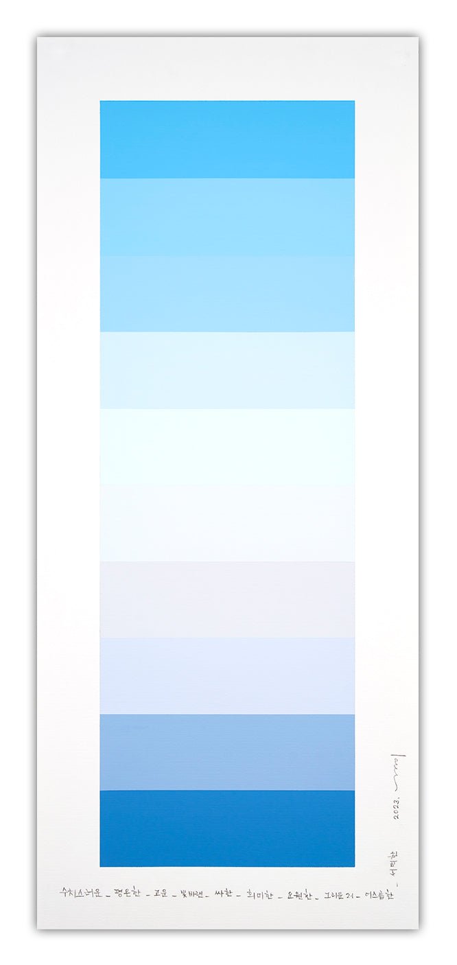
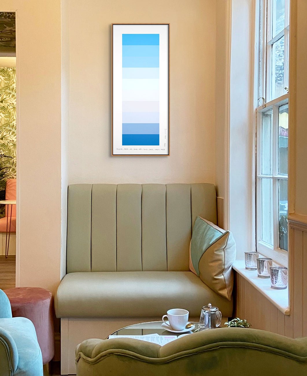
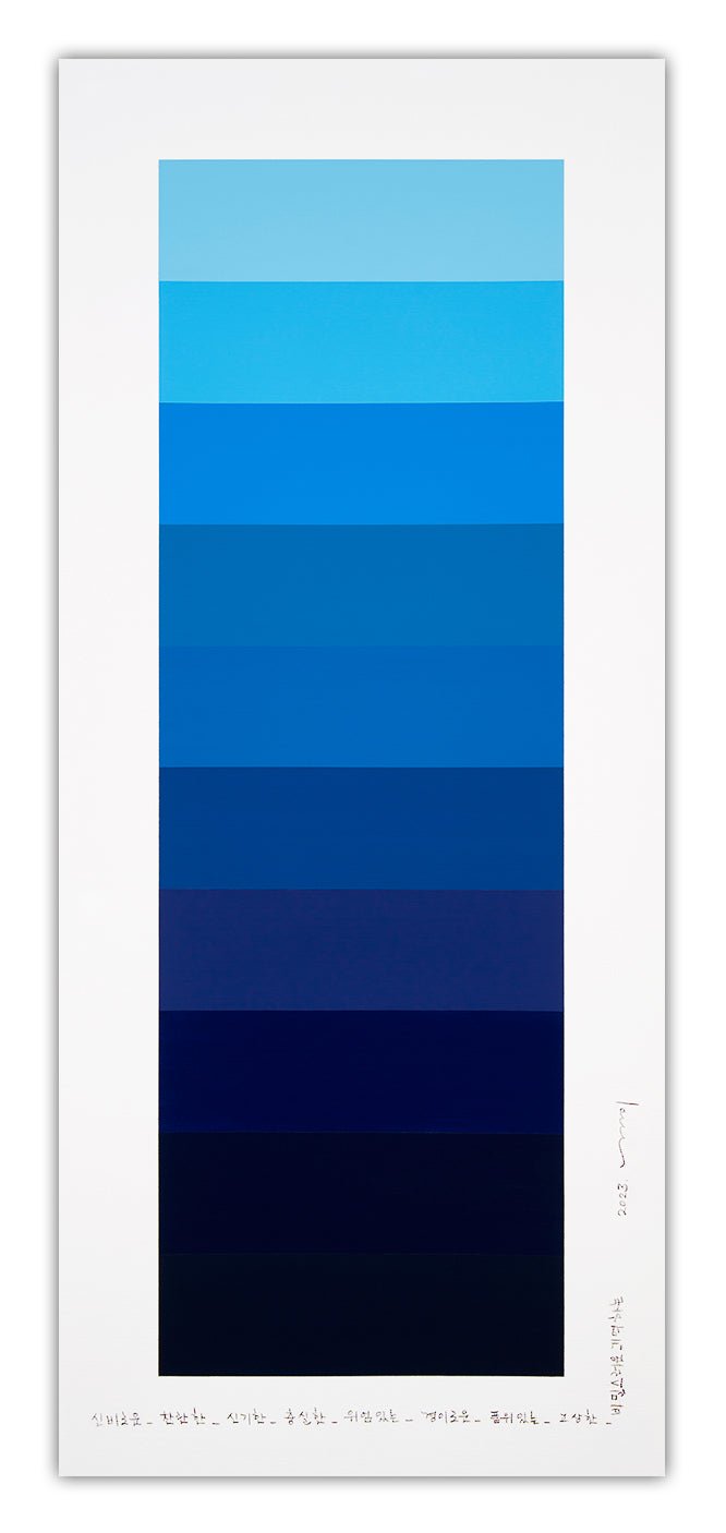
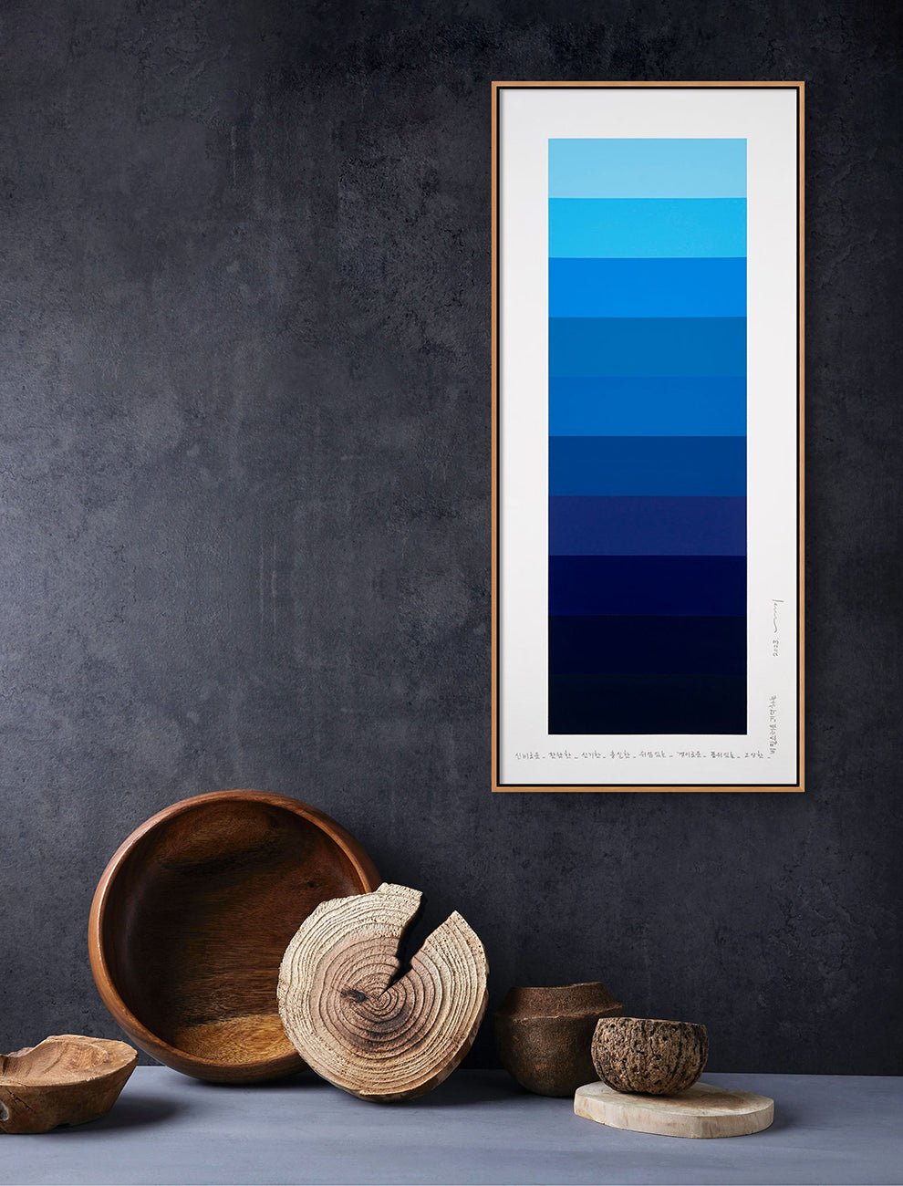
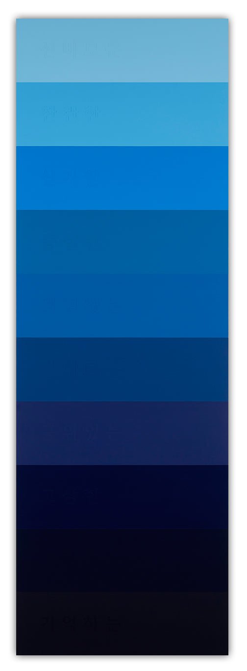
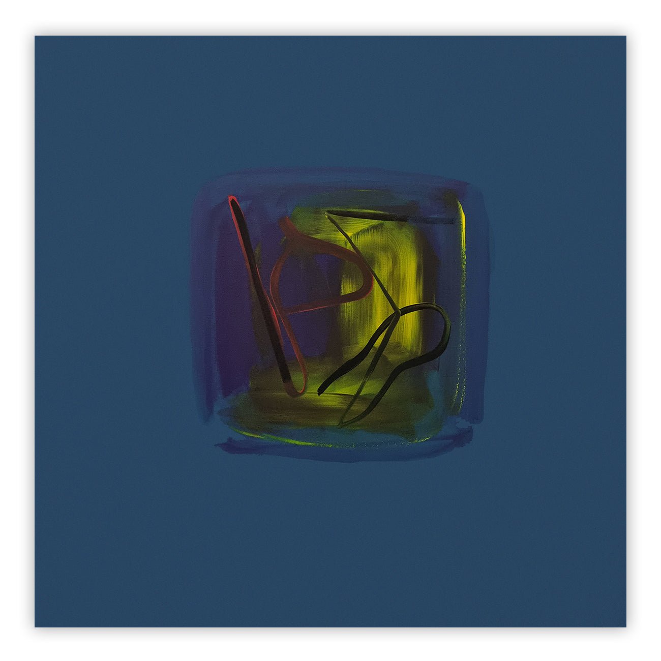
South Korean artist Kyong Lee treats the hue as both an expansive sensory field and a highly precise, concept-driven vocabulary. Lee has developed a personal "color alphabet" consisting of over 400 distinct hues, each meticulously mapped to a specific emotion or state of mind. In her Emotional Color Field and Emotional Color Change series, her smooth, immaculate blue gradients are never random; they are carefully calculated psychological transitions. In her Drawing for Color as Adjective-Noun series, she utilizes strict geometric grids to organize deep blue tones, transforming the flat color field into a structured linguistic map of the human psyche.

Kyong Lee - Emotional Color Change 53 - 2025
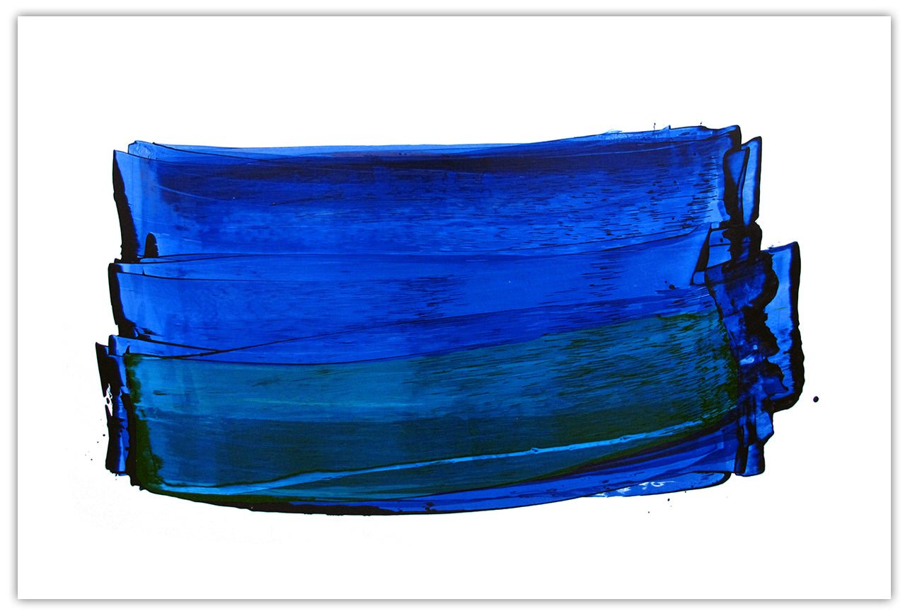
Lyrical Abstraction & Reflective Process Painting
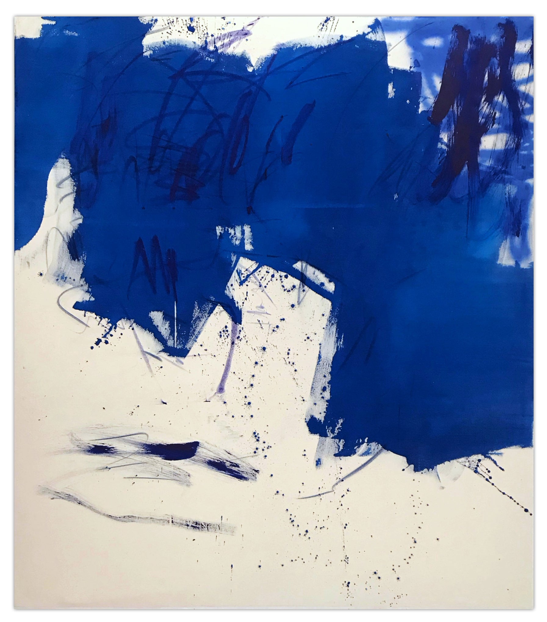
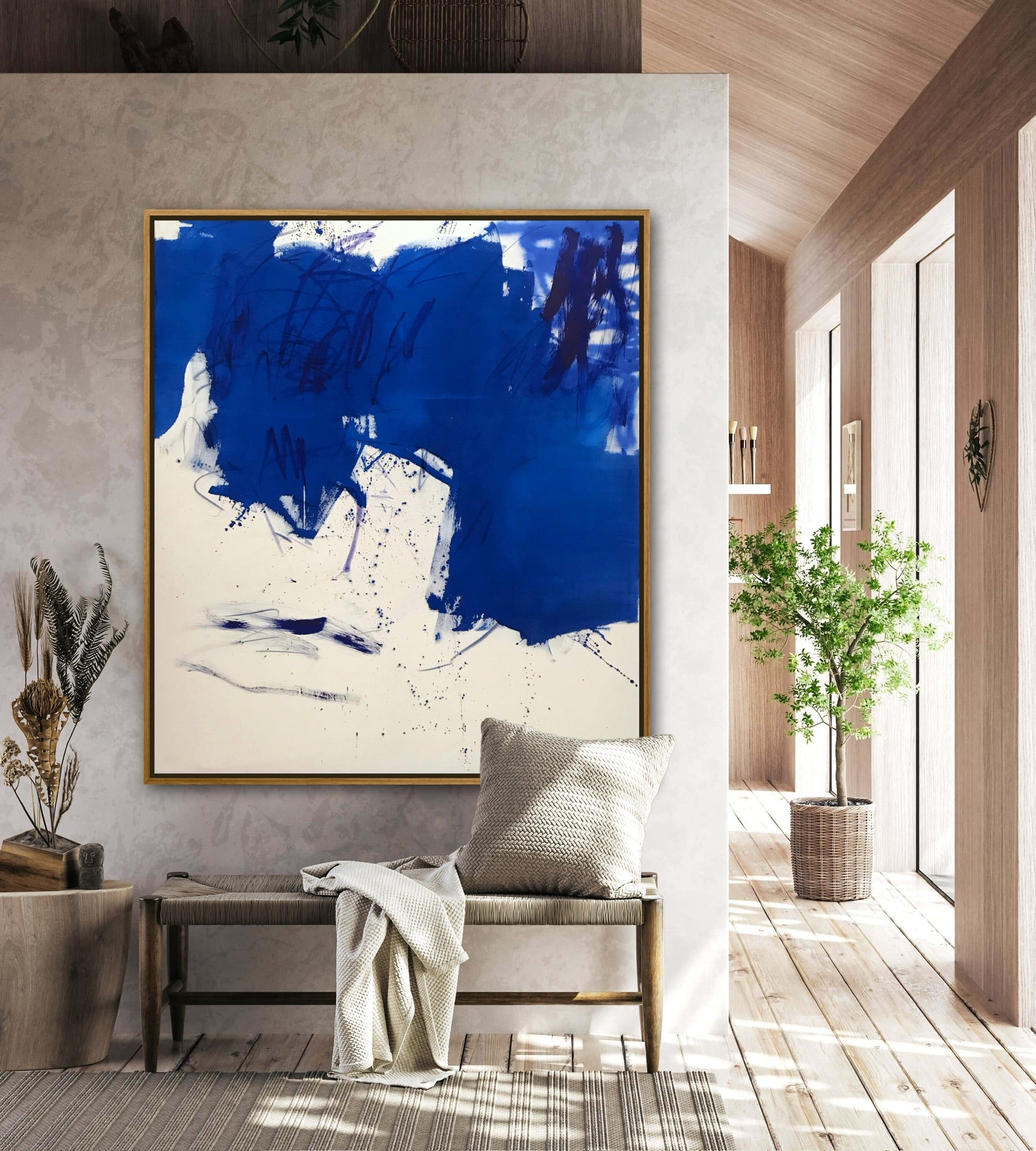
New York-based Emily Berger works in the rich lineage of Lyrical Abstraction and Abstract Expressionism, exploring the atmospheric gravity and tactile weight of color. In works such as Elegy and Blue on Blue, Berger layers gestural, horizontal bands of oil paint on wood panels, stacking them from top to bottom. She scrapes, scumbles, and coaxes the paint to reveal a physical record of time. Because her bands are allowed to gently sag under the force of gravity, her work stands as an imperfect, deeply human record of the painterly event. Her deep, somber tones evoke the introspective mood of Picasso’s Blue Period, achieved through a quiet, meditative process.

Emily Berger - Blue on Blue - 2020
Gestural Abstraction & Action Painting
German painter Manuela Karin Knaut shatters any notion that blue must be a calming force, channeling the raw, physical energy of Gestural Abstraction and post-war Action Painting. Her expressive, mixed-media paintings, such as Expedition and Right from the Source, are explosive, chaotic events on canvas. Knaut builds her compositions through an intuitive process of addition and erasure, mixing traditional acrylics with everyday street detritus like glue, fabrics, and discarded paper. It is an "abstract punk" aesthetic that celebrates the beauty of urban decay and spontaneous physical action, turning blue into a wild, unpolished force of nature.
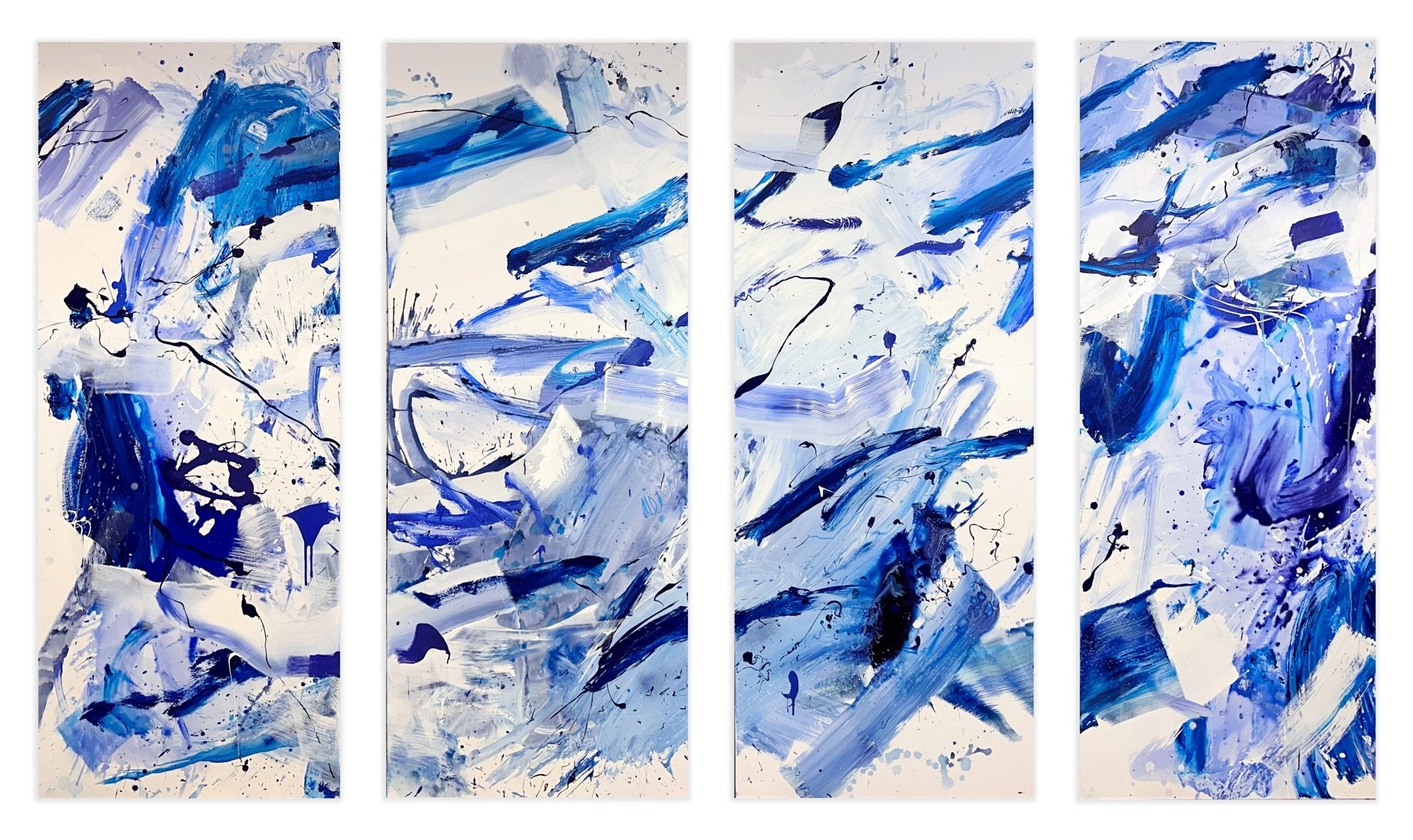
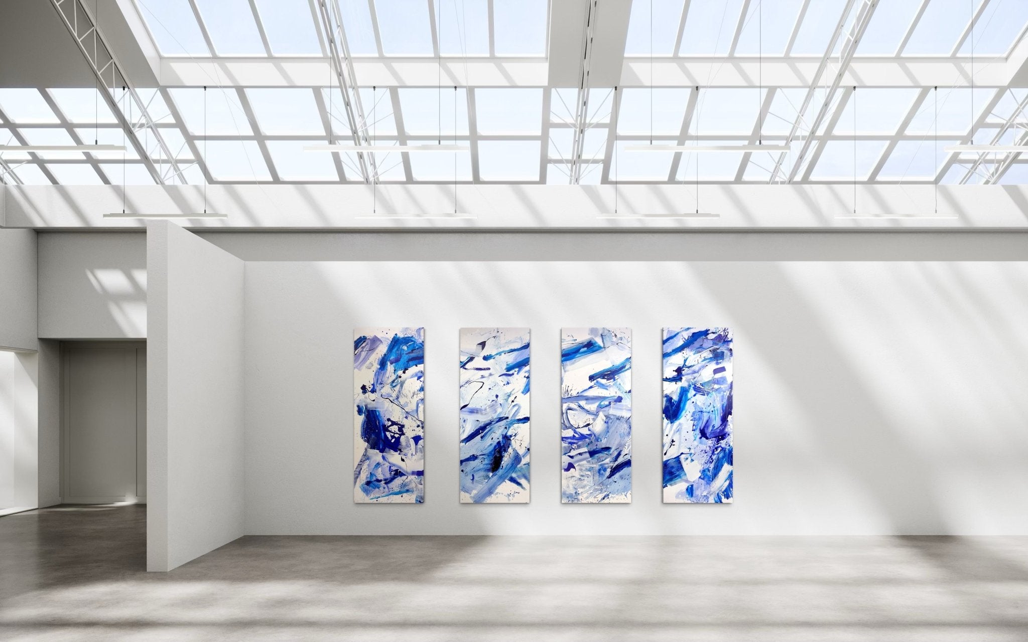
 Manuela Knaut - Highline (Quadriptych) - 2025
Post Minimalism, Color Field And Perceptual Depth
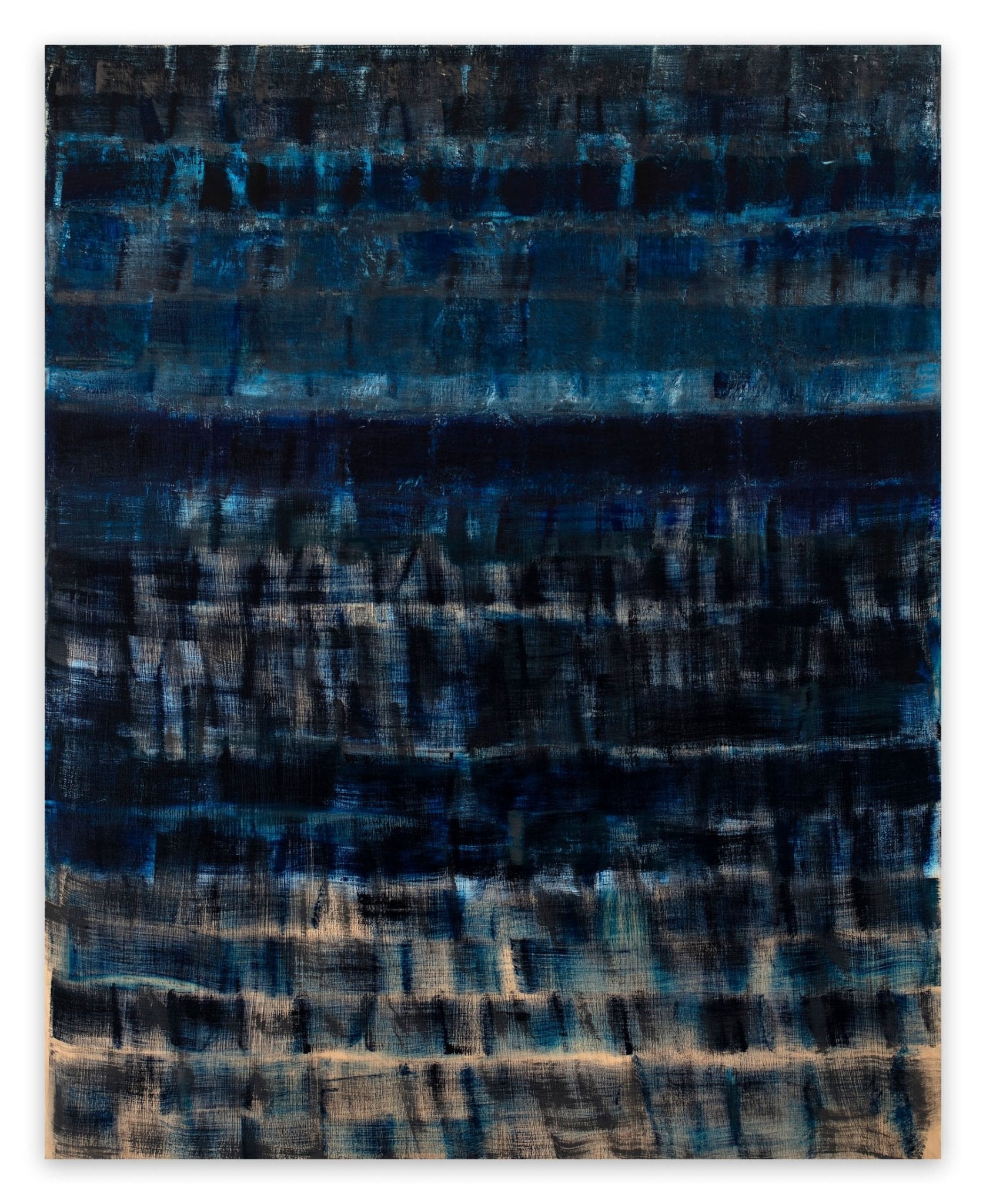
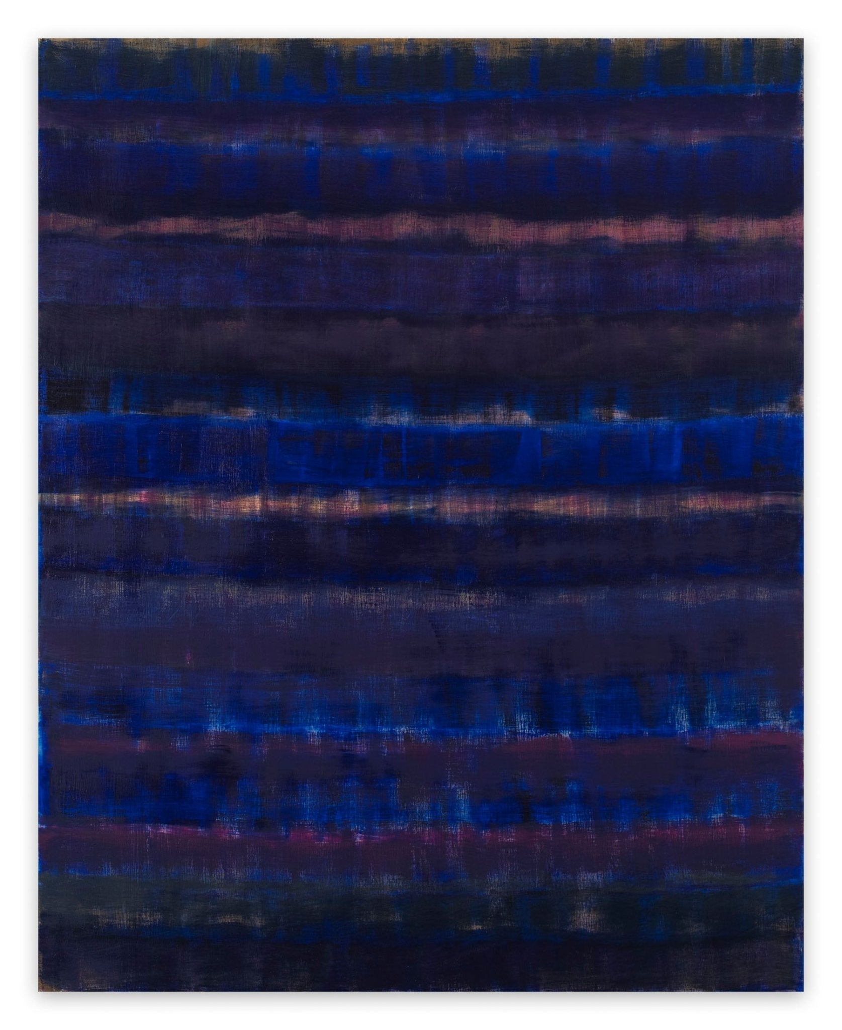
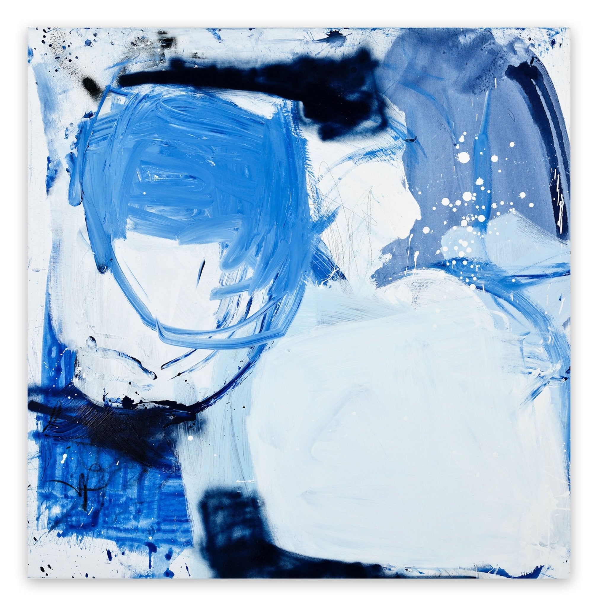
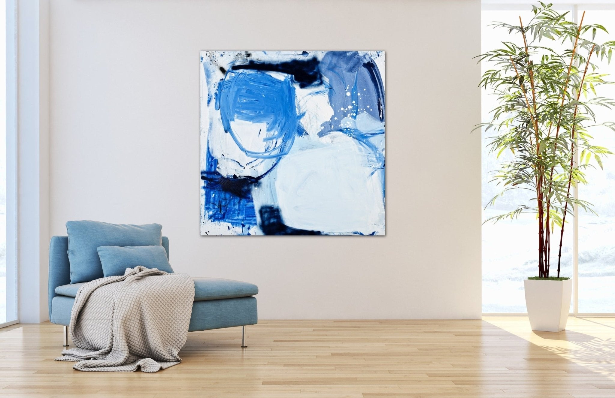
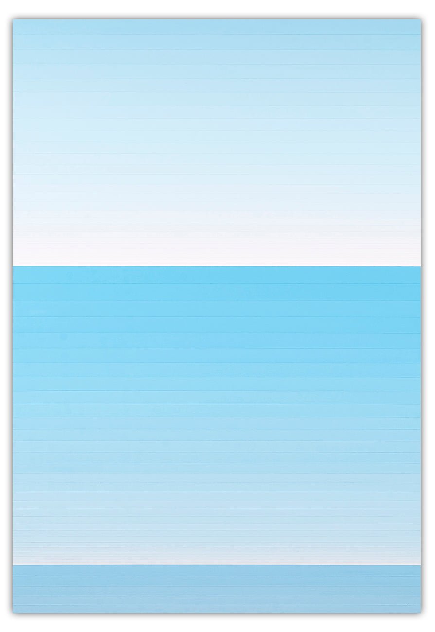
American artist Macyn Bolt works at the intersection of Post-Minimalism and Color Field painting, investigating how shifts in color and boundaries alter our understanding of space. In rich, velvet-like works such as Day for Night 3, Here to There (Present Tense) (below), and Skipstep AA, Bolt deploys flat, highly saturated expanses of blue that are interrupted by subtle, contrasting interior borders. These shifted margins—varying from electric cobalt to deeply shadowed ultramarines—create a powerful optical and structural tension. Instead of flat, passive monochromes, Bolt's paintings function as physical portals, challenging the eye to navigate the precise yet elusive boundary where one spatial plane ends and another begins.

Macyn bolt - Here to There - (Present Tenses) - 2023
Blue refuses to be pinned down to a single meaning. Whether you are seeking the striking graphic punch of ultramarine, the atmospheric depth of a color field, or the chaotic splash of raw energy, the perfect blue artwork has the power to completely transform the mood of your collection and your home.
Featured image: Yves Klein - Untitled Blue Monochrome, 1960, photo © Yves Klein Archive
All images copyright The Artists and used for illustrative purposes only
By Phillip Barcio (2017) and Francis Berthomier (2026)
FAQ: The History, Chemistry, and Collection of Blue in Art
1. What is the psychological impact of the color blue in abstract paintings?
Unlike warm colors (such as red or orange) which physically advance toward the eye and trigger physiological arousal, blue is a cool color with a shorter electromagnetic wavelength. In the human brain, blue initiates a parasympathetic nervous system response—lowering blood pressure, slowing respiration, and evoking deep feelings of calm, introspection, and tranquility. In abstract paintings, where there is no narrative subject matter to distract the eye, this biological response is heightened, allowing the color to function as a direct mental landscape of meditation or melancholy.
2. How did Yves Klein create International Klein Blue (IKB)?
Historically, when painters mixed dry ultramarine pigment with traditional binders like linseed oil, the oil would coat the pigment particles, dampening their natural luster and turning them into a dull, dark navy. To solve this, Yves Klein collaborated with Parisian color merchant Edouard Adam and chemical engineers. They developed a synthetic petroleum-distilled resin binder called Rhodopas M60A. Because this fluid binder dried completely matte and transparent, it preserved the raw, powdery luminescence of the dry pigment. Klein patented this revolutionary formulation in 1960 as International Klein Blue (IKB).
3. Why did Pablo Picasso paint almost exclusively in blue between 1901 and 1904?
Picasso's legendary "Blue Period" was a direct psychological response to profound grief. In February 1901, his close friend and fellow artist Carlos Casagemas committed suicide in a Paris café. Plunged into severe depression, guilt, and isolation, Picasso stated: "I started painting in blue when I learned of Casagemas's death." By limiting his palette to somber, monochromatic blues, Picasso matched his physical pigments to his internal emotional state, using the color as a visual metaphor for social alienation, poverty, and human sorrow.
4. What is the difference between Ultramarine, Cobalt, and Prussian blue in art history?
These three historic pigments vary drastically in chemistry and visual weight:
- Ultramarine: Historically made from ground lapis lazuli imported from Afghanistan. It is a warm, deep blue with a slight violet undertone. It is highly luminous and was once more valuable than gold.
- Prussian Blue: A dark, dense, synthetic pigment accidentally created in Berlin in 1704. It has a slightly greenish undertone, is highly tinting, and carries an intense, shadowed atmosphere (famously used by Picasso in his Blue Period).
- Cobalt Blue: A pure, extremely stable metal-based pigment synthesized in 1802. It is a neutral, highly brilliant blue, completely free of green or red undertones, heavily favored by modernists for its crystalline clarity.
5. Why was blue paint historically considered the most expensive pigment in the world?
Before the invention of synthetic chemistry in the 18th century, the only way to paint a vibrant, true blue was to use natural Ultramarine. This pigment required crushing the semi-precious stone lapis lazuli, which could only be mined in the remote mountains of Badakhshan (modern-day Afghanistan), and shipping it across the Mediterranean to Europe. Because of this complex trade route and the tedious extraction process, natural ultramarine was astronomically expensive, costing more than its weight in gold. Renaissance masters reserved it strictly for sacred subjects, such as the robes of the Virgin Mary.
6. How do contemporary abstract artists use blue to create the illusion of three-dimensional depth?
Due to a visual phenomenon known as chromatic aberration, the human eye refracts different wavelengths of light at different angles. Cool colors like blue have short wavelengths and appear to recede or bend away from the viewer, while warm colors advance. Contemporary artists like Macyn Bolt exploit this biology. By bordering a flat field of deep blue with thin, contrasting lines of lighter cobalt or warm colors, Bolt triggers a perceptual boundary shift, making the flat canvas appear to physically recede like an open portal or shadow box.
7. How does lighting affect the way we perceive blue paint on a canvas?
Because human color vision is completely dependent on light waves, a painting's environment dictates how its blue pigments behave. Incandescent gallery lighting (which leans yellow/warm) will subtly neutralize blue pigments, making them look slightly warmer or flatter. Conversely, cool daylight or halogen bulbs (which lean blue/cool) will amplify the natural vibrancy of cobalt or ultramarine. For complex, layered paintings like those of Emily Berger, diffuse, balanced white light allows the eye to process the shifting depth of the underlying paint layers without glare.
8. What is the conceptual difference between a blue monochrome and a blue color field painting?
While both styles prioritize expansive color, their intentions are historically distinct. A Monochrome (like the works of Yves Klein) is a radical reduction; it presents color as an autonomous, physical object in its own right, rejecting representation entirely. A Color Field painting (rooted in the post-war New York School) treats color as an immersive space. In Color Field art, the vast, bleeding pools of color are designed to envelop the viewer's peripheral vision, triggering a transcendental or emotional space where the viewer "enters" the painting.
9. How do I choose the right blue abstract painting for my home's interior?
When collecting, consider the physical energy and lighting of your space:
- For tranquil, meditative spaces (bedrooms, studies): Opt for structured color fields or linear works like those of Kyong Lee, which utilize calming gradients and systematic order to soothe the nervous system.
- For dynamic, social spaces (living rooms, entryways): Choose high-energy gestural abstractions like those of Manuela Karin Knaut or graphic minimalist prints by Joanne Freeman to inject movement and visual focus.
- Ensure the artwork is placed in an area free from harsh, direct sunlight to preserve the pigment's intensity over time.
10. How should I care for and preserve a painting that features heavy blue pigments?
The primary threat to fine art pigments is ultraviolet (UV) light degradation, which can cause colors to fade or shift. To protect your investment:
- Never hang an original painting directly opposite a window where it will receive direct sunlight.
- If framing works on paper, always request museum-grade UV-filtering glass or acrylic (which blocks 99% of harmful UV rays).
- Keep the humidity in your home stable (between 40% and 60%) to prevent wood panels, raw canvases, or handmade papers from warping or contracting, which can crack dense layers of paint.
Discover more Blue Art on Ideelart


