Three Masters of Color Blue in Contemporary Art
When you see the color blue, what do you feel? Would you describe it as something different than what you feel when you hear the word blue, or read the word blue on a page? Is the information communicated by a hue different than the information communicated by its name? Whatever you feel, is it possible that feeling is universal? Or does the color blue mean different things to different people? And what about animals? Do they associate color with emotion, or do they use their color receptors only for survival? These questions have mystified students of color for centuries, and in some ways we are no closer to answering them today than we were a hundred years ago. But a book recently published by Phaidon Press takes us a little farther toward an understanding of color, at least as it relates to art. Written by Stella Paul, a former curator at the Los Angeles County Museum of Art and former program director at the Metropolitan Museum of Art in New York, Chromaphilia: The Story of Color in Art highlights 240 individual artworks. Not only does her exhaustive exploration of color shine new light on the innumerable ways ten distinct color categories have been used by artists throughout history, it also explores the range of ways color intersects with science, emotion, aesthetics and other areas of human culture. Today we would like to take a deeper look at the work of a few of the artists Paul mentions in the book to illustrate the range and power of the color blue: Helen Frankenthaler, Pablo Picasso and Yves Klein.
Seeing Color
One of the odd things about color is how often two people can look at the same object at the same time in the same place and still claim the object they are looking at is a different color. We wonder, “How can that be? Is color not objective?” But the short answer is no. Color is often subjective. The reason has something to do with the science behind how humans see color. Humans (and most other animals that see color) are trichromats. That means the receptors in human eyes perceive three basic wavelengths that correspond to color. You may have heard of the RGB color model used by some printers. The initials RGB stand for Red, Green and Blue. That is the color model that most closely corresponds to human vision. Obviously, red, green and blue are not the only colors human eyes can perceive. In fact, most humans can perceive as many as seven million distinct hues. But each of those different hues is interpreted in the brain after the eyes first perceive it as some combination of red, green and blue.
Additionally, the color we perceive an object to be does not only have to do with the object itself. Yes, we could analyze the material an object is made of and arrive at some understanding of what color that material is likely to be based on its chemical makeup. But the chemical makeup of a substance is not the only factor that goes into what color we perceive it to be. The reason humans are able to perceive color at all is because of light. And light can also be colored, in which case it can alter the color our eyes see when they look at a surface. Furthermore, one set of eyes can also be more sensitive, or just differently sensitive, to light than another set of eyes, thus causing the way two brains interpret color to also be different. Basically, the same thing that allows us to see color can also alter our perception of color. Therefore, to talk about color can sometimes indeed seem subjective, and to argue over what color something is can seem downright silly.
 Helen Frankenthaler - Moveable Blue, 1973, acrylic on canvas, © 2014 Helen Frankenthaler Foundation, Inc, Artists Rights Society (ARS), New York
The Color Blue
Nonetheless, the variations different people see when they look at something that is a particular color do not usually vary so dramatically as, for example, one person seeing red and another person seeing blue. Normally, the variation is more subtle, such as one person seeing sky blue and another seeing aquamarine. But what can vary widely is the range of other things our brains perceive when we look at a particular color, beyond its physical properties. As the opening sentence of the chapter on the color blue in Chromaphilia: The Story of Color in Art observes, “There are many kinds of blue—all the same hue, yet with in-exhaustive permutations of appearance, effect, origin, and meaning.”
Appearance we have already covered. But the fun really starts when we consider “effect, origin, and meaning.” As for effect, one person may see the color blue and become calm. Another may become sad at the sight of something blue. So much of how we react to color has to do with our past experiences with the color. Origin is another fascinating consideration, since every variation of the color blue comes from some fundamentally different mix of elements. Variations in blue paint pigments could come from different combinations of binders and minerals. Variations in blue light could have to do with different particles in the air. And as for meaning, that is where things really become complicated. Every individual, every group and every culture develops its own idiosyncratic relationship with the color blue. Therefore, when using the color blue in a work of art there is literally no telling what kind of meaning is going to be perceived when the artwork is finally viewed. To explore just how wild the variations between the perception of blue can be in art, consider the work of the three artists mentioned in Chromaphilia: The Story of Color in Art: Yves Klein, Helen Frankenthaler and Picasso.
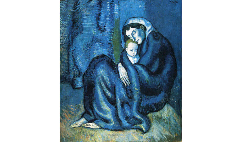 Pablo Picasso - Mother and child, 1902, oil on canvas
Blue in the Works of Yves Klein
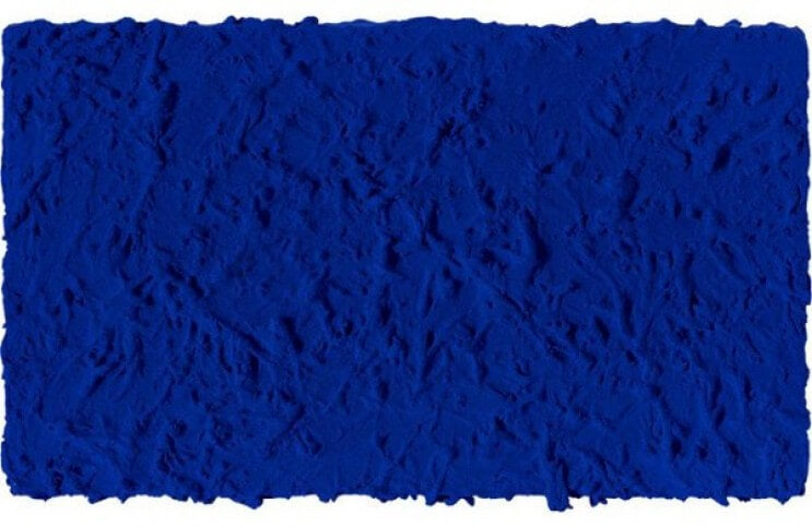
When it comes to 20th Century art and the color blue, no artist jumps faster to most minds than Yves Klein. Legend has it that as a young man, Klein was hanging out on the beach with his friends, the artist Arman and the French composer Claude Pascal. The three divided the world between them. Arman chose the earth. Pascal chose written symbols. And Klein chose the sky, immediately then raising his hand up and signing his name in the air. From that moment color was important to Klein. One of his earliest exhibitions featured monochromatic canvases painted in various pure colors. Bu when the audience failed to understand what he was trying to express, he realized he would have to simplify, and use only one color to make his point. He thus embarked on a process of developing his own signature hue.
As Stella Paul explains in Chromaphiliaa: The Story of Color in Art: “[Klein] worked with Edouard Adam, a Parisian color vendor who consulted with chemists at Rhone-Poulenc, to create a synthetic binder...The result was Rhodopas M60A, which could be thinned to various levels of viscosity with ethanol and ethyl acetate. This binder preserves the magical luminescence of the pigment...Klein commissioned his own customized synthetic paint using this new binder, which he patented as IKB (International Klein Blue); from 1957 onward he used this pigment almost exclusively.” Klein used International Klein Blue to make his iconic monochromatic blue canvases and several monumental public installations. He also used it to create what became some of his most influential works: performance pieces in which nude models covered themselves in IKB then pressed their bodies in various configurations against canvases.
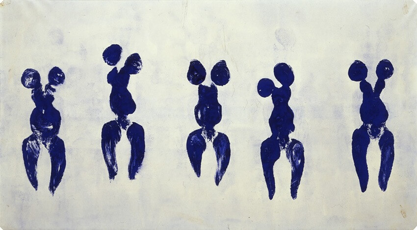 Yves Klein - Anthropométrie de l' époque bleue, 1960, © Yves Klein Archives
Blue in the Works of Helen Frankenthaler
The abstract painter Helen Frankenthaler was another masterful, 20th Century proponent of the color blue. Frankenthaler was the inventor of a painting technique called soak-stain. The technique involves pouring paint directly onto the surface of unprimed, un-stretched canvas spread out on the floor then allowing the paint to soak into the fibers and spread across the surface of its own accord. Frankenthaler initially performed this technique with oil paints, but soon learned that oil paint quickly degrades raw canvas. She thus became an early proponent of acrylic paints, which do not have the same degrading effect on canvas. What acrylic paints do have, however, are vibrant, luminous qualities when it comes to hue. By pouring different pure hues directly onto her canvases, Frankenthaler could direct the flows of paint in ways that explored color relationships in new ways, without conceptual interference from elements such as line, shape, texture or form.
In Chromaphilia: The Story of Color in Art, Stella Paul pays particular attention to the painting Mountains and Sea, which Helen Frankenthaler painted in 1952. It is considered to be the first canvas Frankenthaler created using her soak-stain technique. Says Paul about the work: “Having returned to her New York studio from an interlude in Nova Scotia, Frankenthaler later recalled that she had internalized the Canadian landscape, which had become embedded not just in her mind but also in her shoulder and her wrist. With that backdrop of mind and body, she created a lyrical, pastoral abstraction to summon a memory of a place through color.” Frankenthaler conceptualized the process of pouring the paint as a way of translating something internalized within her body into something externalized on the canvas. The painting almost entirely utilizes hues of red, green and blue, the various hues of blue standing out most profoundly as an abstract, rather than figurative, manifestation of the sea.
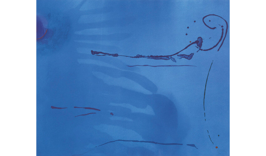 Helen Frankenthaler - Blue Current (Harrison 134), 1987, © 2014 Helen Frankenthaler Foundation, Inc, Artists Rights Society (ARS), New York
Blue in the Works of Picasso
Color was of paramount importance to Pablo Picasso, especially in the early phases of his career as an artist. Often his work from this time is classified according to color, as in his RosePeriod and his Blue Period. These classifications obviously have something to do with the predominant pigments he was using in his paintings at the time, but they also relate to the circumstances of his personal life, which allegedly affected the subject matter he chose to portray with these different hues. His Rose period, for example, spanned roughly from 1904 to 1906. It coincided with the beginning of his relationship with his lover Fernande Olivier, and his move to the Montmartre area of Paris. His work from the Rose period consisted of joyful images of things like harlequins and circuses. It was at the end of his Rose Period that Picasso painted his seminal work, the pink-hued Les Demoiselles d’Avignon, which is often cited as the predecessor to Cubism.
The Blue Period for Picasso preceded his Rose Period, spanning from roughly 1901 to 1904. It was a time in his life dominated by an awareness of depression and sadness. Picasso once stated, “I started painting in blue when I learned of Casagemas's death.” The remark refers to his dear friend Carlos Casagemas, who shot himself in the head at a cafe in Paris while Picasso was out of town. When Picasso returned to Paris, he lived and worked in the studio of Casagemas, where he embarked on painting nearly monochromatic compositions in blue. As Stella Paul points out in Chromaphilia: The Story of Color in Art, “The pervasive blue of The Old Guitarist is the material expression of something sad, disenfranchised, and marginal. A twilight mood of low spirits is cast over the subject's unnatural blue-tinted flesh, his garments, and the ambient encompassing space. The angular gestures and attenuated limbs and features of this downcast, blind musician reinforce impressions established by the insistent blue color.” But as we can see from these three examples, of Yves Klein, Helen Frankenthaler and Pablo Picasso, blue does not always communicate sadness, no more than it always refers to the sky or to the sea. The potential range of hues that we refer to when we say blue is seemingly endless. As well, the potential range of emotions, feelings, contexts and meanings we can coax from the color is equally vast.
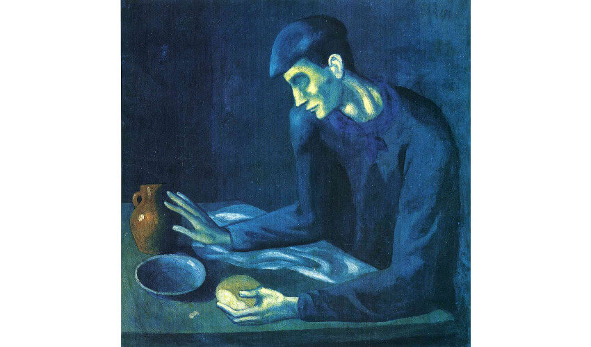 Pablo Picasso - Breakfast of a Blind Man, 1903, oil on canvas
Featured image: Yves Klein - Untitled Blue Monochrome, 1960, photo © Yves Klein Archive
All images used for illustrative purposes only
By Phillip Barcio
