Three Masters of Color Green in Contemporary Art
We have been conducting some research into the meaning of the color green, and the results, frankly, are quite confusing. Many of the most common associations people have with green directly contradict each other. For example, there are those who swear green is the color of health and nature, but many others adamantly associate green with sickness and toxicity. In Irish folklore green is supposedly the color of good luck, but in Chinese folklore it is the color of bad luck. One website says green means life and vitality, while another says it symbolizes death and laziness; one says it means hope and optimism, another says it means jealousy and cowardice; one says it means wealth and success, another says it means envy and ineptitude. And we could go on. But the point is, there is no consensus on what the color green means. Perhaps like so many other things in this life, the color green requires context in order to acquire meaning. So once again we would like to look toward a book called Chromaphilia: The Color of Art, written by former LACMA curator Stella Paul and published earlier this year by Phaidon Press. It examines the different ways various artists have used color in their work. In its examination of the color green, the book singles out three artists: Bruce Nauman, Brice Marden and Olafur Eliasson. Each relies heavily on color for effect, and each also makes work that inspires different meaning from spectators depending on context.
It Is Easy Seeing Green
The study of light is called optics, and optics has everything to do with color. Our eyes sense different colors based on variations in wavelength that occur on what is called the spectrum of visible light. Humans can only perceive a small segment of the electromagnetic spectrum. Measured in nanometers (abbreviated nm), we can only see light that manifests in the range of about 400 to 700 nm. Blue has a wavelength between 450 and 495 nm. Red has a wavelength between 620 and 740, but much of that is beyond the visible spectrum for humans. Of all visible colors, green has the largest wavelength range in the visible spectrum for humans:between487to 570 nm. And green is also the color the human eye is most easily able to perceive. When adapted to darkness, are eyes are most sensitive to light at 507 nm, and when adapted to light they are most sensitive to light at 555 nm, both firmly in the green zone.
But optics is not universally translatable for all people. Though the science does not change, our experience of the science relies heavily on individual perception. We see color because of cells in our eyes called cones. But roughly eight per cent of humans are born with a deficiency in their cone cells, causing them to experience some level of color blindness. Someone who is green weak, the most common form of color blindness, has difficulty perceiving the color green. Green weakness is so common that many countries add visual cues like strike through lines on green traffic lights to help color blind drivers navigate the signals. Even though green is, scientifically, the most abundant color we can see, and the easiest color for us to perceive since it is perfectly within our sensitivity range in both darkness or light, it is also the most commonly disputed color, one each of us sees a little differently depending on the genetic predisposition of our cone cells. So it follows that it is also natural for each of us to have some different ideas about the meaning of green, since we perceive it, and thus associate it with experiences, in idiosyncratic ways.
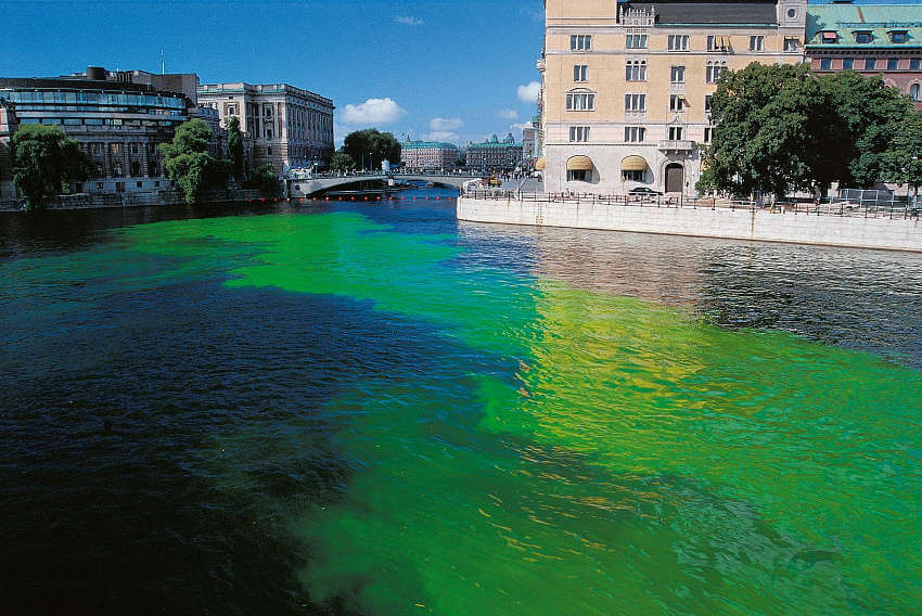 Olafur Eliasson - Green river 1998, Stocholm, 2000, © Olafur Eliasson
Olafur Eliasson and the Green River Project
A substance called fluorescein has been used to turn water fluorescent green for more than a century. Also known as food colorant Yellow No. 7, fluorescein was deployed by World War II soldiers when they needed rescue at sea, and by spacecrafts after splashing down so they can be located and salvaged. Chicago residents also may know fluorescein as the substance originally used to turn the Chicago River green on St. Patricks Day. And nearly two decades ago, Danish-Icelandic artist Olafur Eliasson used a sodium salt variation of fluorescein, called uranine, a.k.a. Yellow No. 8, to create the vibrant effects he used in the execution of a public artwork he called the Green River Project.
The first edition of the Green River Project transpired in Bremen, Germany, in 1998. Without announcing his intentions to anyone in the city, Eliasson and an assistant piloted a canoe down the Weser River, releasing along the way a large quantity of uranine into the water. A massive, fluorescent green streak soon appeared, to the shock of anyone happening by the river. Eliasson allowed a public spectacle to play out for some time as his aesthetic intervention rattled the social sphere of the town. The first reaction, of course, was fear and horror, as people assumed it was some toxin. Only later did the artist reveal what he had done, easing the public concerns. Eliasson later repeated the project in Norway, Iceland, Sweden, Japan and the United States. The green dye cause varied reactions in each city, but because of the context, almost all reactions were universally negative. Eliasson calls this type of work a “phenomena producer,” and believes such projects are important to pull people out of their normal interactions with their environment, as well as to bring art to people who would not ordinary encounter it.
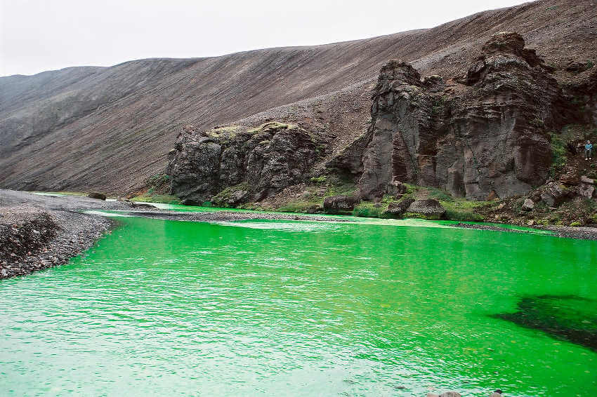 Olafur Eliasson - Green river 1998, The Northern Fjallabak Route, Iceland, 1998, © Olafur Eliasson
Brice Marden and the Monochrome
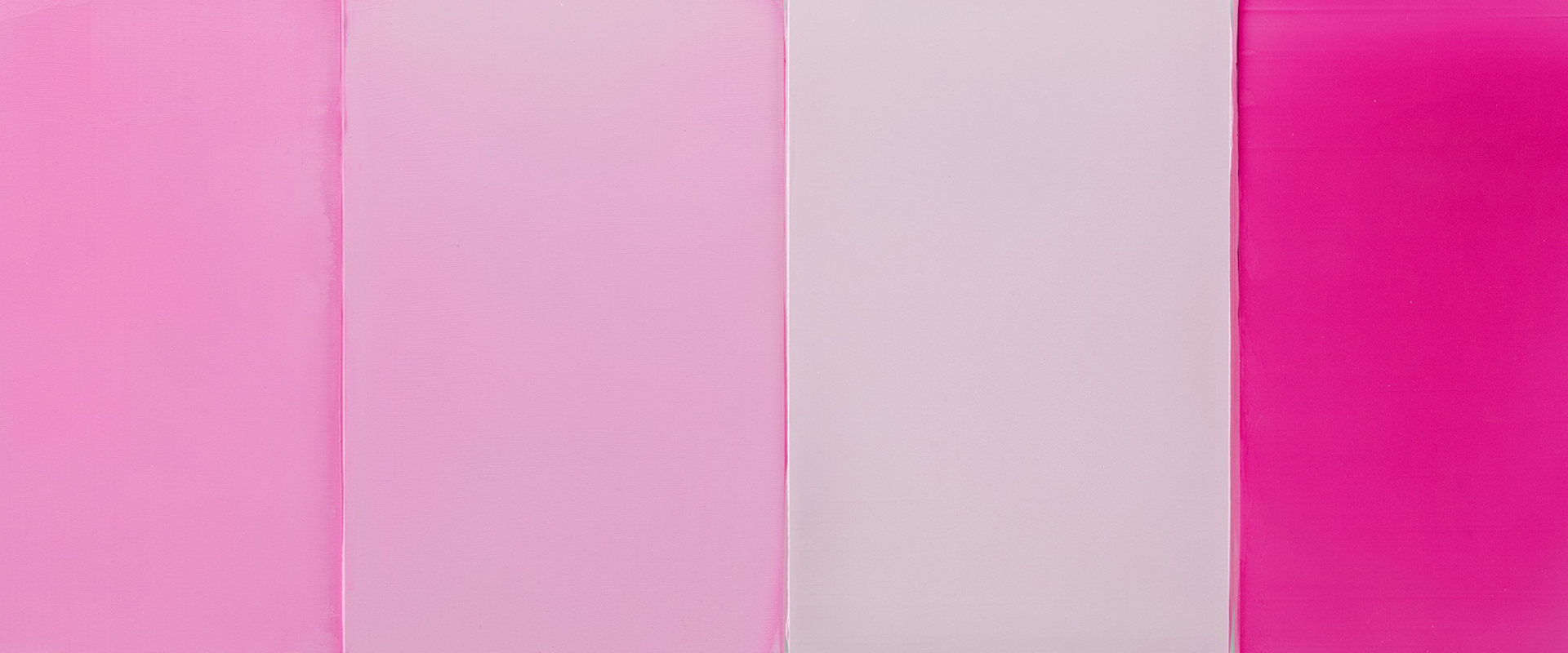
Brice Marden is one of many artists who have experimented with the idea of the monochrome painting. He creates his monochromes by adding successive layers of paint in different colors, allowing the under colors to contribute to the ultimate finished hue. The physicality of his monochromes make them objects to behold: their presence looms large as their rich, sumptuous, deep color holds the eye. But the act of encountering a green monochrome painting by Marden is nothing like suddenly seeing a green streak of fluorescent color flowing down a public river. If you are standing in front of a green Marden monochrome you are likely in a museum, at an art fair, or in a high end art gallery. It is a safe place, and an opportunity therefore to question what green means to you personally, aside from any outside contextual interference.
About his monochromatic paintings, Marden once said, “I like to think that my painting goes beyond merely being what it is.” Color certainly plays some pivotal role in causing his monochromes to amount to more than the sum of their parts. The example of a Brice Marden monochrome used by Stella Paul in Chromaphilia is from 1976, and is a painting called Grove IV. Marden painted the piece as a reflection on nature, specifically referencing the Greek island of Hydra where he spent time. “Nature is correct,” Marden once said.But in what way was this painting inspired by nature? Is it a figurative image of green grass? Or does it refer to something abstract association we might make between nature and the color green? Is there anything inherently natural about green? The green monochrome painting offers opportunities to answer that question for yourself.
 Brice Marden - Grove IV, 1976, Solomon R. Guggenheim Museum, New York , © 2017 Brice Marden/Artists Rights Society (ARS), New York
Bruce Nauman Gives the Green Light
Indiana-born artist Bruce Nauman engages in his artistic enterprises in part to investigate the psychology and behavior of people. He often uses text in his work, challenging spectators to disseminate between the meaning of the words and the context of their interaction with the art. But he is perhaps most commonly associated with the use of colored light. In 1970, Nauman built a pair of high walls and placed them side by side, creating a tight corridor, just 12 inches wide. He then hung green fluorescent bulbs above it so the corridor glowed bright green. Spectators were encouraged to walk through the corridor. Assuming they fit in the space, their eyes would adjust to the flood of green light then after exiting the corridor their eyes would adjust back, causing them to see an optical illusion of the color pink, the opposite end of the color spectrum.
It is difficult to say whether Nauman meant to imply anything specifically about the color green with this work. He could have used any other color and achieved similar effects. There may not have been any meaning to his choice of this color. But the fact that he did choose green has caused many art viewers to create new contextual associations with the color. This intense, claustrophobic and otherworldly experience has been described as terrifying, psychedelic, and even sacred. It again begs the question: do colors have any intrinsic meaning? Does their meaning depend on context? The work of these three artists leads us to believe most of our associations with color develop from our personal experiences alone.
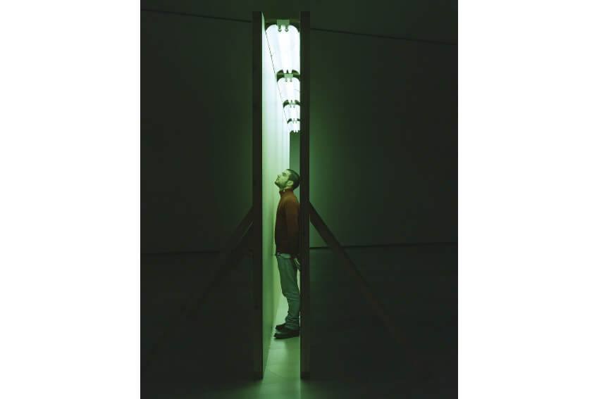 Bruce Nauman - Green Light Corridor, Copenhagen Contemporary, Copenhagen
Featured image: Bruce Nauman -
