Richard Deacon and the Anatomy of Public Art
Public art is a force of nature. When a new public artwork appears it is like a new life form has sprung up in the ecosystem. The existing inhabitants must adapt to the interloper, interact with it and learn to love it, or at least coexist with it. Richard Deacon is currently one of the world’s most influential public artists. Hailing from the United Kingdom, Deacon has added monumental abstract forms to the visual landscape of public spaces all over the world. His works have been likened to human body parts, organic, natural forms and abandoned architectural relics. What exactly they represent and how exactly the public is supposed to interact with them are questions of some debate. But whatever side of that debate you are on, it is undeniable that the body of work Deacon has created in the past four decades is now part of the public anatomy. His strange and beautiful artworks confidently inhabit our world, same as any other product of nature. We inhabitants of the public ecosystem may not understand how we are supposed to react to a Deacon sculpture, but like wandering beasts encountering some new rock formation or monstrous plant we have much to gain by simply asking the questions that honestly come to our minds when we see it, such as, “What is it,” “Why is it here,” and “What does it mean?”
A Certain Ambiguity
Richard Deacon refers to himself not as a sculptor, but rather as a fabricator. Something in the word fabrication offers a clue to his artistic intentions. He is engaged in a form of fiction. Like an author, he is using the false in order to convey something essential about the real. Like personal stories, the forms Deacon fabricates seem to grow naturally out of their own circumstances.
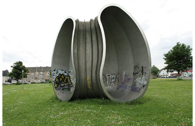
Works such as Building From the Inside and Footfall raise questions that have to do with meaning and context. They possess their own internal vernacular and they owe much to their setting. They seem familiar, though we may not be sure where to place them in our experience. They don’t seem to belong there, and yet neither do they resemble anything necessarily alien. Something about the visual language Deacon uses in each of these pieces seems to spring out of the aesthetic vocabulary of their surroundings. They are literary in their presence.
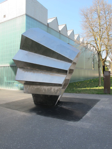
Richard Deacon - Footfall, 2013. Steel. 410 x 390 x 295 cm. Galerieverein Freunde des Kunstmuseums Winterthur
Resemblance and Detachment
When we refer to the body of work an artist makes, we are not normally referring to the human body. But in the case of Richard Deacon it is sometimes tempting to assume such a reference is appropriate. There is something undeniably anatomical about so many of the forms Deacon fabricates. Some of his creations seem so plainly representative of human body parts that it would be impossible not to notice the resemblance. It’s Like A Rock, a fabrication Deacon created in 2015, plainly resembles a pair of human lips. And when considered side by side with another of Deacon’s fabrications, Moor, from 1990, it seems natural to assume that it, too, is intended to resemble a mouth.
But how often we think we recognize someone or something and then realize that we are mistaken, that the resemblance was only a coincidence. About his fabrications, Deacon says it is only natural for people to “recognize that something resembles something else. We don’t only do this in looking at art; seeing resemblances and recognizing that things look like other things is part of how we meet the world…The question for me is whether resemblance can be detached from objects.” When we consider the titles of these works we might decide there is more meaning to them than meets the eye. Moor is another word for an open field, the natural feature Moor overlooks. And what does it mean to be “like a rock?” It could mean being strong and immobile, or stoic and hard, characteristics that are decidedly not lip-like.
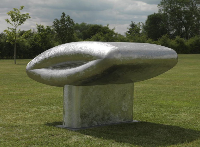
Richard Deacon - It’s Like A Rock, 2015. Stainless Steel. 155 x 245 x 180 cm. © Richard Deacon
Spirit and Location
Deacon calls his fabrications representational, he is just not certain what exactly they represent. Like moments of inspiration they arise out of a process, what Deacon calls a “transition between order and disorder, where different kinds of ordering emerge.” One possibility is that rather than representing a thing, Deacon’s works resemble a sensation. Between the Eyes inhabits a harbor-side plaza in Toronto. At first glance, it seems like a cast-off, unfinished section of a ship. Or there is perhaps something gourd-like about it. Or it could by an old telephone receiver, or an inner part of the human ear. But then if we ignore resemblances and stop trying to recognize what it is, we might catch sight of what it celebrates. Like a ship on the water it is simultaneously heavy and light, industrial and elegant. It has a sense of, and communicates the spirit of, its environment.
Similarly, a work Deacon temporarily installed near New York’s Central Park called Masters of the Universe: Screen Version conveys the spirit of its location. It incorporates an assortment of visual tropes related to the location. It speaks of hot dog links and balloon animals. It invites people to play on it and yet proudly blocks peoples’ way. It is architectural, and yet resembles the anatomical building blocks of our cells. Its bulbously organic, grid-like form welcomes humans to explore and inhabit it. Though using a different language, it speaks in loving conversation with the park and the skyscrapers and the creatures that are its neighbors.
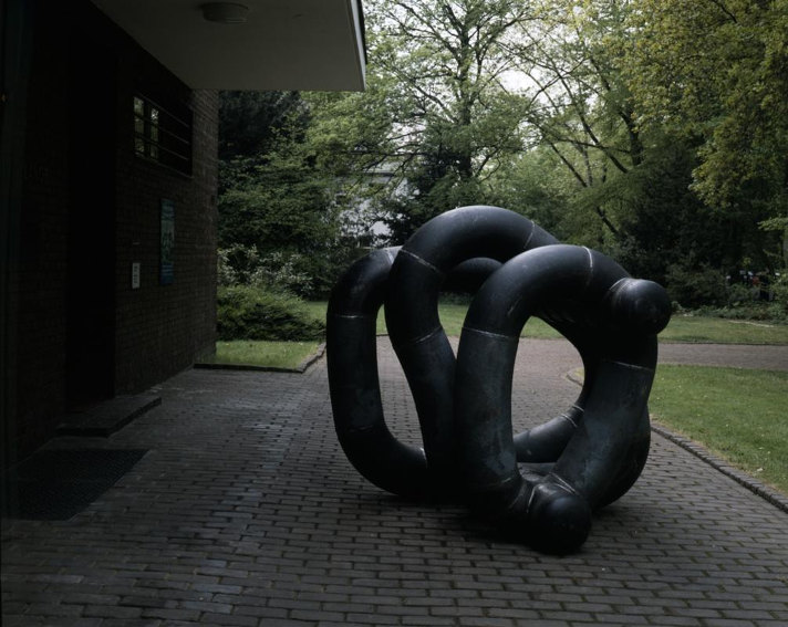
Richard Deacon - Untitled, 1991. Welded steel. 162 x 156 x 184 cm. © Richard Deacon
Unnecessary Beauty
When we cannot find an obvious resemblance in a work of public art to something we already know, it is natural that the next logical step our brain might take is to try to assign abstract meaning to the work. And when we have a hard time doing that, it is natural for us to take offense that this unrecognizable, meaningless object is taking up public space. And that is a phenomenon that Richard Deacon understands well. It gets to the root of why public art can sometimes be controversial. We have constructed our public spaces to appeal to the widest possible segment of the population. That requires public space to be useful, above all else.
But useful does not have to mean barren or brute. For example, we happily welcome natural landscaping and fountains in our public spaces. “It’s to do with unnecessary beauty,” Deacon says. “I don’t really know why plants are so beautiful—they don’t have to be.” The forms Deacon creates come about through the same evolutionary process as plants, or as anything else in nature. They spring from nothing, originating in chaos, hoping to find relevance in their new world. One of the goals Richard Deacon hopes to accomplish with his abstract public fabrications is to help more members of the public understand how public art can be useful in the same way; at least as useful as a flower.
Featured Image: Richard Deacon - Building From the Inside. © Richard Deacon
All images used for illustrative purposes only
By Phillip Barcio
