Examining Theo van Doesburg’s Counter Compositions
When people think of the Dutch art movement De Stijl, they tend to think of its most famous representative: Piet Mondrian. Yet Mondrian was by no means its only founder. Theo van Doesburg was equally instrumental in the development of “the style.” Some would even say his “counter composition” series surpasses the work Mondrian accomplished. It is doubtful that contemporary audiences would ever devolve to the point of bickering over such details. But at the turn of the 20th Century, when abstract art was in its infancy in the Western world, arguments about even the tiniest of details indeed set off feuds between artists that lasted for years, or even lifetimes. The feud between Mondrian and van Doesburg may be one of the most famous of them all. The two artists teamed up at first in their quest to create a universal style of pure abstraction, and even worked together on the publication of a magazine in order to promote their ideas. But Mondrian grew more and more sparse in his aesthetic vision, believing that in order to achieve true purity as few elements as possible should be used in a composition. Van Doesburg disagreed. He felt that purely abstract compositions still needed a sense of energy. He felt that by increasing the elements that could be used in a painting, the work could retain more dynamism and therefore be more interesting. This disagreement is what led the two artists to end their friendship. When they split up, Mondrian changed the name of his style to Neo-Plasticism. Van Doesburg in turn changed the name of his style to Elementarism. His counter composition series was the first series that he created after this split, and it vividly defines the essential differences that set his new style apart.
The Straight and Narrow
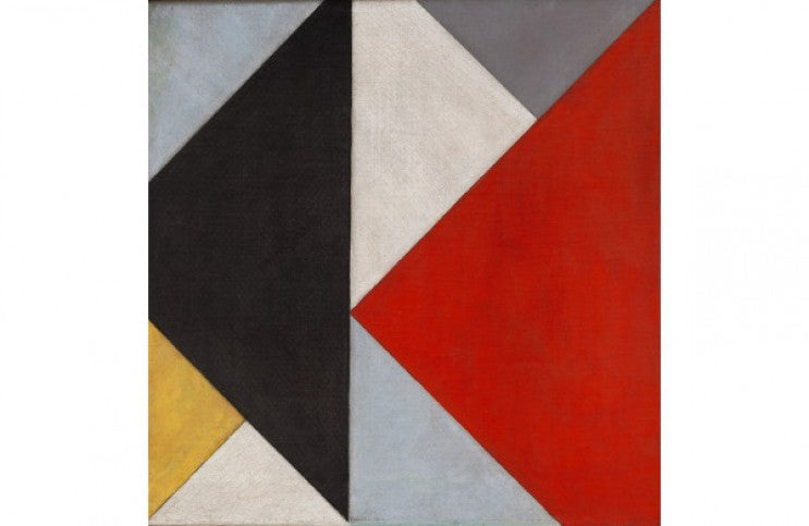
The essential parameters that Mondrian came up with to define his Neo-Plasticism style were simple. He believed that paintings should stick to featuring only three elements: horizontal and vertical lines; rectangular or square shapes; and a limited color palette of black, white, and the primary colors of yellow, red and blue. Van Doesburg felt this was too restrictive, so for his Elementarism style, he allowed three additions: diagonal lines; additional colors; and the ability to turn the shapes, or the whole canvas, to create more of a sense of movement in the composition. The turning of the shapes and canvases is where the term “counter composition” comes from, as if the compositions have been turned counter clockwise.
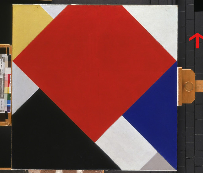
Theo van Doesburg - Counter-composition V, 1924. Oil on canvas. Centre for Fine Arts (BOZAR), Brussels.
The word counter also referred to was a sort of counter-revolution against the work of Mondrian. As subtle as these changes seem in retrospect, they were monumental at the time. They allowed van Doesburg to create far more elaborate compositions than the austere pictures Mondrian was painting. Some of his counter compositions featured square shapes turned in all sorts of configurations, even counter to each other. Others featured horizontal, vertical, and diagonal lines layered over each other such that triangles and diamond shapes were created. Most horribly to the eyes of a purist like Mondrian was that the counter compositions seemed to show depth of field. The lines even sometimes ran over the top and through the middle of the colored shapes, creating the sense of illusionistic space. To the eye of a purist, this was blasphemy.
Famous Counter Compositions
One of the most famous, and simplest, of the counter compositions was “Counter Composition V.” Painted in 1924, this deceptively simple painting features nine colored shapes. The shapes appear to be horizontal rectangles and squares exactly like the ones Mondrian was painting, except that they have all been tilted exactly 45 degrees. For a color palette, van Doesburg appropriated the iconic yellow, red, and blue palette for which Mondrian was known, except van Doesburg also included one small grey shape in the bottom right edge of the frame. Were it not for that tiny shape, the color palette would have been exactly the same as that of Mondrian. Finally, van Doesburg butted the shapes right up next to each other, leaving out any reference to line whatsoever. By leaving out the lines, he was not only disavowing the notion that lines could only be horizontal or vertical, he was stating that they were not necessary at all. This was an insult to Mondrian, who was pious about the idea of how pure his compositions were. Van Doesburg was saying they are not as pure as they could be if you simply left the lines out altogether.
Another one of the most famous counter compositions was titled “Counter Composition VI.” Painted in 1925, this piece features a horizontal and vertical grid in the background with a diagonal grid layered over the top of it in the middle ground. In the foreground are three thick black diagonal lines insinuated over to the right side of the frame. The foreground lines are as thick as the squares in the background grid, a choice that asserts them not so much as lines, but as shapes. The supposition could be made that the lines in the background are intended to seem so far away that they appear thin—a trick of perspective. This composition also succeeded in expressing another important interest van Doesburg had, which was the love of architecture. He believed strongly that Elementarism should move towards the idea of creating a gesamtkunstwerk, or total synthesis of the arts. This picture is intentionally architectonic, suggesting notions of modern streetscapes, skyscrapers, and constructivist homes. Like all of the other paintings in the counter composition series, it is also a reminder that even though these paintings may seem benign today, hidden within them are the biggest ideas of a painter who wanted nothing less than to destroy his competition, and in the process, change the world.
Featured image: Theo van Doesburg - Counter-Composition XIII, 1926. Oil on canvas. 19 5/8 x 19 5/8 inches (49.9 x 50 cm). The Solomon R. Guggenheim Foundation Peggy Guggenheim Collection, Venice, 1976
All images used for illustrative purposes only
By Phillip Barcio
