Synthetic Cubism Explained - Planes, Shapes and Vantage Points
Pablo Picasso, the father of Cubism, was famous for his eagerness to evolve. After inventing Analytic Cubism in 1907, he easily could have just kept painting in that style for decades and still gotten rich and famous. But instead he kept experimenting, helping invent what became known as Synthetic Cubism in 1911 by adding to Analytic Cubism an expanded color palette, new textures, simpler shapes, new materials and by simplifying the use of viewpoint and plane. From the time of its invention until around 1920, Synthetic Cubism was considered the height of the avant-garde. It expanded the range of ways painters could explore reality and contributed to the rise of the Dadaists, the Surrealists, and even Pop Art.
Synthetic Cubism in 200 Words
Synthetic Cubism resulted from a departure from those very techniques, in an attempt to create something even more real. Picasso, Braque and the painter Juan Gris added a vibrant range of colors back into their works, reintroduced depth, and diminished the number of simultaneous perspectives and planes in their imagery. Most importantly, in order to give the ultimate sense of reality to their paintings, they started adding paper, cloth, newsprint, text, and even sand and dirt to their works, attempting to bring a total sense of their subject’s essence into play.

Pablo Picasso - Still Life with Chair Caning, 1912, Oil on oil-cloth over canvas edged with rope
Musée National Picasso, Paris, © Artists Rights Society (ARS), New York
New Materials and Techniques
In 1912, Picasso created the work of art that’s considered to be the first example of collage, and a defining example of Synthetic Cubism: Still Life with Chair-Caning. The work is a Cubist representation of a café table with a selection of food items, a newspaper and a drink. In addition to traditional mediums, Picasso added to the surface of the painting a section of the wicker chair-caning that was traditionally found on café chairs. This seemingly trivial addition had tremendous consequences for Modern Art. Rather than painting a chair, part of a chair was actually put onto the painting. Rather than showing something from multiple perspectives in order for it to seem real, Picasso just put the actual thing, or at least part of it, directly onto the work.
Picasso also added text to this piece, writing the letters “JOU” across part of the surface. This word “Jou” literally could be translated as “game” in French, a fact which has contributed to the sense many people have that Picasso intended Synthetic Cubism to add a sense of frivolity back into art after the academic seriousness of Analytic Cubism. However, “JOU” could also easily have been intended as the first part of the French term for daily newspaper, or journal, a reference to the fragment of newspaper seen in the picture.
Though he achieved a first by adding that bit of chair-caning to his piece, Picasso wasn’t the first Cubist to add text to a painting. In 1911, Georges Braque had created a work called The Portuguese, which was the first Cubist work to introduce lettering. Evident in both Picasso’s first collage and Braque’s first textual piece is a shift away from the serious and overly complex nature of some of their later Analytic Cubist works. There’s a whimsical simplicity to the imagery on these artworks. The perspectives are simplified and the images are becoming almost playful, similar to the anthropomorphic images in advertising pictures.

Georges Braques - The Portuguese, 1911, Oil on canvas, Musée National Picasso, Paris
© Artists Rights Society (ARS), New York
In 1912, Braque would break new ground at least two more times. That year he became the first Cubist painter to add sand to a painting in order to add levels of texture and depth to the work, and he also became the first to incorporate the technique known as papier colles, which refers to the pasting of cutout pieces of paper onto a surface. Both of these techniques were used in his work titled Fruit Dish and Glass. In this painting he applied cut out pieces of wallpaper directly to the surface and then shaded the piece using paint filled with sand, adding depth and texture to the image.
Braque also included text in this piece, using the clearly defined and easily readable words “Ale” and “Bar.” These words challenge to the lines separating advertising imagery and so-called high art. The combination of all three of these techniques would eventually prove to be a major influence on the Dadaists, who relied heavily on collage and text to confuse and obfuscate the apparent meanings in their works and to challenge Bourgeois notions of art.

Georges Braque - Fruit Dish and Glass, 1912, 62.9 × 45.7 cm
© Artists Rights Society (ARS), New York
Planes, Shapes, Vantage Points and Colors
The artist most responsible for bringing vibrant colors into Synthetic Cubism was the Spanish Cubist painter Juan Gris. Gris also utilized a substantially simplified visual language that superbly demonstrates the reduced number of vantage points and the simplified use of forms and planes that defines Synthetic Cubism. In Gris’ work Newspaper and Fruit Dish, we see all of these elements in play. We can also see in this same painting many of the reasons that Synthetic Cubism is often seen as the pre-curser to Pop Art.
It’s not only that the Synthetic Cubists played with notions of the blurred line between low and high art, and art and advertising. This painting also amazingly evokes the Ben-Day dots of Roy Lichtenstein, and appears to almost identically foreshadow the repetition, image placement and color palette of Robert Rauschenberg’s buffalo II.

Robert Rauschenberg - Buffalo II, 1964, Oil and silkscreen ink on canvas.
© Robert Rauschenberg Foundation / Artists Right Society (ARS), New York
The earlier Analytical Cubist paintings had incorporated so many different points of view that the complexity of the images became almost impossible to unravel. Their subject matter seemed abstracted to the point of being unrecognizable: each point of view was represented by separate geometric shapes on a separate plane and each plane seemed stacked atop the others and then flattened again. And the geometric shapes utilized in Analytical Cubist paintings seemed almost transparent at times. They were painted in a way that demonstrated speed, vibration and movement. They represented different times of day, different lighting and different viewpoints.

Juan Gris - Newspaper and Fruit Dish, 1916, Oil on canvas
Solomon R. Guggenheim Museum, New York
By adding a vibrant color palette back into Cubist pictures, Juan Gris gave the style a sense of playfulness and excitement that was lacking from those earlier Cubist works. And Gris’ simplified visual vocabulary presented the notion that Cubism could accomplish its goals in a straightforward, simplified, and aesthetically pleasing way. In Gris’ painting The Violin, he accomplishes the absolute bare minimum number of vantage points, shapes and planes in order to still be considered a Cubist work. The resulting image seems more like an example of the suggestion of Cubism than the rigorous definition of it.

Juan Gris - The Violin, 1916, Oil on three-ply panel
Kunstmuseum, Basel
Synthetic: Another Word For Fake?
By adding writing and bits and pieces of everyday objects into their paintings, Picasso, Braque and Gris were striving to connect with an enlarged sense of the realness of their subjects. But by adding those artificial elements to their works they were also creating something that was patently unreal, and unlike any of the Cubist works of art that came before. Sometimes they even painted forms that looked like collage, intermingling mimicked collage elements with real collage elements in the same work. This new style was named Synthetic Cubism precisely for that reason, because of the artificial nature of the techniques being used relative to the seriousness of the Cubist work that had come before.
Synthetic Cubism was more symbolic than Analytical Cubism. It did not strive to achieve a heightened view of four-dimensional reality. Rather it strived to achieve a hint at reality, but in a distorted way. It was a transformation that contributed immensely to the theories and investigations surrounding Surrealism.
Synthetic Cubism also challenged the differences between painting and sculpture. Instead of breaking the image apart and then reassembling it from a number of different perspectives, Synthetic Cubism assembled the image, building it up from a flat surface into a multi-layered object, like a three-dimensional object resting on a two-dimensional surface. In all these ways, Synthetic Cubism approached its accomplishments by way of a clear and intentional paradox: By making work that was ever more false they achieved something ever more real.
Colour, Collage and Constructed Space in Contemporary Art
Synthetic Cubism also offers a way of looking at contemporary abstraction. A painting need not depict a guitar or a café table to raise questions about assembled shapes, overlapping planes and the relationship between an image and its surface. The following artists approach those questions in distinct ways. Their works are not examples of historical Synthetic Cubism, but invite comparisons with its experiments in construction and colour.
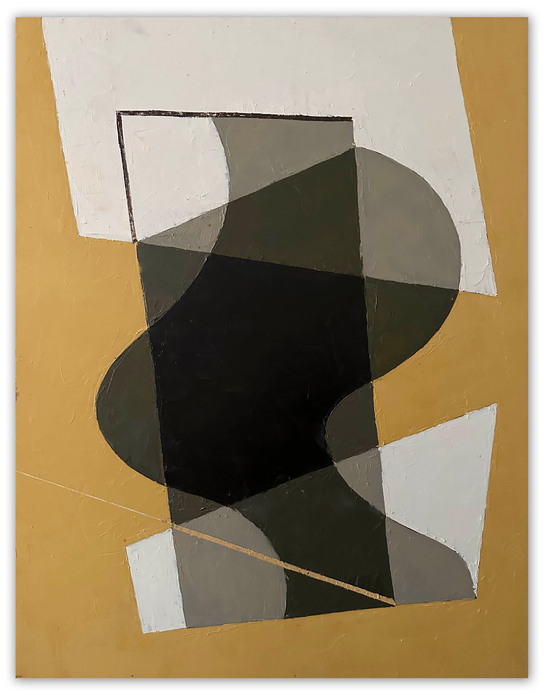
Jeremy Annear: Layered Planes and Pictorial Space
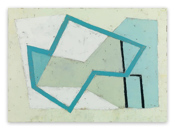
Jeremy Annear builds his paintings through layers of shapes, colour and paint, and his work shares acknowledged affinities with Braque and Picasso as well as the artists of St Ives. In Metrographic II No.8, an angled white plane interrupts an earthy field, while black frameworks, red curves and patches of texture establish competing spatial relationships. The eye moves between the apparent solidity of the shapes and the openness of the drawn lines. For a reader drawn to Braque's interplay of surface and structure, this offers a contemporary point of comparison without reproducing Cubist subject matter.

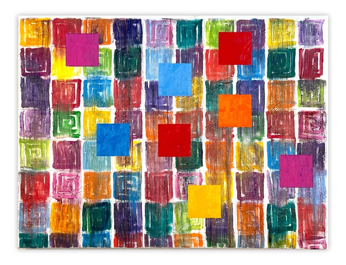
Dana Gordon: Colour Shapes Within a Larger Whole
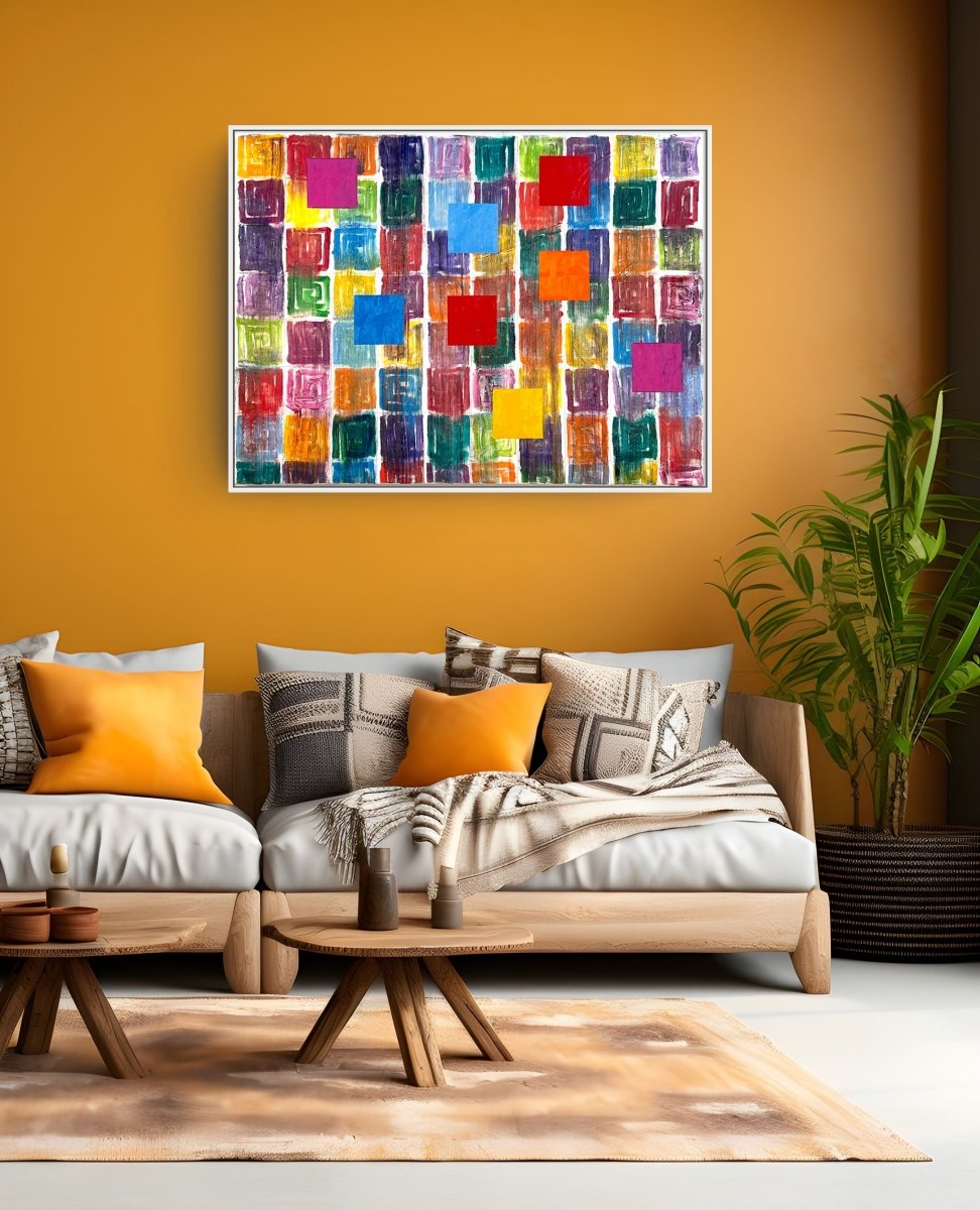
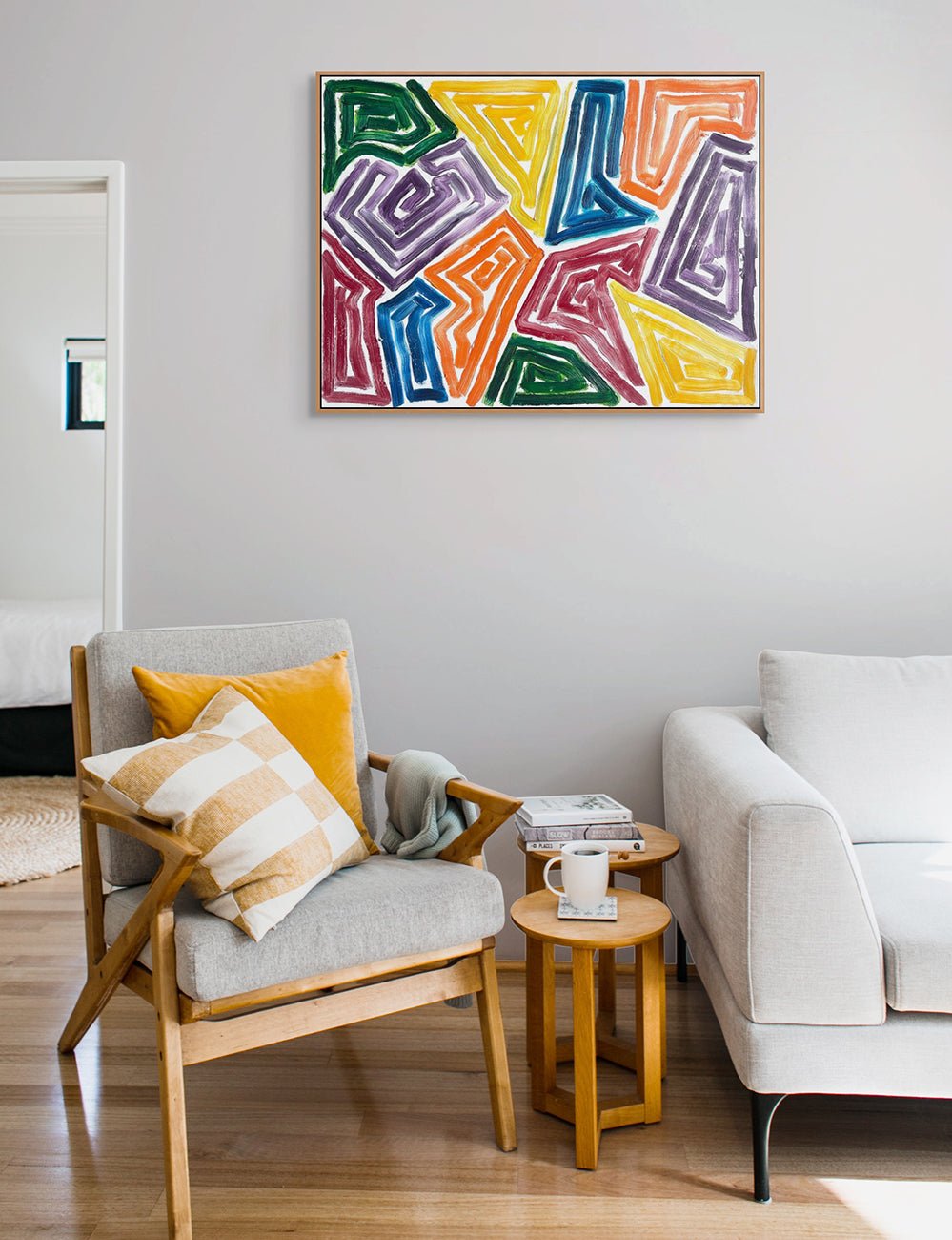
Dana Gordon's kaleidoscopic compositions have been described in relation to Orphic Cubism, a distinct comparison rather than a synonym for Synthetic Cubism. His work offers another route into the pleasure of colour and constructed form discussed here. In New Space, solid coloured squares punctuate a dense grid of painted spiral motifs. These quieter blocks seem to float over the busy surface, creating a tension between individual shapes and the composition as a whole. Gordon thinks of adjoining shapes and clusters as little paintings within a larger painting, an idea that rewards looking closely as well as from a distance.

Anne Katrine Senstad: Collage from Scanned Colour Negatives
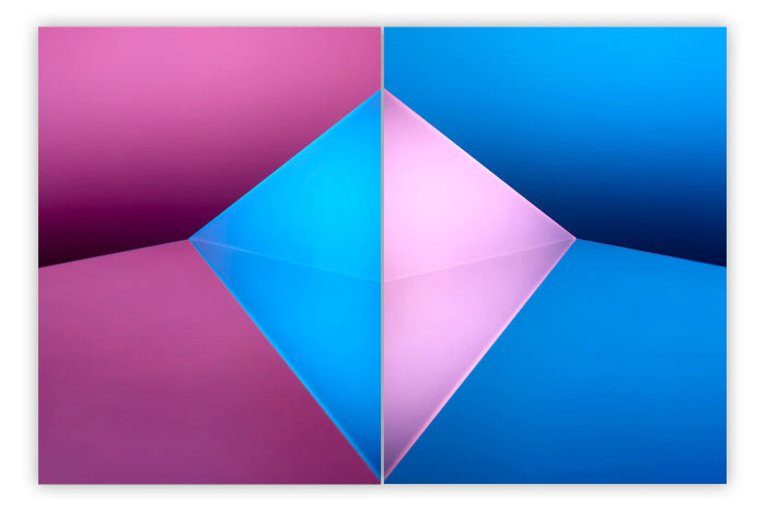
In Anne Katrine Senstad's Cosmosis Collages, construction takes a photographic form. As the artist explains, her source negatives were scanned and then collaged, not photographed. They originate in her early abstract colour-field photographic works, The Pink Project (2004–2007). In Composition no 2C4 Blue, slender pink, peach and yellow bars cross a deep blue field, while translucent rectangular planes suggest layers beneath the surface. Colour and placement, rather than a depicted object, establish the composition's spatial relationships. Unlike Braque's pasted paper, these elements are assembled through a scanned photographic process. With its documented Suprematist and Constructivist inspirations, the series provides a contemporary comparison with collage's capacity to generate an image through relationships between separate elements.

Collecting Contemporary Abstraction: Materials, Price and Context
For someone considering an acquisition, these comparisons can help clarify taste. Is the attraction to a textured surface, a rhythmic arrangement of colour, or the illusion of overlapping planes? Identifying that preference is a more useful starting point than seeking a contemporary work simply because it resembles a famous historical painting.
What Should You Look for Before Buying?
Begin with the individual work: its materials, dimensions, condition and documentation. Ask how it sits within the artist's wider practice, and review the exhibition history and collection records supporting its presentation. For layered paintings or mixed-media works, request close-up photographs and information about surface construction. For a photographic edition such as Senstad's selected Cosmosis work, offered in an edition of six plus two artist's proofs, establish the edition details, printing specifications and accompanying documentation. A photographic collage and a unique painting may share visual concerns while being very different objects to own.
How Should You Think About Price and Market Value?
Historical importance, visual affinity and market value are separate questions. A contemporary artist's relationship to Cubist ideas does not place their work in the same market as an original Picasso, Braque or Gris. When comparing prices, look for genuinely comparable works by the same artist, taking account of medium, scale, date and whether the work is unique or editioned. An asking price is not the same as a realised sale price, and a limited edition does not by itself establish future demand. Exhibition history and critical recognition provide context, not a promise of appreciation or an easy resale.
What Does Living with the Work Involve?
Consider framing, delivery, insurance and any specialist installation alongside the purchase price. Ask for care guidance appropriate to the materials, particularly for photographic surfaces and layered constructions, and think about the light and space in which the work will be displayed. The most rewarding connection to art history may ultimately be a personal one: understanding why a work holds your attention, and discovering how its colour, structure and surface continue to change through repeated looking.
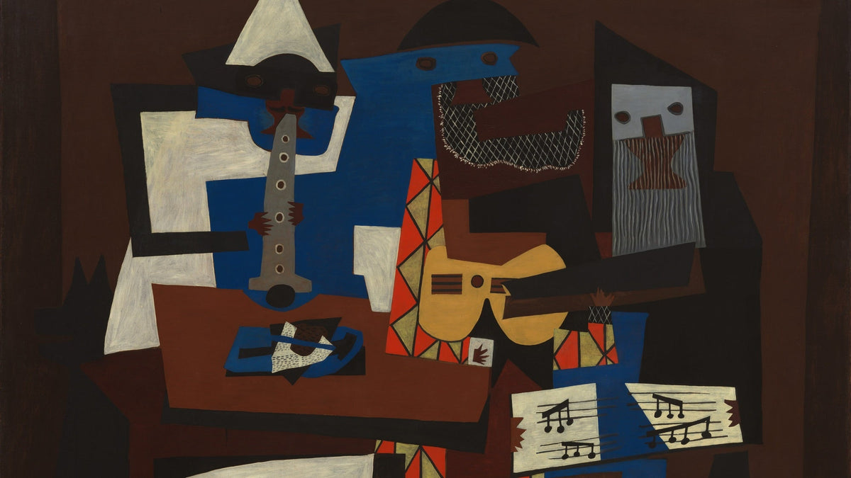
Featured image: Pablo Picasso - Three Musicians, 1921 (detail), ©Artists Rights Society (ARS), New York
All images used for illustrative purposes only
By Phillip Barcio (2016)
Edited by IdeelArt Editorial (2026)
Related Artworks