What is Hidden Inside an Abstract Design of a Painting
We have written before about the elements of art, such as line, color, texture, etc. Design principles are what we use to describe the ways those elements collaborate within a visual composition. Abstract art design principles are hardly different than representational art design principles, but abstract art designs can often elucidate the general principles of design in a more straightforward way since there is no narrative subject matter to interfere with a formal interpretation of the work. Ironically though, by analyzing the work from a formal design perspective, enhanced or hidden meanings in the work can sometimes be revealed.
Abstract Composition Defined
To compose something means to assemble it. In visual art, a composition means the entirety of an aesthetic phenomenon. In the case of a painting, it refers to all of the artistic elements of the work when considered as a unified whole. Sometimes abstract compositions are meticulously planned out. Other times they come together intuitively or are reworked later. In any case, they are formed thanks to the exclusive choices an artist makes when arranging visual elements to achieve desired effects.
The judgment of good versus bad compositions is subjective. Nonetheless, several basic compositional strategies are recognized as being reliably pleasant to human eyes. For example, compositions in which the dominant visual elements are arranged into a recognizable shape such as a triangle or a cross are pleasant because they seem stabile; all-over compositions, which cover the entire picture plane with unique, yet non-dominant visual elements, feel harmonious; grid compositions, in which visual elements adhere to systematic horizontal, vertical or diagonal arrangements, are pleasing because they are symmetrical. Whichever compositional strategy an artist chooses, the nine basic design principles help determine how each composition is perceived.

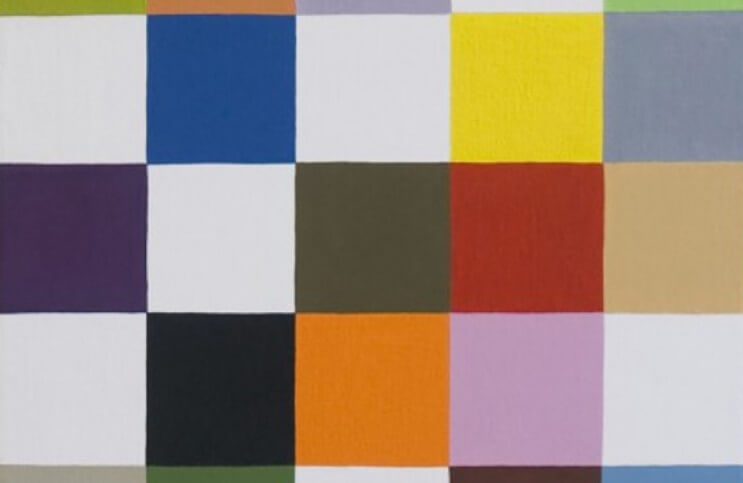
The compositional unity of L19. Voyage Des Couleurs, by Jose Heerkens, is based on a grid
Unity
When we call a composition unified, we mean no single element of the piece distracts us from comprehending the artwork as a whole. Individual elements might stand out or be dominant, but if the work is unified, all elements fit into the overarching aesthetic scheme established by the artist for the piece.

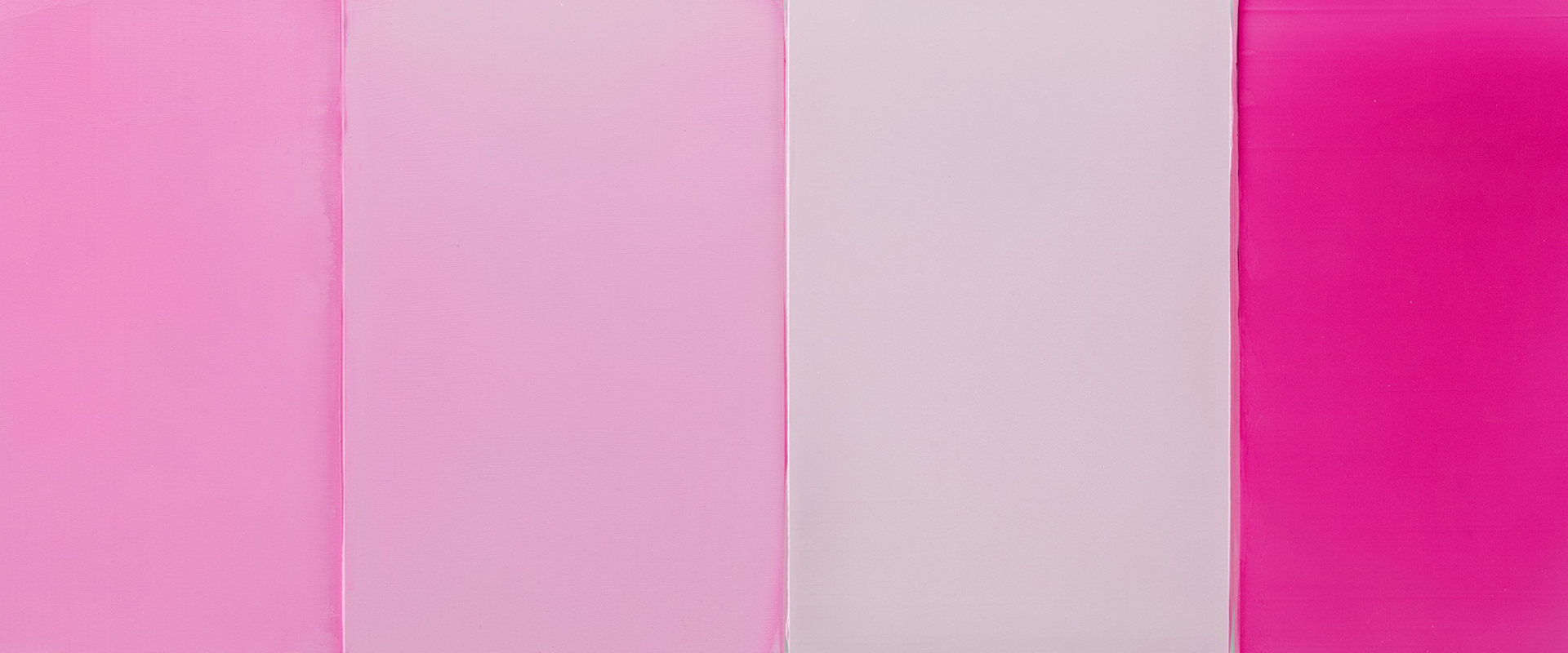
Flat 68.12, a dimensional wall hanging by Tilman, contains disparate elements that nonetheless become unified by following the visual vocabulary the artist created, based on vivid, flat color and rectangular forms
Balance
A composition is balanced when the artist has ensured that each area of the work, whether it contains the focal point or not, holds its own visually, contributing to the overall composition without dominating it. Types of balance include radial balance, in which all elements radiate out of the center of the painting; formal balance, in which the composition is precisely equalized, such as with the Rule of Thirds; and asymmetrical balance, in which elements are arranged in an off kilter, yet equally important way.

String Burst, by Tenesh Webber, is representative of radial balance within a composition.
Dominant Emphasis
The dominant emphasis is the element of an artwork that the artist wants to be the center of interest for a viewer. In photography, the dominant point of emphasis can be controlled by what the photographer allows to be in focus. If the dominant emphasis is color, the composition should be designed in such a way that no other elements are allowed to compete with color for attention.

Barnett Newman - Vir Heroicus Sublimis, 1950-1951. Oil on canvas. 7' 11 3/8" x 17' 9 1/4" (242.2 x 541.7 cm). MoMA Collection. Gift of Mr. and Mrs. Ben Heller. © 2019 Barnett Newman Foundation / Artists Rights Society (ARS), New York
Contrast
The thoughtful arrangement of contrasts can result in harmony. Even a monochrome painting or a blank canvas contains contrast between itself and its surroundings, or in the way it creates shadow when exposed to light. Contrast is variety. It is the presence of any opposing or complimentary elements. Even a single element, such as texture, color or tone, can, on its own create contrast by the juxtaposition of itself with the empty, or negative space around it.

In Grotto, an all-over composition by Anthony White dominated by green hues, harmonious contrast is created by an area of black and white in the lower left and hints of under colors along the edges
Movement
Although some paintings actually incorporate moving elements (like Kinetic Art), or simulate movement through optical illusions (like Op Art), in design, movement refers to how a composition causes the eye to scan an artwork. Two ways to cause the eye to move around a composition are perspective, which pulls the eye into illusory space, and bridge elements, which can connect various points of interest, giving the eye a line to follow from one to the other.

Dana Gordon - Night, 2012. Unique. Oil on canvas. 152.4 x 198.2 cm
Repetition
When elements are repeated they can create a larger sense of themselves. One horizontal line could be an actual horizon. Ten horizontal lines repeated variously throughout a painting evoke an entirely different idea about lines in general.
Pattern
When a formal element is repeated in exactly the same way in various areas of a composition it can become a pattern. Six circles in various sizes—that is repetition. Six identical circles spaced perfectly apart from each other in a line—that could be a pattern.

In (R)evolution 20 by Tracey Adams, the circular elements repeat. We are tempted to see patterns in their repetition, but the varying colors and values confuse the ability of obvious patterns to emerge.
Rhythm
When one or more of the other elements of design is repeated, that can create the visual equivalent of a rhythmic beat in music. For example, if an established pattern manifests in multiple areas of a painting, it builds into a visual rhythm.

Repetitive shapes and patterns create rhythm in these paintings by Jessica Snow
Proportion
In a realistic portrait, proportion could refer to the balance of physical human features. In an abstract artwork, proportion describes whether all elements of design coalesce in a way that makes sense according to the visual language established by the artist.

This detail shot of Permanent Maintenance, an installation by Peter Soriano, reveals design principles including pattern, repetition, balance, rhythm, movement and contrast, working together toward a proportional, unified aesthetic whole.
Featured image: Jessica Snow - Seven Square White (detail)
By Phillip Barcio
