The Genius of Blinky Palermo
When I think of Blinky Palermo I think of two things: the incomplete becoming complete, and the underestimated becoming profound. If you know the life story of this artist, you might think I am trying to be poetic or allegorical. After all, he became suddenly famous right out of art school then died mysteriously on a trip to the Maldives at age 33. In that short time, he burned through two marriages. He was evidently a heavy drinker and occasional drug user. Allegedly, his death had something to do with a drug he was taking to get off the booze. Since he was cremated in Sri Lanka, the full details of his demise may never be known. But we do know Palermo lived a true rags to riches story. Born Peter Schwarze in 1943, in Leipzig, Germany, he was given up by his birth mother during the height of World War II to a family she knew named Heisterkamp. When Peter was nine, his adopted family fled East Germany for West Germany. Six years later, his adopted mother died. Peter was 21 when he changed his name to Blinky Palermo. He was in art school, studying under the great Conceptual Art pioneer Joseph Beuys. Beuys famously told his students that to change their art, they should change themselves. So Peter Heisterkamp took the name Blinky Palermo after the American mobster and boxing promoter Frank “Blinky” Palermo, who at the time was three-and-a-half years into a seven year sentence for conspiracy and extortion. The artist and the mobster shared a faint physical resemblance. But I have also always taken the name choice as a sort of brash statement about the similarities shared by mobsters and artists, who both beg, borrow and steal to get ahead. Yet when I say that the art Palermo created makes the incomplete complete, and the underestimated profound, it has nothing to do with any of that drama. It solely has to do with the material qualities of his work.
Material Differences
Palermo left behind a surprisingly prolific oeuvre in his short career. That oeuvre is evidence of an artist with both sensitivity and restraint; someone who had a simple talent for bringing out the inherent beauty of materials, and for taking the best ideas of his time and making them his own. One of the most common insults I hear critics (and some artists) hurl at Palermo is that his work is derivative—it riffs on the work of other artists, such as Sol LeWitt, Richard Tuttle, and Kazimir Malevich. Indeed, one of the greatest early paintings Palermo made was called “Composition with 8 Red Rectangles” (1964). The name is almost identical, minus parenthesis, to a painting Malevich painted in 1915, called “Composition (With 8 Red Rectangles).” Both works feature eight red rectangles hovering in the void of a white background. But both are also distinctively different. Malevich achieved dynamism and perfect flatness. Palermo achieved stillness, and infused his painting with expressionistic brushwork. The Palermo painting somehow looks older than the Malevich painting, even though it was painted 49 years after.
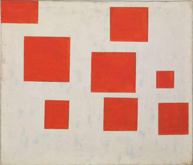
Blinky Palermo - Komposition mit 8 roten Rechtecken (Composition with 8 Red Rectangles), 1964. © Blinky Palermo
As for the charge of ripping off his contemporaries, Palermo definitely made work that was in the same aesthetic realm as that of LeWitt, Tuttle, and many other artists of his generation. A commonly cited example is his “Miniatures” series, which features tiny, stencil printed geometric compositions in the center of rectangular sheets of handmade paper. These works look almost identical to a series of works by Tuttle, except that the Tuttle pieces are collaged, not stenciled or printed. This may not seem like a huge distinction, but the central idea that guides Tuttle in his studio is that method holds primacy over content, so whereas the scale and visual vocabulary of the two bodies of work are obvious, the unique methods of their creation sets them apart.
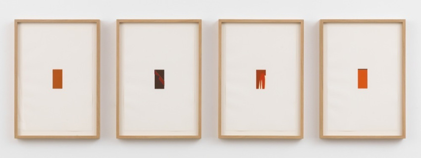
Blinky Palermo - Miniaturen II, 1975. Set of four (4) color foil embossings, title page, and justification on watercolor paper, bound. 15 1/2 × 10 1/2 in; 39.4 × 26.7 cm. David Zwirner Gallery
Simple Pleasures
Perhaps the most universally criticized bodies of work that Palermo made—the works the haters just love to hate—consists of pairs of painted geometric shapes either hung on the wall or leaned against the wall next to each other. In one such work, Palermo placed a tall vertical board against the wall beside a small circle. Both were painted the same color. In another piece, a tall vertical black piece of wood hangs on the wall beside a white aluminum trapezoid. One critic panned these pieces, saying, “The standard error was in assuming that things put together would just naturally go together, in meaningful ways.” But I see them quite differently. A line and a dot, or a line and a trapezoid, could be assembled into infinite potential combinations. They could assert some symbolic meaning. Or they could be scattered randomly. Palermo made choices that denied these arrangements meaning. He forced viewers to take the objects at their face value as things that are simply interesting to look at. To me, it is their differences that are compelling.

Blinky Palermo - Untitled, dedicated to Thelonius Monk, 1973. Two triangles: A: Casein paint on wood B: Casein paint and mirror on wood. 8 1/2 × 12 1/2 × 1 1/10 in; 21.6 × 31.8 × 2.9 cm. Edition of 30. Carolina Nitsch Contemporary Art, New York
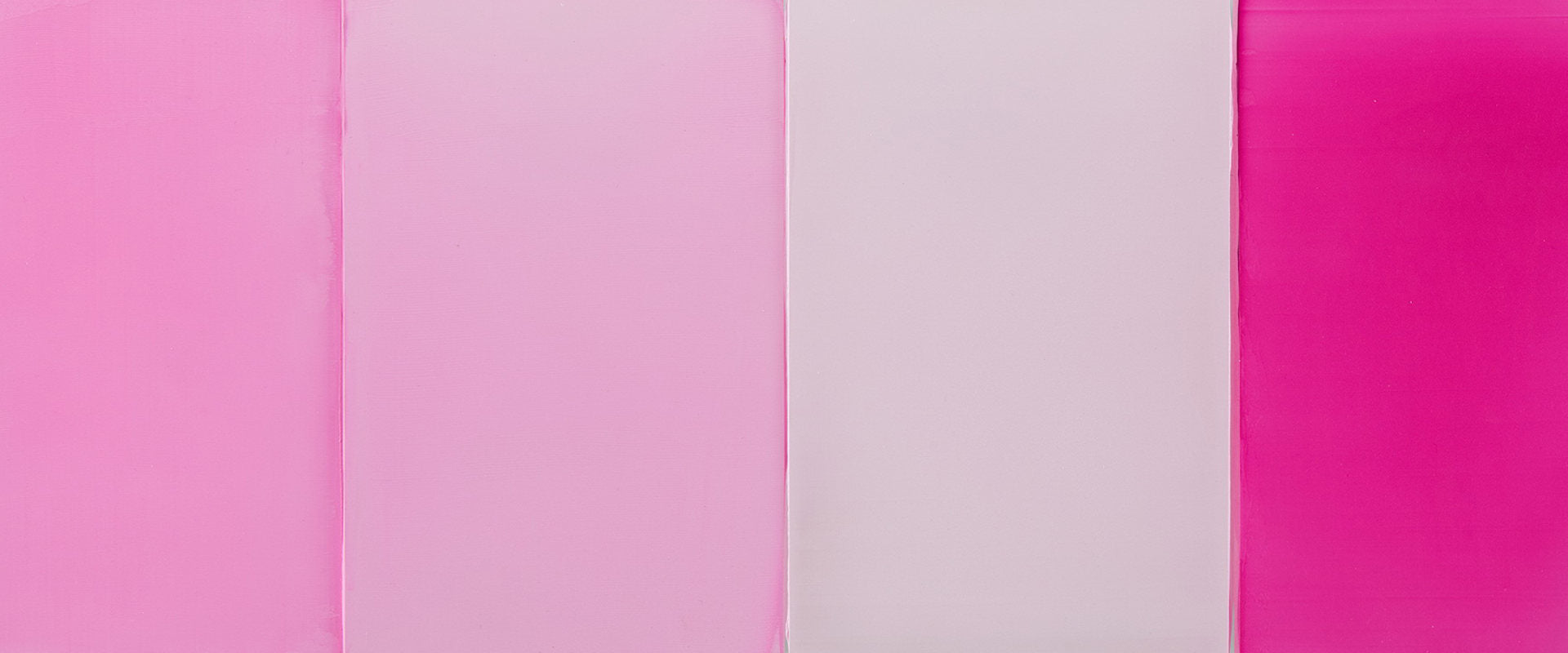
The most pleasant reminder Palermo gave us that everything exists in contrast with something else is in the final work that he made: a series called “To the People of New York City.” Palermo completed the series in 1976, just a year before he died. It currently also happens to be on view at Dia:Chelsea in New York through 16 February 2019. The work is evocative of the time Palermo spent living in New York. He painted the 40 rectangular aluminum panels right after returning to Düsseldorf. Each of the panels is painted in various geometric compositional variations with the colors of the East and West German flags (today it is just called the German flag). Surely there is, in fact, symbolism and meaning inherent in this piece. It references all three of his adoptive homes. But it is also a straightforward visual example of geometric abstraction and minimalism. In my opinion it is the perfect demonstration of what I find brilliant about Palermo. Together, the 40 individual compositions become complete. Together, they become profound.
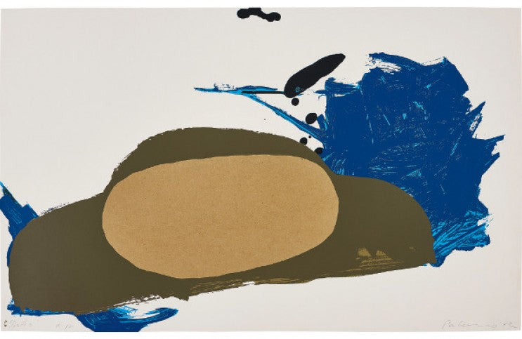
Featured image: Blinky Palermo - Auto, 1971. Screenprint in colors with collage, on smooth wove paper, the full sheet.
14 3/10 × 22 4/5 in; 36.2 × 58 cm. Edition of 150 + 30AP
All images used for illustrative purposes only
By Phillip Barcio
