The Power of Piet Mondrian’s Composition with Red Blue and Yellow
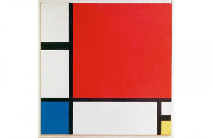
Piet Mondrian painted “Composition with Red Blue and Yellow” in 1930. It marks a subtle turning point in the evolution of his distinctive, singular style of painting, which he called Neo-Plasticism. His visual voice came about through a meticulous, daily striving towards complete abstraction, which he believed was a way to express a universal purity through the plastic arts. It was in 1920, the same year he published his book Le Néo-Plasticisme, that Mondrian painted his first grid paintings, featuring the black horizontal and vertical lines and rectangular fields of pure color for which he is now most known. Early on in his exploration of this unique position, Mondrian experimented with multiple colors and tones, and explored a wide variety of configurations for both his canvases and for the shapes within his compositions. By the time of his death in 1944, he had arrived at a fantastically complex and mature vision, embodied by his masterpiece, “Broadway Boogie Woogie.” It was in the middle of that evolution that he painted “Composition with Red Blue and Yellow.” It may not be obvious why this work is remarkable, or why it marks an important turning point. But there are some aspects of it that clearly set it apart from so many other paintings Mondrian made, and which signal a point in his development when Mondrian himself was becoming transformed.
Reading the Lines
Some people say that in order to understand the true message of what a person is saying you have to read between the lines. In the case of “Composition with Red Blue and Yellow” it is the lines themselves that carry a hidden message. It is well known that Mondrian sought balance in his work. He wrote extensively about compositional harmony as a reaction against chaos. He achieved that sense of harmony by relentlessly seeking balance between the plastic elements of his pictures. The placement of colors, the size of the shapes, and the qualities of the surfaces played off of each other in ways that either left him feeling off-balance or in balance. The quest was always to discover the perfect point at which a composition achieved a sort of stillness.
Yet over time, Mondrian began to despise the very sense of stillness that he once sought. His later paintings that he created in New York, which were inspired by the motion of the city and the energy of jazz music, seem almost to vibrate and hum. “Composition with Red Blue and Yellow” marks a beginning point in his ability to endow his pictures with that energy. The secret hides in the lines. It may almost be imperceptible upon first glance, but if you look at the black lines in this painting, you will see that the line in the upper left of the composition is double the thickness of the other lines. Mondrian believed that this choice, to make one of the lines double wide, gave life to his composition. He was transforming his thoughts away from the belief in stillness as a universal necessity, and towards the idea that even a completely abstract and harmonious composition needs energy in order to feel alive.
Hanging in the Balance
Despite the quest for energy and movement that Mondrian expressed with his double wide line, “Composition with Red Blue and Yellow” is nonetheless a supreme manifestation of pictorial harmony. In a strange kind of way, in fact, the energy infused into the picture by the wide lines balances the other pictorial elements, which otherwise might have seemed too concrete. Namely, I am talking about the massive red square that dominates this image. The visual weight of this square echoes the perfectly square shape of the canvas. It almost evokes comparisons to a Malevich painting from decades earlier. It is tempting to see the red square as the subject of the work, which would have taken this painting outside of the realm of pure abstraction. Mondrian clearly was attempting to use as few other pictorial elements as he could in the composition. He went to the opposite extreme with the tiny yellow rectangle in the bottom of the canvas, and hit the mid-point with the blue rectangle. But it is weirdly the double wide line that suggests there is indeed more going on in this composition than simple colored shapes.
Another interesting aspect of this painting, at least to me, is that Mondrian left the fields of color unframed at the edges of the canvas. By no means did he always do this. Frequently, his rectangles are completely fenced in by black lines. By leaving the shapes open in this case, we are left with the idea that maybe the lines were never intended as frames. Maybe they were intended as fields of color equal to the other colored shapes. Or maybe they are intended to act as something concrete, and the color was intended to be perceived more like light—something ethereal filling empty space. In this painting since they are not edged by black lines, the colored spaces might expand forever into space beyond the edge of the canvas. If this is the case, it is almost as if Mondrian cropped an image he saw in his mind. I can imagine that rather than Mondrian being an all knowing narrator of a fictional visual world, he was more of a documentarian, seeing what was before him and editing it in such a way that we could all understand it the way he did. Perhaps that idea would annoy Mondrian, since he was adamant about his pursuit of pure abstraction. But that is partly what makes “Composition with Red Blue and Yellow” such a transformative painting. It not only transformed his own development as a painter—it also transforms our ability to interact with the legacy of his work in ways that defy even the expectations he had for himself.
Featured image: Piet Mondrian - Composition in Red, Blue, and Yellow. 1930. Oil and paper on canvas. 46 x 46 cm. Kunsthaus Zürich
By Phillip Barcio
