Color, Focus and Field in Kenneth Noland Paintings
A casual observer might confuse Kenneth Noland as a painter of designs. Indeed, the most memorable Kenneth Noland paintings express a limited range of shapes and patterns: circles, chevrons, diamonds, stripes and plaids. But contrary to that perspective, Noland was not at all interested in things like shape and design. The reason he returned to the same imagery again and again was because he believed repetition would invite viewers to ignore the shapes and designs, and focus instead on his true area of interest: the infinite potential of color and field.
A Journey to Style
In addition to being an excellent artist, Kenneth Noland is also an excellent example of the value of the G.I. Bill; a US Government program that allows discharged soldiers to attend university tuition free. In 1942, Noland joined the US Air Force at age 18. After returning home to North Carolina at the end of World War II, he used his G.I. Bill privileges to enroll at his local art school. That school happened to be the famous Black Mountain College, where many influential teachers from the Bauhaus had relocated when their academy shut down in response to Nazi interference.
While at Black Mountain College, Noland studied under Ilya Bolotowsky, who had been a protégée of Piet Mondrian, the founder of Neo-Plasticism. In the tradition of the Neo-Plasticists, Bolotowsky championed simple geometric patterns and pure colors. Noland also studied under Josef Albers, a leading Modernist theorist and painter, and a passionate student of color relationships. Noland absorbed the mentorship of his teachers and built on their ideas, developing a lifelong interest in the expressive capabilities of simple compositions made of vivid color.
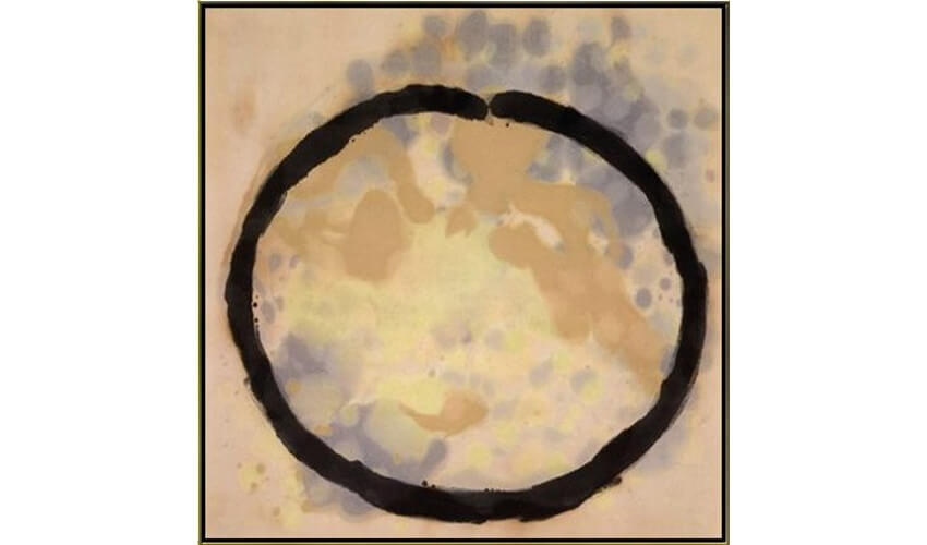 Kenneth Noland - Globe, 1956. Acrylic on canvas. 60 x 60 in. Collection of Cornelia Noland Reis. © Kenneth Noland
Post-Painterly Abstraction
Along with Morris Louis, Helen Frankenthaler, Clyfford Still, Mark Rothko and Jules Olitski, Kenneth Noland soon became associated with the Color Field movement, one of the artistic tendencies associated with what is called Post-Painterly Abstraction. Coined in 1964 by Clement Greenberg for a show he curated at the Los Angeles County Museum of Art, the term Post-Painterly Abstraction refers to a trend in painting away from painterly, impasto works, and toward flat surfaces and a lack of visible brushstrokes.
Though the term Color Field Painting suffers from a somewhat unclear definition, Kenneth Noland was the quintessential representative of Post-Painterly Abstraction. His paintings rejected the personal drama of Abstract Expressionism. They simplified the means of painting, rejecting collage, assemblage, found objects and other complexities, instead relying on the simplest of ingredients: paint and canvas. His colors were vibrant and pure, his compositions were direct and simple, and his images became one with their supports.
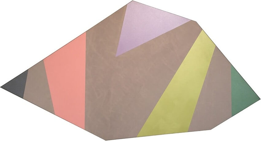 Kenneth Noland - Lapse, 1976. Acrylic on canvas. 75 x 141 in. © Kenneth Noland
Merging Color With Field
Noland created his first so-called Color Field Paintings around 1956. They consisted of concentric rings of colored circles. It is tempting to speculate that these paintings somehow related to his experience in the war, since they resembled targets. But in various interviews, Noland has said he chose the circle motif because it was a non-image that could allow the eye to be drawn into an experience of color. But color was not the only thing his paintings were about. They were also about confronting the separation between a painting and its surface.
For most of art history, paintings have been seen as images painted on top of prepared surfaces. The field on which the painting exists, i.e. the canvas, was pre-sized, pre-stretched and primed. It awaited the painting, supported it, and was separate from the image. In the minds of painters like Noland, that separation was a detriment. Rather than enjoying free, unhindered expression, the artist was restricted or directed by a predetermined support despite the fact that the ensuing image may as yet be unimagined. Noland wanted to merge the image with the support combining color with field in a unified aesthetic statement.
 Kenneth Noland - Morning Span, 1963. Acrylic on canvas. 103.7 x 142.5 in. © Kenneth Noland
The Unified Expressive Object
Noland received his revelation in 1953, in the form of a studio visit with the painter Helen Frankenthaler. In her New York studio, Frankenthaler had pioneered what she called the soak-stain technique. Rather than priming a pre-sized canvas in preparation for a painted image, she spread raw swaths of canvas out on the floor and then poured paint directly onto the unprimed surface. The paint merged with the surface, spreading out in organic ways across the surface as it merged with the fabric. The paint and the support became one entity.
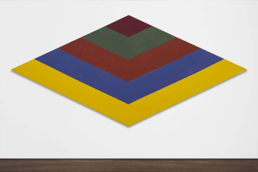 Kenneth Noland - Mach II, 1964. Acrylic resin on canvas. 98 x 208 in. © Kenneth Noland
Noland immediately adopted the Frankenthaler soak-stain technique. It afforded him the chance to create a unified object, with which the color was embedded. It also enabled him to eliminate the appearance of brushstrokes, which were seen as the mark of the personality of the artist. Together these two advances allowed him to begin making paintings that focused not on depicting anything specific, but were about the essential elements that preoccupied him, such as color, surface, texture, symmetry and scale.
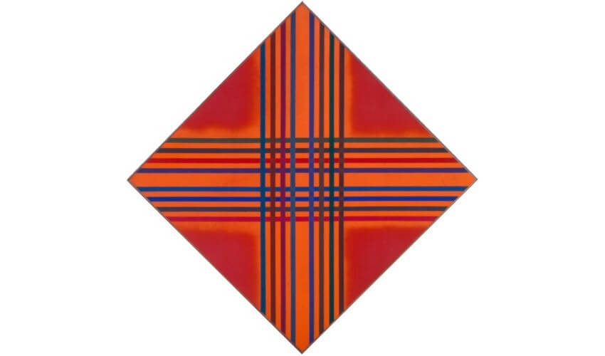 Kenneth Noland - Interlock Color, 1973. Acrylic on canvas. © Kenneth Noland
Cropping
It has been well documented that Noland, as well as his contemporary Morris Louis, adopted the soak-stain technique from Helen Frankenthaler. But there is another technique Kenneth Noland adopted later in his career that also may have been inspired by Frankenthaler. That is the practice of cropping. In photography, to crop an image means selecting only the part of an exposure that you want to print, revealing only what you like. Many photos of Frankenthaler in her studio show her working on massive unstretched canvases. She cropped and framed her canvases after painting them, which allowed her to develop the image with as few constraints as possible then select whichever area she felt resulted in the most expressive object.This was a practice that Kenneth Noland used extensively, especially when he began making shaped canvases. He would work on a massive canvas on the floor and create color compositions without spatial limitations. This allowed him to explore color relationships freely without worrying about the final result. Once the process of creation and discovery was complete, he could then “stamp out” the final picture, selecting the area that he wanted to frame from endless possible options in what was basically an editing process. Noland referred to the beauty of this process in a 1977 interview with Diane Waldman for Art in America, saying, “A color could be on an edge of a picture or inside the space of a picture: the question of top, bottom, left, right became totally flexible as did the question of parallel or vertical or horizontal.”
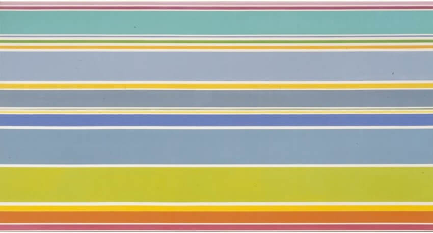 Kenneth Noland - Summer Plain, 1967. Acrylic on canvas. © Kenneth Noland
The Depths of Simplicity
Kenneth Noland periodically looked to sculptors in an effort to explore the abstract nature of color. The sculptor David Smith inspired him in particular, and Noland even occasionally collaborated with the sculptor Tony Caro, painting his sculptures after they were built. He did this purely out of curiosity, and in the spirit of experimentation. He could not express exactly what he was hoping to find, or what such experiments were intended to mean. He said, “We tend to discount a lot of meaning that goes on in life that's non-verbal. Color can convey a total range of mood and expression, of one's experiences in life, without having to give it descriptive or literary qualities.”
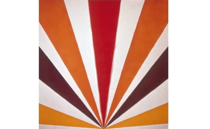 Kenneth Noland - Cadmium Radiance. © Kenneth Noland
People with a penchant for the elaborate might find it easy to dismiss a career based entirely on simplicity and curiosity. Kenneth Noland paintings indeed seem to contain no drama whatsoever. And yet they are expressive. They are like the wail of a child, the ring of a bell, or the scream of a siren. We recognize them immediately for what they are. We know they are asking us to react, though we may not understand their exact purpose or precisely what our reaction is supposed to be. But perhaps, as with bells, cries and sirens, a reaction by everyone is not necessary.
Featured image: Kenneth Noland - April (detail), 1960. Acrylic on canvas. 16 x 16 in. © Kenneth Noland
All images used for illustrative purposes only
By Phillip Barcio
