Notes and Reflections on Rothko in Paris by Dana Gordon
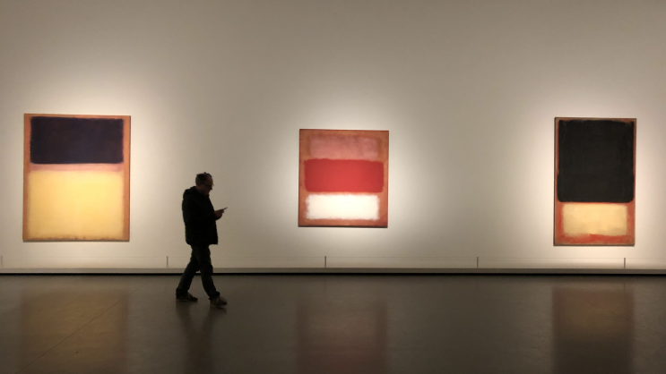
Paris was cold. But it still had its satisfying allure, beauty all around. The grand Mark Rothko exhibition is in a new museum in the snowy Bois de Boulogne, the Fondation Louis Vuitton, a flashy plasticky edifice designed by Frank Gehry. Its restaurant is called Frank. The galleries are fine, and the paintings respectfully displayed by restrained spotlighting in otherwise very dim galleries. Once your eyes adjusted, the work glowed in its own energy.
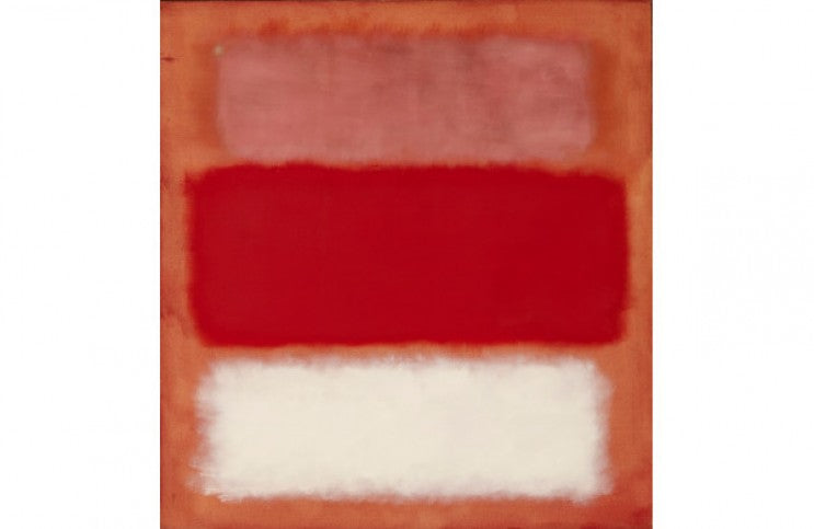
The first room you come across contains Rothko's masterworks from the 1950s. And masterworks they are. These years Rothko established his enduring format usually comprising two or three soft rectangular shapes one above another within the vertical rectangle of the canvas edge, an edge which seems almost irrelevant. In this work he used combinations from the full spectrum of colors at their most intense. For me, these works are his best. They have the most full expression of color possible. I found them easy to look at, drawing me to them, and they made me want to look at them longer and longer. The longer I looked, the better they got. This large room full of so many of them said that painting, these paintings, this man’s paintings – these thin films on flimsy surfaces -- were providing as deep and brilliant an experience as the world can provide. After leaving this gallery, I looked back and had the recognition, saying to myself, “He did it.”
After that room, I went downstairs to see his earlier work. First there were the paintings from the 1930s to the mid-40s. These were in general tight, airless, nearly colorless images of the city and a few people. Then we were given a selection of his surrealist-influenced abstract paintings. These showed a little more opening up but were mostly stringy, linear, and withholding.
Then it was as if Rothko dropped acid in 1947. The freed-up "multiforms" of soft floating shapes of color suddenly appear, open and free and glowing. These are the clear prologue to the emblematic "Mark Rothko" paintings we know, soon to arrive in the 1950s. What really happened was that he saw the Bonnard exhibition of December 1946-January ‘47. In the context of the miraculous years of 1947-1951 in which New York painting invented a new kind of abstraction, a new kind of painting (soon to be dubbed abstract expressionism) complete with its masterpieces, Bonnard's paintings catalyzed Rothko to his own great breakthrough.

Mark Rothko - Black On Maroon, 1958. Oil on canvas. 266.7 x 365.7 cm. Tate, Londres. Presented by the artist through American. Foundation of Arts, 1969. © 1998 Kate Rothko Prizel & Christopher Rothko - Adagp, Paris, 2023
Another catalyst occurs to me -- perhaps a thought-bridge too far -- is that the formats of the rectangles of color and light suspended in the vertical canvases were approximately of a 4-to-3 aspect ratio, which was the shape of most movie images in the 1920s to the 1950s. In the 1940s and 1950s, a new and striking quality of many such movies was the intense Technicolor color reflecting off the screen. Looking at Rothko’s rectangles brought to my mind the swirling grains of color you see when looking closely at these films.
After the 1950s room there is a 1960s room. This is stunning in its own way. The colors are on the whole darker, but still intense. Rothko is known to have said that he wanted his paintings to be dramatic experiences, not abstract decorations. This emphasis becomes clear here. In the 1950s works, the bright color is certainly dramatic, but the viewer’s experience is more of being absorbed in the delight and depth of color itself. An experience, to be sure, and dramatically strong, but not drama dominantly. In the 1960s work, the darkness of the color and the emphatic placement of the shapes – e.g., very bright at the top, everything else dark – shows the intent for drama through visual means.
Next is a room consisting of the mural panels made for the Four Seasons restaurant in the new Seagram skyscraper designed by Mies van der Rohe. Rothko was commissioned for this by Philip Johnson, architect and man-about-the-art-world in the 1960s. Rothko came to a realization that the paintings would decorate a boisterous high-priced restaurant patronized largely by corporate bigwigs, and after painting the paintings, he refused to release them. When you see them now installed in a room made for them, you can understand why he did so. These paintings almost eschew color and are made up by large, odd, excruciatingly dramatic shapes and darkness whose mood was nothing to eat dinner in.

Mark Rothko - No. 14, 1960. Oil on canvas. 290.83 cm x 268.29 cm. San Francisco Museum of Modern Art - Helen Crocker Russell Fund purchase. © 1998 Kate Rothko Prizel & Christopher Rothko - Adagp, Paris, 2023
Next and nearly last, the climax, or anticlimax, of the show are Rothko’s black and grey acrylic paintings of the late 1960s. These, to me, encompass a descent from the deep poignance of his successful breakthrough that lasted from 1947 into the late 1960s to an implacable desolation of his last years of depression. The paintings are divided more or less in half, black on top and light grey on the bottom. The surfaces are brushy, but nowhere near as finely nuanced as before. The acrylic paint is flat and only inertly reflects light (or as with the black absorbs it and doesn’t reflect it back), it doesn’t absorb and refract it back to you as the color in his oils did before. It doesn’t absorb you. It‘s a plastic barrier that keeps you out. All these paintings except one are bounded by a white line about ¾ inch wide along the edge of the canvas, clearly a border the width of masking tape. There’s also one where you can see the residue of the tape used to keep the edges sharp. These borders emphasize the edge of the painting within the painting and help to keep the flat shapes impenetrable. It’s true, one can usually imagine that black is deep space, but here it would be ignoring the paint’s effect. Some have said that these paintings were Rothko’s response to Minimallsm of the mid and late 1960s. Maybe, maybe not. In either case, they have almost nothing in common with, nothing left from, his previous brilliant color work. It was well known at that time that Rothko suffered from increasing, serious depression, which as we know soon led to his suicide in 1970.
I met Mark Rothko once, in 1968-69. I was working for his friend the sculptor Tony Smith and was detailed to pick up Mark and his family at his studio on East 69th Street and drive them out to dinner at Tony and Jane Smith’s in New Jersey. I and a friend were invited to stay for dinner and then drive the Rothko family back to New York. Stamos was a guest, too. And one of Tony’s Jackson Pollocks was on the wall behind the dinner table. I don’t recall the conversation, alas, except that it was nothing profound about art, just normal chit chat and Rothko contributed little (nor did I). I also recall that Rothko came across to me as under a pall, a shrunken black hole of depression. Like the late black and grey paintings, he emitted no energy and seemed to suck-in light, reflecting next to none. Perhaps this was especially striking to a young painter at the time, as it contrasted so much to the fine-grain swirling energy of light projecting from Rothko’s great work of the recent past. I knew his contemporaries felt similarly, helplessly saying little about it.
Dana Gordon is an American artist based in New York. His writing on art has appeared in The Wall Street Journal, the New Criterion, Painters’ Table, The New York Sun, Commentary Magazine, and the Jerusalem Post.
