The Abstract Character of Typography Art
Certain illusions must be maintained in order for civilization to continue. For example, modern currency has no intrinsic value. We maintain the illusion of money’s value in order to structure society in a reliable way. Language is also abstract. Sounds and symbols mean whatever we agree they mean. Typography art is one way that artists explore these abstractions that are inherent in our culture. It challenges our accepted ideas of what is meaningful and what is not meaningful by presenting written language out of its usual context, in uncanny ways, or juxtaposed with unusual or unexpected aesthetic counterparts. From Cubism to Dada to Conceptual Art to Pop Art and beyond, Typography Art has investigated our use of written symbols for 100+ years. It has expanded the boundaries and possibilities of what we perceive language to be and what we believe it can achieve.
Cubist Typography Art
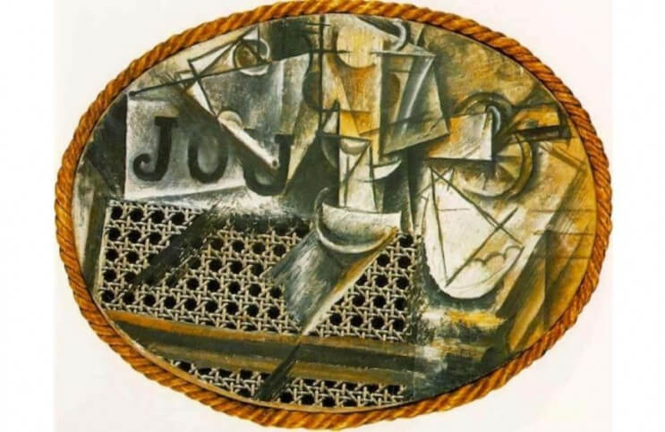
One of the first examples of Modernist typography art is Pablo Picasso’s Still Life with Chair Caning, created in 1912. This iconic work is also considered to be Picasso’s first collage, marking the beginning of Synthetic Cubism. The piece is evocative of the surface of a café table and includes elements of a drinking glass, a pipe, a newspaper and a café chair, among other items. In addition to being important to the evolution of Cubism, it is also a key to our understanding of typographic abstraction. The piece includes three painted letters that seem to spell out the word “JOU,” which in French can be translated as “game.” Or, JOU could be part of the phrase “Le Journal,” the name of most widely read newspaper in Paris at the time this work was made.
Since the imagery in Still Life with Chair Caning alludes to a newspaper, Picasso easily could have intended to reference Le Journal. But then again the text could have been a playful nod to visual or conceptual games. Another possibility is that the confusion between these interpretations was an intentional statement Picasso was making about the news media and its tendency to confuse meaning and intention in its reporting. In any case, the point isn’t to identify Picasso’s intent. The point is to acknowledge the lack of clarity. The whole question about the meaning of the work’s typographical elements identifies it as representative of the birth of Modernist typographic abstraction.

Francis Picabia - Dame! Illustration for the cover of the periodical Dadaphone n. 7, Paris, March 1920
Dada Art and Typography
Immediately after the rise of Cubism came the Dadaists, a group of artists devoted to confronting the absurdity of their civilization. The Dadaists relied heavily on collage as a visual medium, and included many abstract typographic references in their works. Francis Picabia was one of the most famous Dadaists to use typography. Trained as an expert realist painter, a poet and a typographist, Picabia knew well that the purpose of written language was communication. Yet he went to lengths in his Dadaist works to create uncanny, absurdist written compositions that could be interpreted in wildly different ways, or that could even be taken as gibberish.
Consider a cover Picabia made for the Dadaist periodical Dadaphone in 1920. The image is titled “Dame!” It includes an abstracted image of a spiral and several areas of text. The full translation of the text is: “Flesh that has drunk too much is a Neapolitan beef,” “the hands in the canonical shit,” “patching up her bed,” and “the lady’s drawbridge.” The meaning of the words is as unclear as the meaning of the spiral. Is the image meant to indicate a screw? Is it something playful, like confetti? Is it an image of mechanical progress? Is it a message of despair or progress? The text does nothing to clarify the meaning, adding levels of abstraction that achieve the opposite of what Picabia understood language as a medium is intended to achieve, which is clarity.
Jasper Johns and Typography
In the 1950’s the painter Jasper Johns rose to prominence for his abstract use of iconic cultural symbols, often including typographical symbols. Johns appropriated symbolic forms such as the American Flag and a target, exploring them in ways that re-contextualized them as abstract forms rather than meaningful symbols, divorcing them from their cultural meaning. Johns avoided explaining the meaning or purpose of his works, indicating that he intended them to be “finished,” i.e. interpreted, by the viewer.

Joseph Kosuth - One and Three Chairs, 1965, © 2017 Joseph Kosuth / Artists Rights Society (ARS), New York City
Johns famously incorporated the English alphabet as well as Arabic numerals in a large number of his works. He used these typographic elements as apparently meaningless subject matter for paintings that seemed to be more about formal qualities, such as surface, texture, dimensionality and painterliness than anything representational. He also incorporated words, such as the names of colors, painting them in, and juxtaposing them with different colors, confusing the meaning of the words. These typographical works challenged whether typography was a tool for communicating or whether it was simply a collection of forms that could be used abstractly the way geometric abstractionists had painted circles, squares, crosses and triangles.

Andy Warhol - Campbell’s Soup Cans, 1962, Synthetic polymer paint,cm x 41 cm, Museum of Modern Art, New York City, © 2017 Andy Warhol Foundation / Artists Rights Society (ARS), New York City
Conceptual Art, Pop Art and Typography
Johns’ work was influential on Andy Warhol, who famously combined symbolic and typographical elements in his works. Warhol’s Campbell’s Soup Cans, created in 1962, consisted of 32 separate prints, each representing one of the 32 varieties of soup the Campbell Company offered at that time. These works were flat, mechanically produced and utilized subject matter that was seemingly irrelevant. The text communicated nothing except for commercial branding. Through this abstracted use of typographic imagery, Warhol raised questions about the meaning, or meaninglessness, of both consumer culture and art.
Jasper Johns also influenced conceptual artists such as Joseph Kosuth. Kosuth used typography as one third of his famous work One and Three Chairs, created in 1965. In this piece, Kosuth presented together a photograph of a chair, an actual wooden chair and a written description of a chair. The work suggested that all three elements represented not a chair, but the idea of a chair. Only one of the items was functional as a chair. The photograph and the typographic description were both abstractions.

Guerrilla Girls - Do women have to be naked to get into the Met Museum? 1989, Screen print on paper, 280x710mm, © Guerrilla Girls
Form and the Painted Word
Artists today often use text, many times intending it to be taken at face value, to be read and understood. For example the Guerilla Girls, a collective of female artists, who use non-abstract typographic messaging as an integral part of their social justice art.
The abstract use of typography in art engages in a different social justice mission, one without a clear objective. Through typographic abstraction, artists aren’t bringing into question one particular cultural ideal. They’re questioning the entire notion of communication. As our societies become more complex, our use of typography often only further complicates things for the masses while viewers who have learned to translate the hidden messages share secrets in plain sight. Abstract typography art questions the value and objectivity of written language, and asks whether something more essential that we could be communicating in more intuitive ways is being lost.
Featured Image: Pablo Picasso - Still Life with Chair Caning, 1912, Oil and mixed media on oil-cloth, 11 2/5 × 14 3/5 in, Musée National Picasso, Paris, Réunion des Musées Nationaux / Art Resource, NY Photo: R.G. Ojeda / Picasso, Pablo (1881-1973) © Artists Rights Society (ARS), New York City
All images used for illustrative purposes only
By Phillip Barcio
