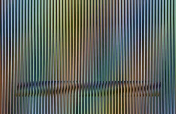
The Hypnotizing World of Franco Grignani
Jan 25, 2019
This February, the m.a.x. museo and Chiasso Cultural Centre in Switzerland will open an exhibition exploring the career of Franco Grignani (1908 – 1999). Although you may never have heard of Grignani, chances are you own at least one copy of his most famous work. Grignani designed the famous “Woolmark” logo: the three-sided, intertwined swirl of black and white lines that appears on tags signifying when something is made of pure virgin wool. This innocuous looking logo may never have caught your eye before, but if you take a closer look you might discover a world of optical mystery. The logo has properties similar to what mathematicians call a non-orientable surface: a two-dimensional, interconnected path that continually transforms into its mirror image. The more you try to make sense of what you see in this logo, the more your eyes play tricks on your mind. It is not only a simple optical illusion, however. The logo also makes use of the psychology of forms. Its triangular structure signals stability and strength. Its circular lines suggest tenderness and support. Its curved sides projects harmony and peace. Its black and white palette furthermore makes use of the psychology of color theory. Black signifies strength and authority. White suggests openness and purity. Black and white together project harmony and inclusiveness. Grignani was well aware of all of this when he designed the logo. Every decision he made was intentional. When he developed the design in 1963 he was 55 years old. He had already been researching the science of perception for decades, and had created thousands of sketches, logos, drawings, posters and paintings informed by what he learned. Grignani poured everything he knew about vision, optics, and the hidden meaning of symbols into this one simple design. The result was one of the most recognizable consumer logos of all time. Yet as the forthcoming exhibition in Chiasso suggests, what truly made the Woolmark logo, and the rest of his work, so successful was that Grignani was no ordinary designer. He was a complete artist who fully grasped how humans interact metaphysically with the visual world.
More Bauhaus Than the Bauhaus
It is fitting that we celebrate the work of Grignani in 2019, the 100th anniversary of the founding of the Bauhaus. Although Grignani was not associated with the Bauhaus directly, his career embodied the highest ideals of the school. Grignani studied architecture in school, and after graduating founded a design firm devoted to creating corporate logos for Italian companies such as the automobile manufacturer Fiat and the publishing firm Arnoldo Mondadori Editore. His designs were not only designed for graphic impact; they were based on a detailed study of how people interact with visual phenomena in the course of their everyday lives. Like members of the Bauhaus, Grignani strived for each of his designs to be a “total work of art,” something that was not only beautiful and useful, but which took into account the psychological needs of those by whom it was intended to be used.
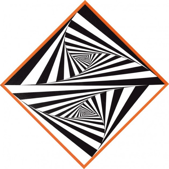
Franco Grignani - Operativo numerico, 1965
His view of graphic design was that it is a tool for instantaneous visual communication. But he realized that the message of an advertisement is only partially conveyed by words and photographs. His research showed him that most of the information conveyed through an image is communicated through formal aesthetic elements, which are interpreted by viewers on a subconscious level. His mastery of this aspect of his work came not from his design classes, but from a rigorous study of Modernist abstract art. In one of his most famous early Fiat posters, Grignani spelled the word Fiat in difficult to read, lower case, cursive letters. The message of the ad is obvious nonetheless: this is a product intended for the future. The image combined Dada collage techniques (black and white photographic elements superimposed over a color background), Futurist compositional tactics (sharp diagonal lines), and a Suprematist language of shapes (a single green square on a white support). Despite the fact that the car in the ad is antiquated by contemporary standards, the image, thanks to its design, still screams modernity even today.

Franco Grignani - Dissociazione dal bordo, 1967
The Lost Op Artist
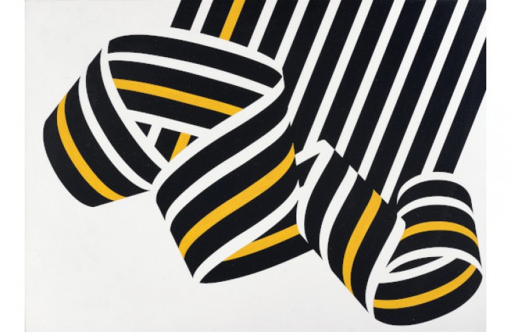
All the while Grignani was designing logos, book covers, posters, and corporate advertisements, he was also diligently creating art in his studio. The paintings he was making as early as the 1950s anticipate the Op Art movement, showing perceptually challenging arrangements of lines and shapes that seem to become kinetic after prolonged looking. Despite making these types of paintings even before the accepted pioneers of Op Art, such as Victor Vasarely and Bridget Riley, Grignani was not included in The Responsive Eye exhibition at MoMA, which is credited with introducing Op Art to the public. MoMA does, however, own one work by Grignani: a lithograph donated by the artist himself, dated 1965, the same year as The Responsive Eye exhibition. The image on the lithograph would have fit right in with the exhibition, which surely must be why Grignani donated it – to send a message that he was unjustifiably left out.
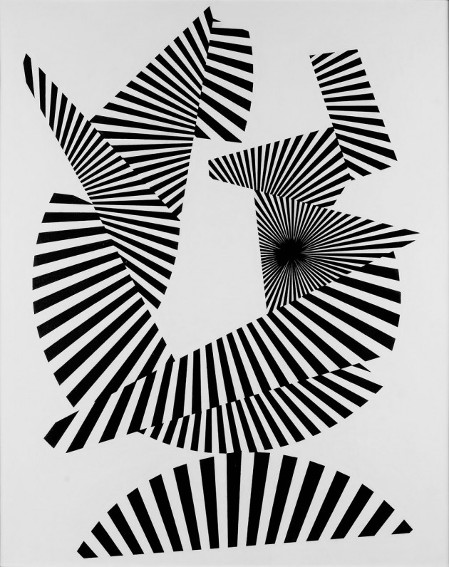
Franco Grignani - Frammentazione radiale, 1964
Interestingly, Grignani was included in a much earlier MoMA exhibition – Modern Art In Your Life – in 1949. His work in that show would also have fit right in with The Responsive Eye, except it was not a painting, it was an advertisement. That fact could be the source of the bias that kept Grignani out of the Op Art conversation, and could also be the reason so few people have heard of him today. But that was an unfortunate, and unjustified error. There is no question that Grignani was one of the most effective designers of the 20th Century, but he was so much more. He was an optimistic and thoughtful artist who dedicated his life to uncovering the relationships between what we see and how we feel, and a brilliant questioner of what that in turn makes us believe. Franco Grignani (1908-1999) – Multi-sensoriality between art, graphics and photography will be on view at the m.a.x. museo and Chiasso Cultural Centre in Switzerland from 17 February through 15 September 2019.
Featured image: Franco Grignani - N. 265, (dissociazione dal bordo), 1969. Acrylic on Schoeller cardboard. 50 x 70 cm.
All images used for illustrative purposes only
By Phillip Barcio
