The Many Shades and Mediums of Jeremy Blake
Feb 17, 2017
Scores of articles have been written about Jeremy Blake. But strangely, precious few of them talk in depth about his art. A multimedia artist who came to prominence in the early 2000s, Blake worked with photography, painting and video, and was widely acclaimed for his digital video projections, which he called time-based paintings. When he died in 2007, at the age of only 35, he was well on his way to making an international name for himself as a serious artist. Nevertheless, the overwhelming majority of press he has received has focused on his private life: his romantic relationship, his celebrity, his looks, and the bizarre labyrinth of conspiracies surrounding his death. Even the art media has tended only to discus the work Blake made in hyperbolic terms, focusing on its flash, its trippiness or its hallucinogenic values, elements that fit in nicely with the narrative of him as an art star. We think something important has been left out of the conversation: namely the value of the unique body of work Blake created from the perspective of art qua art, and the fascinating ideas it raised in regards to the habits and responsibilities of contemporary viewers.
Ladies and Gentlemen: Jeremy Blake
An artist and critic friend of mine named Scott Grow once asked me, “Do you find it strange when you Google an artist and more pictures of the artist come up than pictures of the work?” What followed was a lengthy discussion about the relative merits of celebrity and the power of factors like looks and attitude to make or break the career of young artists today. What if that had been the case when Mark Rothko had been painting? Would we still be talking about Rothko today? Not to pick on poor Rothko, but just to point out that his appearance, hipness, attitude and flash (or total lack thereof) had nothing to do with the opportunities he received, or the seriousness with which people now regard his work.
In that regard, Jeremy Blake was the anti-Rothko. He was undeniably attractive and cool. He had swagger. He made cover art for Beck and an animation sequence for a Paul Thomas Anderson film. And he had an equally attractive, equally cool, equally creative life partner, who, for example, worked on a project with David Sedaris before Sedaris was known. And Blake also had art world cred, receiving his BFA from the Art Institute of Chicago and his MFA from the California Institute of the Arts, and being included in the Whitney Biennial three times, in 2000, 2002 and 2004. But what people wonder is whether Blake would have gotten those opportunities if he had been unattractive and uncool. Is there something inherently interesting about his art that would have opened those doors regardless?
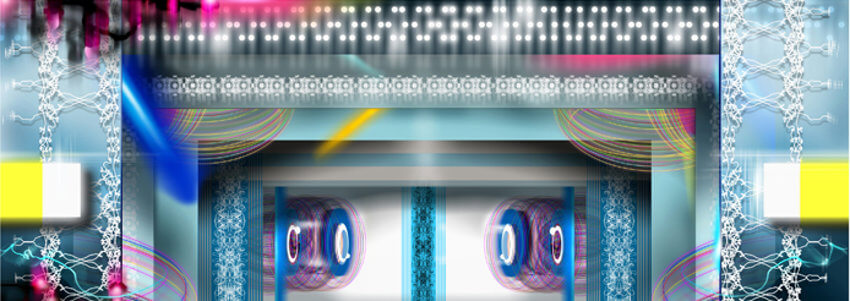
Jeremy Blake - Hobhouse, 2006 Digital C-print 40 x 98 in, photo credits of Honor Fraser Gallery
Fields of Color
We say yes. The other reason we used Mark Rothko in our comparison to Jeremy Blake is because that is the artist to whom Blake has most often been compared. One reason for the comparison is because both artists incorporated abstract fields of color in their work. But the comparison goes beyond simply relying on color. Both made works that were intended not be read as ends in themselves. Rather than having them appreciated only as objects, Rothko hoped his paintings would be encountered by viewers as intermediaries that could provide access to a larger, transcendent experience, facilitated by the spiritual attributes of color. He chose colors based on what emotional state he believed they could evoke and presented the colors in as silent a way as possible, allowing the viewers to guide their own journey.
The time-based paintings of Jeremy Blake are far less silent; in fact, they scream compared to a Rothko. But they also present color as an intermediary element that presents opportunities for transcendent experiences. For his 2001 artwork titled Mod Lang, Blake created a 16-minute continuous loop of abstract color fields that shift and morph, sometimes turning into formal geometric compositions and other times changing into seemingly random clouds of color. As with a Rothko painting, the colors in Mod Long possess instantly recognizable emotional values. They are shocking in their vivacity, and even when they take shapes or forms their color remains the most important factor. They are so intense that they connect directly with the subconscious in ways that indeed seem almost hallucinogenic.
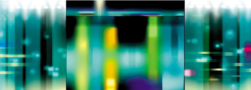
Jeremy Blake - New Haven, 2001 Digital C-print 41 x 104 in, photo credits of Honor Fraser Gallery
Changing Images
But what is obviously different about the time-based paintings of Jeremy Blake and the static paintings of Mark Rothko is that they change while the viewer is viewing them. The colors evolve and move and morph in a predetermined way. Whereas a color field painting by Rothko might hold a viewer in a particular emotional state for a long period of time, Mod Long drags viewers through a schizophrenic assortment of mood changes, giving no time to dwell in a particular emotional state. In an interview with the San Francisco Museum of Modern Art, Blake referred to this as, “A manifestation of neurosis.” Rather than inviting you to bask in calm, contemplative waters, his work forces you to swim in the flood.
But every painting changes in appearance gradually, even if only over the course of decades, thanks to the effects of air, light and gravity. Those changes are just beyond the ability of viewers to perceive in a single viewing. Jeremy Blake sped the changes up. He made paintings that are more like chameleons, altering their appearance before our eyes and making us question what exactly we are seeing. However, he also subverted those changes by playing his projections in a loop. The images morph repeatedly then revert back to their original state, over and over again, forever. If there is a spiritual equivalent it relates to natural cycles, reincarnation, and the endless repeating conflicts of existence.
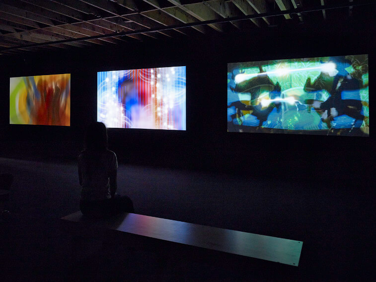 Jeremy Blake - Winchester trilogy, 2002 - 2004, Installation view, Project Los Altos: SFMOMA, Silicon Valley, 2013
Please View Responsibly
Though we give much attention to their inherently changing nature, the projections of Jeremy Blake are also fixed sums. They will not continue to morph into new, unforeseen things in the future. We can watch them completely through then watch them again and they will be the same. In that sense they are no different than a kinetic sculpture on a motor, or an Op Art painting that seems to move as we stare at it. But they take the effects of such work to another level. Jeremy Blake had an instinct for the ways digital technology affects the way we consume images. He had a sense that people want to be passively entertained, and that moving images are more compelling to many viewers than static images because they require less of an investment of time and intellect.
But there is something manipulative about art that does not require you to contemplate it. A viewer is invited into a different relationship with a work that guides them than with a work that simply is. What we as viewers must not do is we must not allow our contemplation to be inhibited just because we cannot stop the moving images. We must in a way ignore the changes and interpret the works of Jeremy Blake as environments. They are like a James Turrell Skyspace. They change before our eyes, but if we can find a way to be within them we can change with them, as Bruce Lee said, changing with change, achieving “the changeless state.”
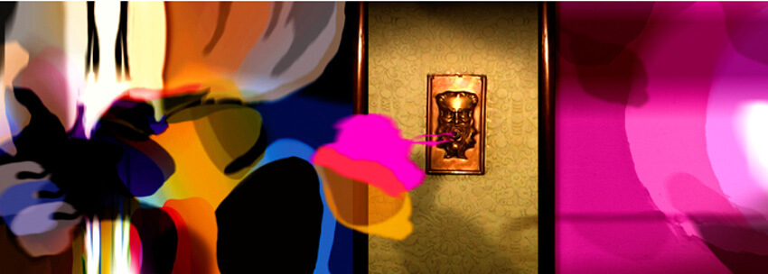 Jeremy Blake - Slipping Into Sleep, 2003 Digital C-print 27 x 65 in, photo credits of Honor Fraser Gallery
Mixed Intentions
That may all sound too heavy. The intentions of James Turrell or Mark Rothko may be so far removed from those of Jeremy Blake that to compare them may be an insult to all of them. As for his own intentions, Jeremy Blake said, “I'm just trying to think about how much flexibility you need as an artist and how much you can get out of the medium…But what comes out is, I think, a cool mix of the new and the old.” But he also said, “I want to create a waking dream that you’re then asked to interpret.”
In another statement, Blake hinted that perhaps he really is not even being serious about his art at all. “As a kid I was a real wise-ass,” he said. “I think a lot of my approach as I've gotten older and more in-depth, well, my approach is still kind of humorous.” Nonetheless, we are under no obligation to interact with his works according to his intentions. We are allowed to have our own. Consider the series of works Blake made about the Winchester Mansion, the insane house built by the maniacal widow of the inventor of the Winchester Rifle. The house was built, as Blake said, as “a space to accommodate spirits.” We feel that in his work, whether we interact with it contemplatively, hypnotically, aesthetically or as a hallucinogenic, Blake accomplished the same goal. He built spaces to accommodate our spirits, and that allow us, if we are willing, to enter into waking dreams.
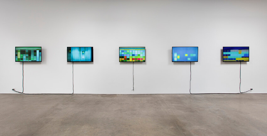
Jeremy Blake - Station to Station, 2001 Five channel digital animation with sound on DVD 16 minute continuous loop, photo credits of Honor Fraser Gallery
Featured image: Jeremy Blake - Sodium Fox, 2005, Still images from DVD, photo credits of Honor Fraser Gallery
All images used for illustrative purposes only
By Phillip Barcio
